- This is particularly painful to witness in some of the early Gusta maps, where his beautiful architecture does not get to shine nearly as bright as the sky above.

Plutonia 2 might have one of the most storied and drawn out development phases of any of the successful megawads. It was first conceived and highly touted by Sam "Metabolist" Woodman back in 2000, and as luck had it he contacted one Vincent "PerOxyd" Catalaá in 2004, when recruiting well versed testers. By april 2004, Sam Woodman stepped out, and "Virgil the Doom Poet" took over, before also disappearing like a shadow in the night late in 2005. Some years would pass, and it was not until 2007 that Catalaá, Belial and Da_Maniac got the ball rolling again.
The effective Catalaá quickly recruited more mappers and testers, juicing up the team considerably with this much needed staff addition since most of the beta version available at the time was in need of a serious tune up. So much so that only a few maps were kept, and even all of those were reworked heavily. With names such as Thomas van der Velden, Joe Pallai, Fredrik Johansson, Gusta, Erik Alm, Angus, Kira, Tango, Eternal, Pipicz and others on board, Plutonia 2 went through its butterfly transformation and eventually saw a proper release late in 2008, after eight years in development.
The project utilize the original texture set from The Plutonia Experiment, as well as a few new additional textures. There is a new, slick statusbar in stone grey colors, and other various menu graphics. It even includes 25 all new music tracks, but these were not taken into consideration during our review.
MAP01 - Comeback
[Johnsen]
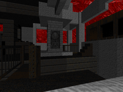
Appropriately Plutonia 2 opens with a map by Gusta. This is a short and well made affair that perfectly sets the thematic tone for the project. What you see here is already very representative for the megawad as a whole. You start outside a small, brown, abstract brick base covered in vines, with nice rocky scenery and muddy pools. A good early sign is the thoughtful placement of not one but two backpacks saluting our coop entry. Good use of windows and stairways, and excellent use of the sky texture to elevate certain parts of the walls, makes this a more complex map than the actual size would indicate. The clever use of the sky texture to achieve such height differences is a trademark that Gusta masterfully implement in his maps. It makes the core part of this map, with the yellow key perched on a ledge, a real sight. Small creative details like the pyramiding switch inside the yellow door room, or the dark vines hanging from the wooden ceiling beams in the blue key room, does wonders for the visuals. The secrets are very basic and simple, and I would not mind some more creativity involved with these. The map also killed me proper since Gusta all of a sudden decided to change the otherwise consistently harmless mud pools into hurt floor sectors within the small compartments next to the exit. A really pointless and unfair decision since you don't expect such at that point. The map host no less than three arch-viles, two mancubi, one baron and some cacos, so it's off to a rough start. Luckily there is also enough ammo and weapons to get through it comfortably. The gameplay is quite decent, but limited by the maps size and its somewhat cramped design, and the vine covered hallways become slightly annoying. One unforgivable trademark of the megawad occurs for the first time as well; the very first door you pass have a "fast close" line trigger nearby - no doubt done to prevent VPO's with the vanilla exe. Unfortunately the sky texture is way too bright, and it makes the map a tad too dark in contrast as it sucks up much of the warmth from the brown textures. This leaves it a bit mundane looking color wise.
Aesthetics: 5/6 - Layout: 4/6 - Gameplay: 4/6 - Score: 13/18
[Hunsager]
This is a very nice looking little complex put in a sea of mud with enough tropical textures to get the right jungle feeling. The buildings look overgrown because of the vine textures which are both on the walls and as passable textures over doorways and windows. You never feel enclosed because there is a good variation between outdoor and indoor scenery, but you will constantly feel surrounded by monsters, and you have to traverse carefully through the doorways because the vine textures make it difficult to spot them. The hanging "Ceilvines" texture behind the yellow door and around the blue key look especially nice against the light sky, and there is an exemplary use of varying sky heights around the central mud pool, creating the illusion that the surrounding buildings have varying ceiling heights. The red, blue and yellow light tiles add an essential and nice color variation in an otherwise brown and green level. There are imps, hitscanners, a few revenants, hell knights, mancubi and even some arch-viles on the multiplayer setting, and we are supplied with the shotgun, the super shotgun, a chaingun and the rocket launcher. Plutonia 2 means business right away. There is an empty balcony to the south with two burning barrels, and this area could perhaps have been utilized better. There are a couple of strange things here as well, for instance some signs that say "radiation", but the mud doesn't hurt except for the area in the last secret, this is an odd inconsistency. And on the note of secrets, I'm not sure what purpose they really serve since they can't be accused of being especially rewarding. The first one is only an ambush with chaingunners which is triggered as soon as you grab the berserk pack. The second secret is the area behind the blue and the yellow switch barriers. As you pass a linedef close to the exit, these lower and give you access, but only offer ammo from four shotgun guys, a health potion and an armor bonus. I'm crossing my fingers hoping the secrets will be more rewarding in the coming maps.
Aesthetics: 6/6 - Layout: 5/6 - Gameplay: 4/6 - Score: 15/18

MAP02 - Jungle Spirits
[Johnsen]
The 2nd map solidifies Gusta as one of the most talented mappers who participated in the project. Theme wise it was obviously inspired by Plutonia's 2'nd map - Well of Souls, as it use the same characteristic rock texture and water flats to great effect. Water, wood, vines, grey rocks and brick flow together here in a beautiful mix. You start well into the map, with an angry arachnotron in a fenced off area behind you, and every direction you decide to take will lead to heavily fortified spots. We quickly established some control by freeing up the darkly lit corner to the left of us, and from there split in each our direction. The Cyberdemon protecting the yellow key from the watery pit to the left, became an early target. I quickly ended him from a safe distance where he could not hurt me with his rockets, and I'm not sure how I feel about putting such a high end monster in a position like this, where you can basically unload the super shotgun on him with no risk. The pit itself is a great construct though, and I absolutely love the design choice with lowering part of its wall after the yellow key pickup, allowing you to see the exit ledge. Such interconnecting design is part of what makes Gusta a fantastic mapper. His creativity and ability to use wooden pillars, vine textures and cleverly apply the sky texture to differ sector heights in the outdoor areas, makes the map a beauty to behold. The cave with the supercharge on the curved ledge is wonderful, but my favorite spot would be right next to the yellow door when viewing the entire outdoor area from an elevated rock. The oceanic views surrounding this violent, beautiful island, further adds depth to the scenery. The red key cave is well constructed, with a frantic spawn ambush flooding in as you grab its treasure. The map goes out in style as well, with a double arch-vile ambush popping from the ground on top of the exit ledge, just as you climb the final stairs. The chaingunners are the real nasties and the stars of its gameplay though. I found the Spider Master-mind to be somewhat wasted here. The secrets are not very creative still, and we had a serious overload of shotgun shells, exiting with 84 and 56 each. Again the high contrast sky totally eats up the warmth of the textures, and renders the differing light levels almost moot in the process. This map would no doubt look even better with a darker sky.
Aesthetics: 5/6 - Layout: 5/6 - Gameplay: 4/6 - Score: 14/18
[Hunsager]
This is another splendid, nice looking level with clever use of the sky texture to create differing heights, just as it was done in the previous level. I like the combination of the textures and colors even better this time as there are white and green stone walls contrasting with the blue water. The chaingunners in the cave with the supercharge to the left from the start are brilliantly positioned. As soon as they fire they will lite up the gaps they stand in and create a beautiful contrast with the dark cave and the large windows. There is tough opposition in this map on multiplayer. We quickly positioned to the left and kept away from the incoming spider plasma spraying from behind, and cleared out the chaingunners and the cave. The Cyberdemon in the water filled pit to the right wasn't especially hard, and the Spider Master-mind took out many of the smaller monsters for us. The layout here is brilliant. It puts you right in the middle of the action, and the progression will lead you all the way around the map until you reach the exit high up on the cliffs. The only downfall might be the two secrets with an easy to find backpack and a green armor, in a map which already had too much ammo and health on multiplayer.
Aesthetics: 6/6 - Layout: 6/6 - Gameplay: 5/6 - Score: 17/18

MAP03 - Skull Island / Emerald Eve
[Johnsen]
This map was obviously made as a tribute to the rather horrible Aztech occupying Plutonia's third slot, most evident from the texture use and the invisible bridge near the end. Gusta collaborated with Pipicz here, and the latter added perhaps the most beautiful area of the map; a brown cave with several green acid rivers cascading down its sides, with a teleporter leading to the blue key. Gusta supplies some of his usual magic creating some wonderful height differences by clever use of the sky texture. The map offers more brown brick and vines, but the blue oceanic views are replaced by green pools of acid, and the map feels more cramped than the previous entry. The green acid cavern with the blue armor right before the yellow door, is stunning to look at. The layout is less impressively constructed in this map though, and it feels a bit messy to revisit an area in order to utilize the red key, and then teleport back to get the blue. The biggest gripe I have with the map however, would be the completely unforgivable use of "fast close" door trigger lines, put in place to prevent VPO's with the vanilla exe. This is not a workable hack on multiplayer, and it also becomes highly noise and gameplay intrusive. The most offensive example comes with the blue keyed door leading in to the great exit hall, as it close shut the moment you move slightly away from it. For me, this completely ruined the experience of the map. The gameplay flows nicely all the way until the exit hall though. This part copies the annoyance of Aztech by providing far off revenants and a nasty Cyberdemon at the end of the invisible bridge. It was not a good sequence in the original map, and its not fun here either. I didn't care much for the visuals on top of that, invisible bridges never added much of a highlight for me and the sections to each side are just copied switch sequences. Overall the map is less visually impressive than Map02, and again the bright white sky kills the subtle light differences completely. I exited with 100 shells here, so the map seems to have missed the mark a bit with the ammo balance.
Aesthetics: 4/6 - Layout: 3/6 - Gameplay: 4/6 - Score: 11/18
[Hunsager]
This is another map with brilliant architecture and height variation, although there are some decisions here that I will claim to be a bit lazy . If you look closely at the ceiling edges, you will see several places where the sky cover up parts of the sectors because of the height differences. There are also some "fast close" doors, which are probably implemented to prevent VPO. A visplane blocking door feels like an awkward solution if this is supposed to be 1.9 compatible, but the worst aspect about it is the gameplay intrusion. I will give a full 6 score for the aesthetics, but not a top score for the layout because of this. Two authors worked on this map, but the seamless flow makes it impossible to tell the contributions apart. The brown "Aswhall" caves with the green slime are very beautiful, but perhaps something more could have been done with it to expand the section some. This cave might also be the most confusing part of the layout. After you pick up the red key you have to return to a red switch outside the blue door, this switch will unlock some bars inside the cave and give you access to a teleporter taking you to the blue key. But it is difficult to see the entrance to the cave, and I instantly thought the red switch would lower the blue key, so I ran back to the blue key to have a look, but nope, it still wasn't accessible, and it took a while before we remembered the caves and the bars. The last section with the Cyberdemon feels a bit disjointed from the rest of the map, but Gusta states in the txt that he wanted to make a tribute to Plutonia Map03, so this would be the inspiration for the invisible bridge. The rapid "fast close" door was especially annoying here as you are bound to fire rockets and plasma from the entrance to deal with the Cyberdemon, and the nasty revenants. The map is quite brutal all through though, with a hard chaingunner ambush as soon as you pick up the blue key. The blue door section takes time and patience to conquer.
Aesthetics: 6/6 - Layout: 5/6 - Gameplay: 4/6 - Score: 15/18

MAP04 - Filth
[Johnsen]
I'm not quite sure how to feel about this one, the layout is actually pretty good but the map utilize almost no contrasting textures, rendering it a very brown affair. There is a dominant brown brick texture on the walls, and acidic, brown mud flows between the various sections. The gameplay has a decent flow but it's a bit heavy on the ledge and alcove snipers at times, and even a bit cramped. The only visually memorable parts would be the cascading brown fountain next to the blue door, and perhaps the curved exit building. It's a tiny map that will easily confuse you because of the interconnected design and lack of varied texturing. The open crate with the rocket launcher next to the red key ledge can be reached by a strafe-jump, and it's a nice non-intrusive addition. I also found the use of the red key bars behind the exit building to be a neatly orchestrated piece of layout. A suitable map name too, you do feel like hitting the showers after wading around here.
Aesthetics: 4/6 - Layout: 4/6 - Gameplay: 4/6 - Score: 12/18
[Hunsager]
We get a new author with this level, so here ends the different ceiling heights that were so prominent in the previous maps. This level is confusing. It feels like there is one texture everywhere, though there might be three or four in reality, but the colors are consistently brown, green and grey. There is basically a lot of acidic mud accompanied by bio-suits and some cramped corridors with various windows and bars. The level lack space and open areas, which would probably have made the revenants a bit more challenging and dangerous. The red key is difficult to spot as it's nesting inside an alcove which happens to be closed the first time you pass through. You actually have to walk to the red key door and then turn around and walk out of the second blue door before the red key and a medikit and some ammo reveal itself inside the alcove. This is the first level with the great looking UAAF-logo on the doors, which is made exclusively for Plutonia 2.
Aesthetics: 4/6 - Layout: 4/6 - Gameplay: 4/6 - Score: 12/18

MAP05 - Flooded Chapel
[Johnsen]
This is an excellent courtyard piece by Gusta, with a memorable yellow key tower and a neat 3D bridge. I wish he would have skipped the flashing red crosses since they just become highly clichéd and visually intrusive set pieces here, anything else would have been better. The map interconnects superbly, and yet again showcase Gustas' ability to make nonlinear maps, with excellent use of the sky texture to fake differing heights. He allow himself way too much liberty with that effect in regards to the yellow key tower though. It looks awesome from below, but when you enter it and the illusion crash with all the paper thin walls disappearing into nothingness, it's a sign the author overstepped the fine limitations of such trickery and disregarded logic completely. I don't like the use of key indicative textures on switches that actually serve to make the key accessible; fortunately this map is so small it doesn't become one of those fatally misleading cases. I'ts possible to get permanently stuck in this map if you fail to activate the red and blue key switch, or die after the bars have closed behind you. I absolutely loved the numerous, well utilized ledges, and the circular feel of the map. It's a wide and open level with excellent gameplay, so I'll forgive that it's too generous on the ammo as I exited with 100 shells left. The blue key pillar and the surrounding walls with the broken off parts, is among my favorite scenery. I also find the exit pit to be extremely pleasing visually. Again the bright sky is really intrusive as it sucks up too much light, rendering the color scheme a bit mundane and dull. Also, the G signature is cute, and one can also trace it in a later map, but cute doesn't suit Doom very well.
Aesthetics: 4/6 - Layout: 4/6 - Gameplay: 5/6 - Score: 13/18
[Hunsager]
I have praised Gusta for the aesthetics in the first three levels, but I wouldn't praise him much for these six giant, red, blinking crosses. Besides being a blatant overuse of one symbol, what makes them more awkward is the lack of symmetry. The upper vertical arm is supposed to be one third of the lower arm and about the same length as the two horizontal arms, that's how you should draw a cross. But Gusta has made the upper arm half the length of the two horizontal arms. The result is that it looks like a cross drawn by a kid. Apart from these decorations, there isn't really that much detailing here, and the yellow key tower should have been shorter to prevent you from looking down at the surrounding buildings and thus exposing the disappearing textures. Once again this becomes a lazy solution with the sky texture trick. On the positive side, there is a very nice texture combination and theme throughout the level. The route here is a little complicated, but as always Gusta leads you all around the map and back again to the starting point, something which seems to be his specialty.
Aesthetics: 4/6 - Layout: 4/6 - Gameplay: 5/6 - Score: 13/18

MAP06 - Collider Complex
[Johnsen]
Vincent picked up one of the cheap shorties from Metabolist here, and trusting his judgement, it was probably one of the most savable maps. Still, it maintains an overall feel of being a bit forced instead of creatively conceived. It's somewhat cheap with the repetitive detailing, but the smooth light effects are generally nice to look at. I would say it goes too heavy on the monster load, perhaps to compensate for its short duration, especially with the placement of the Cyberdemons, and also towards the end near the BFG pillar with the tons of stuff that spawn into this section. The earlier spawn ambush near the yellow key "reactor" room is much better orchestrated, and this would also be the visual highlight of the map, perhaps together with the quite nice looking end section. I don't care too much for the large connecting hall with the keyed doors, it seems repetitive and somewhat bland to me, despite trying to come off fancy. We had to check an editor in order to locate the sneaky red skull key, and I never feel great about authors putting vital stuff in easy to miss areas like this, it becomes just another way to draw out the map and frustrate the player. The storage room have some neat atmosphere thanks to the megasphere secret, the ceiling lights and the varying crate heights, as well as the memorable green walls from Plutonia. The texturing looks odd from the outside when you're in the rocky area though, and I don't like how this spot illogically blocks off a garden part by huge metal bars. The scenic views from the various windows doesn't add too much either, since most of the mountains are blocky and cheap, with some square looking acid pools as a last minute addendum. The BFG is a most vital secret here, and reachable through a random wall in a small stairway. As a side note, I hate it when a map abuse the switch texture for decorative purposes.
Aesthetics: 4/6 - Layout: 4/6 - Gameplay: 4/6 - Score: 12/18
[Hunsager]
A strange thing occurred in this map. In the second room we didn't notice the tiny compartment where the red key is placed so we bypassed it several times and wondered where to go. Suddenly, an imp in the red key section had somehow woken up and decided to open the red door from the inside. Naturally we went in, an assumed we had broken the map, only to realize that we couldn't flip the switch in this section since it also requires the red key. In the end we were so frustrated about missing the red key that we had to check in an editor (I'll admit that using the editor to find a key in such a small map is a bit embarrassing). As we had already guessed, this is one of the old maps made by Metabolist, and we cursed him for hiding the key so well, but in fact he is actually not to blame for this. It looks like Vincent Catalaá did a lot of great work reorganizing and rebuilding this map from the original version called "Complex". Vincent has made the parts to the north and east by relocating some of the parts which formerly lay to the south. He has expanded and flipped them and he has been doing some retexturing and added windows and some secrets throughout the map. The result is quite nice, even though this map do retain the fingerprints of Metabolist. The small corridors with the "A-vine3" texture bear his signature, and the use of the "Brwindow" in the start area is identical to the decorations in his Community Chest Map14. The most outstanding difference between the beta version and the final edition is the increased space which allowed Vincent to populate it with high-end monsters. Perhaps he could have utilized the start area some more, what if monsters spawned in each time you finished one of the sections? I also feel that some more could have been done with the outside of the building, as is it looks a bit unfinished with only some bars to the southwest. The secret which is visible from that point is an interesting design piece though. It refreshingly interconnects the western and southern part and lets you revisit an older section of the map. In the end, Vincent successfully saved an old Metabolist map from damnation.
Aesthetics: 4/6 - Layout: 4/6 - Gameplay: 5/6 - Score: 13/18

MAP07 - Enemy Caught
[Johnsen]
The seventh map becomes a very typical arena that draws inspiration from Plutonia's original Map07, as well as my own creation from Alien Vendetta's slot. It's a very brown map, and I would not have minded some more contrasts here. The outside scenery is decently molded, but still feels very much brown and grey. The blue key cave part is a small extension, and it adds a bit more depth to the map without granting any visual highlights. I was annoyed at the placement of the megaspheres, since putting them on descending steps in a pit like this makes it hard to get to them in time during the frenzy, and it cost me a respawn. There are plenty of cells in the map, and it's not too hard though. I was mildly entertained by it but have no craving to replay it any time soon. Overall, it's an OK effort, and obviously achieves the typical Map07 agenda. The "shoot switch" secret was a creative highlight in an otherwise plain and slightly dull map.
Aesthetics: 4/6 - Layout: 4/6 - Gameplay: 4/6 - Score: 12/18
[Hunsager]
This map doesn't aspire to be anything revolutionary and instead applies the usual Map07 concept, and succeeds to a fair extent. The courtyard is a bit larger than usual, and I find the monsters covering behind the breastworks annoyingly difficult to hit with my rockets.
Aesthetics: 4/6 - Layout: 3/6 - Gameplay: 4/6 - Score: 11/18

MAP08 - Harmany
[Johnsen]
Tango comes up with a nice arena map here, with excellent gameplay. It's a relatively short affair, but fun. Admittedly having a BFG ready from the previous map was of great help - but there's a multiplayer only BFG available on a secret ledge near the blue key, in any case. The blue door uses the trademarked and unforgivable "fast close" trick in an attempt to prevent 1.9 VPO's. You get two Cyberdemons here on multiplayer, but both of them work well with the gameplay dynamics and are fun fights. I really like the scenery behind the blue key, with the cascading blood falls and the sweet mountain texture. The exit area is also real nice, with tasty ceiling detailing and a few neatly curved sectors. The overly bright sky unfortunately does not bring out the colors properly, and contributes to a somewhat contrast lacking look in all the outdoor sections.
Aesthetics: 4/6 - Layout: 4/6 - Gameplay: 5/6 - Score: 13/18
[Hunsager]
This is a small map with a brutal start. It's a courtyard with a Cyberdemon and two caged arch-viles. After we disposed the mancubi and the revenants we took care of the Cyberdemon and then the somewhat debilitated arch-viles. Something more interesting could have been done in this courtyard instead of the cage but the map has some nice visuals and details in general, and there is a clever secret in the blue key garden which includes a multiplayer only BFG.
Aesthetics: 5/6 - Layout: 4/6 - Gameplay: 5/6 - Score: 14/18

MAP09 - Wormhole Zone
[Johnsen]
Gusta provides another brilliant map here, perhaps his best so far. I wish he would have placed it in a later episode with a different sky, and also elevated the indoor light levels somewhat, because it's borderline too dark. If you can forgive this, and also forgive the fact that you are likely to get lost in this superbly interconnected beauty, then it qualifies as a "must play". There are some really impressive open views from the high up ledges. The various ways you can attack the map as you spawn, makes it very interesting. Climbing the winding, blue waterfall into the mountain area to get the red key, is an absolute highlight for me - and the cacodemon army you encounter there makes it a fun and memorable fight. There is such a clever use of texturing, especially by lowering portions of the walls by utilizing the sky, that one should take note and study it if one is to start a mapping career. You get both the plasma and the BFG here, and they are needed, since the map is loaded with heavy hitters such as two Cyberdemons. It's never unfair though as you get plenty of health and ammo, and the fights are well orchestrated. I love the use of the barbed wire texture applied at the edges of the oceanic views, especially the spot with the supercharge. I'm not sure what I think of the impassible lines preventing you from logically entering the section with the blue key, I feel this alcove should have been blocked in a more obvious manner. The drop to the yellow key ledge, as well as the winding exit ledge, is just layout brilliance. If the map was a little less dark, and if it omitted a few quirks, I'd have given it the full 6 points in the layout department.
Aesthetics: 5/6 - Layout: 5/6 - Gameplay: 5/6 - Score: 15/18
[Hunsager]
Apart from some lazy use of sky texture height trickery around the red key, this is another masterpiece from Gusta. I feel there are some similarities to Map02, probably because the interior of the base is dark and combines water and textures in white, green and brown, even though the only reused texture seems to be "A-Mosrk2". There is a wonderful texture combination on the front of the base, near the yellow key which is situated on a ledge on the west side. It can be a little difficult to realize that you have to make a drop from an opening in the base in order to get this key. Two Cyberdemons might be too much here, and they don't have a lot of space to move around. One of the best things in this map is probably the caves that go all around on the southern and northwestern ridge. There are cacos nesting in the dark enclosures to the south, but those to the northwest are empty and serve only as scenery. This is also the most passive part of the map with some of the weirder solutions. Like in Map02, the rocket launcher presents itself as a rather boring secret. The imps and the revenants to the west are placed behind an impassable vine texture, but did this really need to be an inaccessible area? Maybe it would have been more fair if the player start was located here? However, it looks like Gusta opted for a more fierce start, and on the other hand this suits the name "Wormhole zone" better.
Aesthetics: 6/6 - Layout: 6/6 - Gameplay: 5/6 - Score: 17/18

MAP10 - Cosmodrome
[Johnsen]
This one starts with a grand window view of some kind of base. Getting there is a small detour away though, since you first have to teleport into another section where a huge spacecraft takes off in a strictly vertical fashion (it's actually the floor that lowers but lets not ruin the illusion). I would have preferred if the ship kept raising and disappeared into the sky, completely leaving the players viewpoint, but the author opted for letting it hang around. The lights beneath it could have benefited from a few more fading sectors. One have to enter the takeoff trench to hit a switch, and then somewhat cheaply teleport back up. Now we get to the good part as you can access the rocky surroundings of the neat looking base that we viewed from the start. I love the use of textures and the sectors applied to the front of the base, and the acid moat adds depth to the scenery. The indoor is cleverly designed to avoid VPO's, and lead you around through a curved hallway, with a nice chainsaw ledge on the way. The drop into the tech-room is a bit odd, and we suddenly found ourselves in a harsh ambush fight down there, which quickly ended my unfortunate partner. I'm not sure what to think of the Doom II Map10 inspired area, it copies too hard for my taste, but at least it adds a refreshing cave take to the latter part with the Spider Master-Mind. The raising and lowering floors in front of the blue key are not too intrusive, and the fights down there are fun. This is a fairly small map, with some visual gimmicks that works decently, but the creativity it offers is pretty much nullified by blatantly reusing elements from Doom II. This thing is fun to play though.
Aesthetics: 4/6 - Layout: 4/6 - Gameplay: 5/6 - Score: 13/18
[Hunsager]
"Cosmodrome" feels like it's got three distinctive parts, the majestic building with the nice UAAF-symbol, the subterranean part inspired from the "Refueling base" and the area with the space ship that ascends (originally part of an old Plutonia 2 map called "Void"). I applaud that idea, but maybe the exit could have been situated in this area so that you visited this part last instead of first, since it is a bit strange that the space ship will just be hanging around? I guess, we will never have total realism in Doom though, so that's just a slight nitpick. Actually, it is not the ship that ascends, but the floor that lowers, so this is a clever illusion. I like that some derivations from the inspirational source was added to the Doom II Map10 area, like the UAAF-logos and the fact that the secrets are not "gun triggered" doors, as such would have been too obvious and similar.
Aesthetics: 5/6 - Layout: 5/6 - Gameplay: 5/6 - Score: 15/18

MAP11 - Arch-Violence
[Johnsen]
It seems near impossible for Gusta to make anything but visually interesting maps. This Plutonia Map11 maze tribute is no exception, and it utilize one of the most beautiful moss covered brick textures from Plutonia. The green and grey hue goes great with the dominant red of the blood floors. The maze is full of creative and cool looking areas, the best one being the strikingly cool vine grown ledge section with the red key tower. It really is a moody and different piece that sticks to memory. Despite being so thematically interesting and atmospherically foreboding, the arch-vile maze gimmick was already used to its full effect in Plutonia's original map, and Gusta doesn't add many refreshing gameplay twists here. You get the same scattered army of arch-viles to hunt, or to be hunted by, as they sometimes crowd you surprisingly. It's a bitch to die in this map, and I strongly feel that multiplayer shortcuts should have been generously supplied near the start area. Keys and weapons should also pop up at the spawn spots after they have been collected once. This would have elevated the fun of playing the map considerably. If it's supposed to be frustrating though, it managed to achieve this well enough. The layout works as intended, and will sufficiently have you run in circles. I love the fading light effects applied to the bloodfalls and the stone clad walls in the very first area of the map. With some more highlighting contrasts on these bloodfalls, this view would be stunning. The overblown arch-vile attack in the exit didn't amuse me in "Hunted" and it still doesn't appeal to me here.
Aesthetics: 4/6 - Layout: 4/6 - Gameplay: 3/6 - Score: 11/18
[Hunsager]
The authors seem to have figured Plutonia 2 needed an arch-vile maze similar to the infamous one found in The Plutonia Experiment. The level is very beautiful an atmospheric, and though it seldom turns into a maze in the classical sense as it also includes some nice open areas, you will certainly get lost since this is a huge map that two authors worked on. The maze areas made by Gusta are a bit too complex, and some restraint would have been better I think. The gameplay is a bit repetitive, and there is an especially annoying arch-vile which teleports around like crazy. Thomas van der Velden has made a cool M.C.Escher inspired building behind the yellow key, and everything in it feels like it has been turned up side down, inducing a sense of sudden insanity.
Aesthetics: 5/6 - Layout: 3/6 - Gameplay: 3/6 - Score: 11/18

MAP12 - Imprisoned
[Johnsen]
One wouldn't guess that a map consisting of bits and pieces from several axed creations would end up as one of the finest offerings in the entire set. This is a deceiving map as far as size goes, it feels much bigger than it is, much thanks to the grand scale of some rooms and the great use of vertical space. The first part is a relatively mundane and laid back grey brick part, with a few connected hallways, and some repetitive light detailing. The blue key corridor have a neat acid ledge running alongside it, with some nasty chaingunners, and I appreciate the fact one can actually access it to pick up the leftovers. There's a neat supercharge secret down there as well. The green acid texture used to decorate the winding hallway past the blue door looks great and adds lots of mood and atmosphere. The visual highlight for me, and one of my favorite views in the entire megwad, would be the grand hall with the numerous and huge, rectangular windows from where you unlock the surrounding yellow key garden. The dark metal texturing contrasting with the red sky horizon, and the epic scale of this hall, makes for a spectacular and most memorable view. The fact that it connects so well with the outside area where the yellow key resides, further elevates it. There are some enormous, great looking pillars attached to the construct. A few high up alcoves with chaingunners will end you quickly if you can't take them out effectively. Dropping into the shaft after the yellow door leads to another impressive section, with a barred window overlooking a great bridge with a roaming Cyberdemon and a towering building in the back, all set to the awesome red sky. I appreciate the fact that two additional yellow keyed doors were added to this section, allowing you to backtrack if need be. My partner was instantly killed by the deadly chaingunner pillar ambush that occurred as he tried to pass the bridge; an equally awesome and frightening sight to behold from my safe distance. The towering exit building is a final great addition to this moody map, and it's a joy to climb the staircases and lifts that take you to the top of it, where it brilliantly allows you to spec back at the main building from far above. I'll forgive some simple and repetitive light effects early on in the map and the fact that the sky texture loop when you climb the final tower. This is a highly atmospheric and memorable map, with great gameplay. The row of authors that worked on this thing deserves one cold beer each, and a pat on the back.
Aesthetics: 5/6 - Layout: 5/6 - Gameplay: 5/6 - Score: 15/18
[Hunsager]
Three different parts were merged into this interesting and wonderful level. The old map "Damnation" makes up all of the interior here, except for the J-shaped, dark hallway. This hallway and the next large room to the east with the arachnotrons, the rocket launcher and the tall windows, and its eastern exterior, is a part of another old map called "Ruins". All of the exterior to the north with the bridge crossing the slime towards the beautiful UAAF building is of a third and younger origin which was probably made by Thomas van der Velden. I suspect that he is also the man who is responsible for the third part and for the successful fusion of these parts. He has changed several textures with new creations to better suit the mood of the map. The biggest change is the red sky as the older maps had the white sky of the first episode. This truly alters the view in the two rooms with the large windows, and this sky adds a lot to the atmosphere throughout the level. The bridge has a deadly chaingunner ambush that usually kills me when I play Plutonia 2 as I find myself stopping in awe to look at the beautiful UAAF building in the distance.
Aesthetics: 6/6 - Layout: 5/6 - Gameplay: 5/6 - Score: 16/18

MAP13 - Hard Facility
[Johnsen]
This is certainly a hard facility - it's a compact, large hyper violent base that will rip you to pieces in no time unless you know all its secrets or progress with some care. It's equally confusing and interconnected as it's beautiful. I absolutely loved the frantic high adrenaline gameplay here, and I would rate it a full 6 if it hadn't been for the decision of adding two arch-viles, several chaingunners and a Cyberdemon to guard the exit, a very frustratingly positioned overload that killed us both. There are lots of wonderful aspects to this map, I love how the cave-like vine sections connect the various parts. The red key room with the large cross-shaped ledge is stunningly beautiful. The darkly lit area inside the blue door with the small storage room, is highly moody and very deadly. I enjoyed climbing the crates to snag the secret supercharge. The route progression here is extremely confusing at first, since you have to jump pillars, catch sneakily placed switches - like the one that lowers the yellow key pillar, and you'll be running in circles several times before you figure it all out. The use of texture variations and height differences comes together perfectly. I really like the use of the red lava rock flat, and how it contrasts with the green vine caverns. Overall the map is about as violent as a Doom map can get without going overboard, and it has a superb layout and a consistently delicious look.
Aesthetics: 5/6 - Layout: 5/6 - Gameplay: 5/6 - Score: 15/18
[Hunsager]
This is a fantastic base set in a jungle with an intricate layout as there are several doors, windows, tunnels and cages. You have to proceed slowly if you want to stay alive. This is the kind of map where there are multiple routes, and the most interesting thing is that the red key is in fact optional. You can bypass the red key and come to the switch that lowers the yellow key by strafing through the hole where the floating arrow is pointing in the yellow key garden. After you have picked up the yellow key comes the crucial moment were it's possible to get lost in this map. Behind the yellow door you must turn right up the stairs and proceed through a small door. You will come out on a ledge in the southwestern corner of this larger room and from here you can access the teleporter in the middle of the room by jumping over a pillar. (Even though I have played this map several times I always forget that this confusing jump is the point of the yellow key and I think this is also why I can't award this map with 6 points for layout even though I love it). The teleporter will transport you behind the blue bars which is a ridiculously short teleport distance, and I think it's appropriate to ask what the point of this was. Could it be just to simulate that the player is suddenly trapped inside the blue section, and that he won't get out before he locates the blue key? Instead of using a teleporter you could achieve a similar effect by just tagging these bars yellow on the front and blue on the other side. That would have meant that the player would head for these bars after picking up the yellow key, and as soon as they closed behind him he would have been locked inside and wouldn't get out before he had found the blue key. Anyway, there are several authors involved in this creation; Fredrik, Gusta and Metabolist. Fredrik is probably the one which is responsible for most of the ideas here, but Gusta has finished it off well. He has totally rebuilt the rooms between the red doors and the northern blue bars with the essential teleporter, and he has constructed a new exit. The original was only a disappointing dark hole with a baron, but Gusta must have thought that this treasure of a map deserved a proper final salute, and he has truly made a nice conclusion to it. He has also done some serious facelifts around the cross with the red key and removed a small tunnel and several cage textures. The biggest change in the level is probably that he has implemented more of the "Metal2" texture on the base and that the former blue water now has been changed to the red "Rrock01", something which fits perfect with the red sky. I wont hesitate with praising Gustas re-texturing, but I am not so sure about his rebuilding of the famous teleporter room since it has become a bit more complicated than it used to be. There is a difficult Cyberdemon in the exit area together with an arch-vile and some chaingunners. If you get past those, there are two last surprise arch-viles, and these guys finished us off several times before we could conquer them, and it's a difficult ending to an altogether violent level. My favorite part must be the dark section behind the blue bars to the northeast.
Aesthetics: 5/6 - Layout: 5/6 - Gameplay: 5/6 - Score: 15/18

MAP14 - Charon Eclipse
[Johnsen]
This map would have felt right at home in the original Plutonia, as it successfully mimics the way of the Casalis. It's admittedly a bit mundane looking, with prominent brown brick textures and the blood covered hurt floors. I much enjoyed the good use of open space in combination with slick traps. This is a very functional map, with strong gameplay and a decent layout, but it do come off as a bit simplistic at the end of the day. Visually, I liked the yellow key room, especially the ceiling detailing above the switch lowering the pillar, as well as the neat cyberdemon showdown garden towards the end. The supercharge and "multi only" BFG secret is a creative highlight, it includes a small wooden bar that has a slightly differing texture, which reveals a shoot switch that lets you access a balcony overlooking the cybers den. I much prefer this map out of the three that Alexander "Eternal" S. made.
Aesthetics: 4/6 - Layout: 4/6 - Gameplay: 5/6 - Score: 13/18
[Hunsager]
A smaller map than the previous one, with a simple but efficient layout that manages to give me the classic Plutonia feeling. That is probably because of the textures and the use of chaingunners and revenants. There are several really cool secrets to find, each giving some subtle hint to their existence.
Aesthetics: 5/6 - Layout: 4/6 - Gameplay: 5/6 - Score: 14/18

MAP15 - Where Hate Runs Red
[Johnsen]
One would be hard pressed to find a megwad that has no stinkers, and this map offers up an obvious entry for that category. Architecturally this is more or less just a few connected halls that try to trigger some likeness to the great Plutonia Map12 by using the same texture theme, and also rips off a multi sided teleport-pillar element from Romero's masterful E4M6, just to add to the insult. This is just badly executed, and I wonder why the map made it into the final set at all. The small outdoor mountain area to the south doesn't add anything either, say for some logical flaws with the transition back to the wooden parts. The cyber and arch-vile fights are more unfair than fun. There are a few hidden supercharges available if you drop into the blood at the core of the map, but it's an annoying affair to dodge cyber rockets while you climb the ledges, or when you just happen to teleport into some incoming missiles aimed at your partner. All in all this is an obvious filler map. I survived until the very last damned arch-vile got.
Aesthetics: 3/6 - Layout: 3/6 - Gameplay: 3/6 - Score: 9/18
[Hunsager]
Oh no. This would be the first awkward moment in Plutonia 2. A clumsy three section mammoth dressed in wood, which attempts some kind of slaughter gameplay. What a miserable little map, shaming each of the three levels it draws inspiration from. The placement of the BFG is meant to be annoying I guess, and there are too many incoming Cyberdemon rockets and angry arch-viles here. The arch-vile jump to reach the secret exit doesn't save this disaster map from being a total humiliation.
Aesthetics: 3/6 - Layout: 2/6 - Gameplay: 3/6 - Score: 8/18

MAP31 - Cybernation
[Johnsen]
If you played the original Plutonia Map31, there is little reason to play this one if you're looking for something fresh, as it's basically the same with a slight variation. I won't knock the design here, nor the functionality - it's a fairly fun map to play, if you don't go crazy from the same old lift + door combo that do become quite gameplay intrusive at times. If you're not familiar with the original, the quick rundown would be that you release Cyberdemons after hitting switches inside an abstract looking brick base surrounding a courtyard. There's even the good old arch-vile behind the texture covered wall, snatched straight from "Cyberden". You release some rather fun slaughter styled ambushes towards the end of the map, and it's likely to appeal to the crowd who enjoy these kinda maps. Some vine overgrown brick textures and a slightly different setup with the cybers don't account for much, and it's undeniably somewhat silly to recreate a map to this extent. You get away with a lot when it's the secret map slot though. Fighting Cyberdemons in cooperative mode always allows for some strategy too, so there's that element to enjoy.
Aesthetics: 4/6 - Layout: 4/6 - Gameplay: 4/6 - Score: 12/18
[Hunsager]
Perhaps it would have been better to not discover the secret exit, since this is just another disappointment which is too similar to the original Plutonia's Map31. Hiding an arch-vile behind a texture to make it invisible to the player, is just a no go that mappers shouldn't do.
Aesthetics: 3/6 - Layout: 3/6 - Gameplay: 4/6 - Score: 10/18

MAP32 - Go 4 It
[Johnsen]
Back in 2007 I handed over some comments on the Plutonia 2 beta edition to help out the team, and mentioned that this map slot could be used for something similar to Plutonia's original "Go 2 It". Perhaps someone took those words too literary, since this ended up as an obvious remake of the legendary Casali slaughter map. Plutonia's version is based off the even earlier "Punisher" from the same author, and they all base themselves on Doom2 Map01, so the structural elements of these are also brought over into this map. Where Plutonia had ledges, this map goes for caves which creates a refreshing change amidst the more obviously inspired parts. Dario's original is one of my all time favorite slaughter maps, but this held its own. I enjoyed the frantic slaughter, and stayed alive even through the massive Cyberdemon showdown beyond the blue door. Unfortunately, we forgot to set the compatibility options for the ghost producing crusher, so that part of the gameplay was omitted. This makes a cool addition to the map in my opinion, and an unexpected twist. If only it would have ended on such a nice creative high. To my great dismay though it did not, and my survival effort was immediately cut short as I teleported into a disjointed Icon of Sin spawn cube arena. Even though the switch sequences in this section are rather forgiving if you know exactly what to do, this is just a terrible way to screw up an otherwise functional slaughter map. Putting a spawner at the end of lengthy maps is a design decision I will never agree with. This completely took away the joy I felt when playing the map up until that point, and I lazily started moving down spawned enemies, not caring about my survival rate no more. I'll award the map for being a successful clone until it fucked up though, and the huge, vertical letters in the final arena looks pretty cool.
Aesthetics: 4/6 - Layout: 3/6 - Gameplay: 3/6 - Score: 10/18
[Hunsager]
The doomwiki states: "contrary to popular belief, the layout of this level is not a combination of Map01 from Doom II and Doom's E1M1. It is instead based on E1M1 and DWANGO5's Map01. The DWANGO level is in turn based on Entryway". Ok, saying "contrary" sounds a bit comical, but let's not fall into popular belief but instead agree that there is some influence from D5M1 here also. If we consider the gameplay, the inspiration is primarily from "Go 2 It", and the authors must have thought that they wanted to push the hardness a little further. They threw in a crusher producing SS ghost monsters, and a final arena with spawn crates and a triple Icon of Sin battle. These crazy guys weren't just satisfied with standard slaughter but went for full insanity. The last arena is rather well done with the Plutonia 2 logo constructed on a ledge. I wonder why they didn't place this arena as Map30.
Aesthetics: 4/6 - Layout: 3/6 - Gameplay: 2/6 - Score: 9/18

MAP16 - Predatorium
[Johnsen]
Damn it, this map could have been a classic. Unfortunately Gusta went overboard with the gameplay here, and added way too many arch-viles and Cyberdemons. The multiplayer gameplay setup is just frustrating, despite a handy invulnerability. We didn't enjoy this map at all, which is a pity, since the architecture is absolutely wonderful and filled with typical Gusta styled ledges, interconnected sections and perfect texturing. It's a quite complex map despite the small size and locating the red key switch can be somewhat confusing at first. I'm thankful for some smart design choices like allowing the player to jump through the window from the red key switch, and thus easily get to the desired spot instead of backtracking. My favorite areas visually would be the awesome, caged yellow key ledge when viewed from a high up window, and the blue key section when viewed from below. A mapper with such an eye for texture combinations and simplistic beauty is a rare thing to see. I would not be surprised if this map scored higher on a singleplayer rating, since I will assume there are less overdone monster clusters then.
Aesthetics: 5/6 - Layout: 5/6 - Gameplay: 3/6 - Score: 13/18
[Hunsager]
The start is an inferno and could perhaps have been a little rearranged. Perhaps the smartest thing to do is to run for the muddy ditch beneath the fake red key. It feels like this ditch is the central vein of the map, which is a little depressing, and there isn't much space down there to move, nor in the map in general. Gusta didn't spend much time creating this map, and it shows as it gets a little too cramped for my taste, even though the visuals are decent as always in his levels.
Aesthetics: 5/6 - Layout: 4/6 - Gameplay: 3/6 - Score: 12/18

MAP17 - Nuclear Horror / Mountain Doom
[Johnsen]
If I was to compile a list of the 50 best Doom maps I've played, I would most likely put this one somewhere on it. This is by far the best map in the megawad in my opinion, and a creation that solidifies Gusta as one of my favorite authors. This is a large, complex piece that undoubtedly will leave you completely confused at times, yet it's so good you'll happily stay around. It draws obvious inspiration from the subterranean and less vertically impressive, but almost equally brilliant Plutonia Map23. It would be hard to categorize this as a base map, since its too abstract for that. It fully encompasses the kind of places only Doom can conjure up among FPS games, and it consists of a multitude of ledges, hallways, vertical drops, gardens, caves and plateaus. It's quite amazing that this thing runs with 1.9, and I would honestly be surprised if it's completely VPO free. Luckily that error is a thing of the past in this day and age, since hardly anyone will actually run it vanilla style. One could argue the map is a bit too complex for its own good, but I'd disagree. This is the kind of interconnected wonder that you should get lost in to fully enjoy. Searching for the way to the exit is part of the immersion here, and you will hardly be bored while doing so since it's suited with a near perfect gameplay. We did exit with a lot of excess ammo here, about 100 shotgun shells and a bunch of rockets each - but one have to take deaths into account on multiplayer, as well as our previously accumulated ammo. There are some truly wonderful fights in this map, the most memorable being the massive spawn army after the yellow key pickup - accompanied by a Cyberdemon (who turned out to be very helpful, thanks mate). The visual highlights are too many to list. How about the vast acid lake with the Spider Master-mind, framed by a row of arches in the far distance, beautifully contrasted with the red sky. Or what about the outdoor area next to the red door, with its multitude of ledges, cascading acid falls and wonderful shapes. Or should we mention the cybers yard next to the yellow switch near the start, with an equally impressive use of scale and textures. The only area I'm less enthusiastic about visually, would be the somewhat over-scaled and bare exit area, with the vine clad staircases, the high up tech walls and the totally out of place candelabra on a ledge in the back (wtf?). That is a minor detail in a massive beauty like this though, much like a a tiny pimple on the buttcheeks of a prime Lopez.
Aesthetics: 6/6 - Layout: 6/6 - Gameplay: 5/6 - Score: 17/18
[Hunsager]
This is one of the most complex maps in Plutonia 2, and it showcases some very impressive architecture with superb details and texture variation. The start area is surrounded by several chaingunners and revenants, and you will want to instigate infights between the monsters. I died in this map as I was teleported onto the yellow key and instantly ate rockets from a nearby Cyberdemon. I can't say that I understand why there is a teleporter here as it would have been just as easy to make stairs, so this smelled more like a trap. As soon as I grabbed the yellow key, a huge ambush with revenants and demons appeared and kept the Cyberdemon busy. There are several ambushes throughout the level, and there are three yellow key switches scattered around, which will lower some bars in the north section. However it seems like you don't have to lower them as you can bypass these bars in the next room. That means the yellow key with the ambush and the three switches are strictly optional.
Aesthetics: 6/6 - Layout: 5/6 - Gameplay: 5/6 - Score: 16/18

MAP18 - Buckets of Blood
[Johnsen]
Gusta seems to never run out of awesome designs, instead he goes "here, have another classic". This would be my 2nd favorite entry of the megawad. I'd recommend it to anyone as a must play, at least if you love the distilled, simplistic beauty captured by the original Plutonia. This is just rock solid, with a texture choice of brown bricks, wood, blood and metal, set to the red sky of the episode. One would best describe it as a brown, rustic delight, with near perfect texturing and layout. The map interconnects just as slick as one would expect from a Gusta map, and it's full of visual highlights. One could mention the awesome view towards the yellow key, or the placement of the red key on top of a huge staircase altar, made all the cooler by the neat sky effect that allows it to perk high above the surroundings. The blue key section is another awesome piece of architecture, especially for an 1.9 compatible map. I love how the key itself is perched on a ledge in the midst of a massively defended area. The open scale architecture makes for some truly great gameplay as well, and even though we excited with excess ammo counting 100 rockets and 100 shells, we killed all the Cyberdemons with two shots per head, and also had accumulated ammo from the previous map. There are some great spawn ambushes here, and you'll have lots of fun wielding the BFG or pumping rockets into the crowds. This is yet another atmospheric masterpiece, and together with Gustas other work it certainly elevates the megawad considerably.
Aesthetics: 5/6 - Layout: 6/6 - Gameplay: 5/6 - Score: 16/18
[Hunsager]
Gusta states that the layout here is inspired by his Kama Sutra mapping, and this sure feels like a slaughter map with grand design and architecture. The gameplay flows well and the visuals are very nice. There is a symmetrical layout combined with diferent architechtural expressions to the west and east. The final monsters that teleport in are only a bunch of troopers, which is probably meant to be a cute joke.
Aesthetics: 5/6 - Layout: 5/6 - Gameplay: 5/6 - Score: 15/18

MAP19 - Hecknology
[Johnsen]
The quality takes a heavy dive compared to the previous masterpiece. Vincent, in a noble effort, tries to salvage another Metabolist creation here, and although it's not a total disaster as a result of his touch, I still didn't enjoy this. There is a general underlying tone in Metabolist's maps as if he's trying to squeeze the most out of his copy-paste detailing. This is most evident if you take a look at the way wall decorations or ceiling lights are distributed throughout like a bad case of the smallpox. He also disregard such unwritten rules as one should not use switch textures for decorations. There is a dark, somewhat moody acid pool pasted on both sides at the core of the map, and much of the gameplay revolves around emptying out these from the loads that spawn into them, including two Cyberdemons on multiplayer. The cramped hallways fill up with ridiculous amounts of monsters throughout, and there is a pesky Cyberdemon guarding the rocket launcher at the end of a steep stairway. The map doesn't start out very convincing either, as it drops you down a shaft and into a large garden area with some green mountains to one side. The huge pillars pumping acid into the pool do look cool, but they would have benefited greatly from highlighting the acid with an increased light level. There is a BFG and some ammo nesting on a window still, visible from both the start and the exit area. I assume getting it includes a tricky jump, but we decided to just shoot one guy over to snatch it. The blue key section looks adequately nice, and I like the idea of dividing the staircase leading to it by using two different flats. The final yellow key section is structurally okay but rather uninventive, it mainly suffers from the same thing as the rest of the map; too many copy-paste details, and a lack of contrast. Happy to exit this one, and did not enjoy it. Thumbs up for giving it a great name, though.

MAP20 - Lurking Fear
[Johnsen]
I'm not a big fan of this map, despite Gustas's obvious appreciation for it in the txt file. I suspect the extremely open, large scale architecture was what appealed to him, and I have to agree that the charm is undeniable if you just look at the structures. Gameplay wise and layout wise though, it's somewhat of a mess. The sequence with the pillars that rise so you can get the blue key, will also lower a nearby rocket launcher as you pick it up, pretty cool stuff. There is a tricky invulnerability secret available if one stand on a tiny pillar next to the rocket launchers caged fence - doing so lowers a nearby lift. Quite illogical, and way too hard to figure out, and annoying since one could have made good use of an invulnerability in the red key section. There are three Cyberdemons guarding that key on multiplayer, and they are placed in a manner that makes it very hard to coordinate a proper attack, rendering it a frustrating spot where we died several times. I found the cacodemon spawn army triggered by the yellow key pickup to be somewhat of an overkill too, and there is a similar wave consisting of pain elementals later on. The doors should obviously have been stay open here. Especially the switch triggered blue door is highly annoying. There are plenty of bio-suits laying around, something which is fortunate when such big portions of the map consist of poisonous red lakes. The map is undeniably nice to look at from some views, and it's rare to see such open scaled architecture constructed for the vanilla exe, but I'm not a fan of the map as a whole, somehow it rather annoys me.
Aesthetics: 4/6 - Layout: 4/6 - Gameplay: 3/6 - Score: 11/18
[Hunsager]
This is some kind of city level with a large pool of blood and some rising and disappearing ledges. The concept with these ledges is also the greatest downfall of the map. The blue key is a mistake, both placing it down in the blood, and most importantly not making the blue door stay open. We had multiple deaths in this map and cursed this blue key as we had to suffer every time to get it. There are some cool secrets here, but the secret with the invulnerability is too difficult, I mean, who will randomly jump onto an eight unites wide, unmarked metal bar that happens to have a line trigger? This invulnerability would probably be of best use in the last ambush with the twelve pain elementals. Without the invulnerability this fight is just a game stopper as it's best to hide in the plasma room while you patiently wait for the floating monsters to come close. Alternatively you can just run for the exit and skip them. There are several Cyberdemons here, but the BFG doesn't appear before you have passed them all. Both the start and the exit area feels like they are not as well integrated in this level, and I think the start area should have supplied us with more weapons on the multiplayer setting. Maybe someone forgot to add a chaingun as they were too occupied listening to progressive metal music? I would never have guessed that the German trash metal band Mekong Delta was the inspiration here.
Aesthetics: 5/6 - Layout: 3/6 - Gameplay: 3/6 - Score: 11/18

MAP21 - Assassin
[Johnsen]
This map pretends to be 1.9 compatible by slamming doors behind you so you won't get to peak at the VPO's. As mentioned several times, this does not cut it technically, and it's just annoying as hell. As for the visuals, there are some neat things to look at if you take your time here, and it conjures a bit of the wonderful Doom II Map29 feeling. That would be the level it draws obvious inspiration from anyway, together with the many clones that exist. I found the switch triggered doors in the start to be very annoying, especially since you have to repeat the sequence for every new flood of monsters that try to squeeze in. The layout is one great, big, fat mess too, and you have no idea where to go at any point of the map - you just happen to jump a few ledges, catch teleporters, backtrack some once in a while, flip a switch here and there, and eventually you get to the large hall near the end where the blue key can be picked up. The map allows itself to teleport you around as it sees fit, and gives you no indication of where you'll end up. Usually it's a welcomed shortcut however, and I will assume the author figured he didn't have the time to backtrack through this mess himself. I'm grateful because it means I can exit the map quicker. I'm being nice on the gameplay score here, since many of the monsters are simply cheaply clustered together in different areas.
Aesthetics: 4/6 - Layout: 3/6 - Gameplay: 4/6 - Score: 11/18
[Hunsager]
The inverted crosses in this map surpass even those made by Metabolist in Map19. The author has made them glow and used the skull texture "New07", which isn't exactly my favorite. I'm a bit undecided if the most notorious element in this level might be the doors leading into the large hall, or the multiple, confusing teleporters. These doors are switch triggered, but the switches are located in separate areas, making them perhaps the most annoying sequences in the entire megawad as we constantly had to run back and forth between the switches and the doors while trying to kill monsters. There are a lot of monsters in this map, which feels more like a tedious slaughter than a fun adventure.
Aesthetics: 4/6 - Layout: 3/6 - Gameplay: 3/6 - Score: 10/18

MAP22 - Locus Perditus
[Johnsen]
Erik Alm contributed with this map. I'll assume it's a skeleton from his past that he'd rather leave in the closet since it's not nearly on par with the maps that made him an iconic level designer. Although it has some cool hellish visuals, and proper utilizes its theme to create a moody setting, the gameplay is just overwhelmingly annoying. For a starter, the Cyberdemon guarding the bridge that you have to raise, is a son of a bitch. He has a perfect view of the map from his position, and you won't have the firepower to proper deal with him unless you have pocketed stuff from the previous maps. There are some extremely gameplay intrusive trenches dropping you into the lava pool. They run alongside the walls inside the first structure, as well as inside parts of the exit structure, and when you fight monsters in complete darkness you should not have to worry about such. There seems to be some VPO blocking buggery going on with walls sealing off the blue key area as you go beyond the bridge. I'm thankful there is a BFG available here, but I would have appreciated if it spawned near the start after the first pickup. The end section by Gusta is fairly nice looking aesthetically, but I'm yet again annoyed by the use of yellow key indicative textures on switches you are supposed to flip to actually get the key. To me, this overloaded affair was one of the least enjoyable maps in the megawad, but it's probably slightly more fun if you learn it proper before you have a go.
Aesthetics: 4/6 - Layout: 3/6 - Gameplay: 3/6 - Score: 10/18
[Hunsager]
I wouldn't have guessed that the same guy responsible for the best maps in Plutonia 2, also did work on this one, as it's probably the weakest level in the entire megawad. Main author Erik Alm has heavily loaded up on monsters and barrels here, and he has made sure that there was a trench of lava in the completely dark hallway, in case you wanted an early death. He has overdone the mutilated corpses, marble faces and torches in the firs part, and Gusta has followed up in the second part, showcasing he's capable of doing the same errors. You will be swarmed as soon as you teleport into this arena, and the layout includes some retarded teleporting from one side of the map to the other, with a quick visit inside the Spider Master-mind's dark tower.
Aesthetics: 3/6 - Layout: 2/6 - Gameplay: 2/6 - Score: 7/18

MAP23 - Aztecorum
[Johnsen]
I'm being quite harsh on my scoring with this map. It admittedly managed to annoy us severely on multiplayer because of the ridiculous Cyberdemon army that totally halts the gameplay in the large blood garden. The map is quite impressive overall, especially for an 1.9 creation. It's a brown colored brick-base, set in the middle of a red lake in the mountains. There are some really striking visuals applied to the mountain areas, particularly all the rocky formations around the blue key, as well as the neatly lit ledges and cascading bloodfalls in the larger gardens. I really like the fact that the author made the far off parts of the mountains darker than those closer since such subtle changes add a lot of depth. The garden part beyond the blue door is quite beautiful as well. If you die after eating up all the health and all the bio-suits on multiplayer (which means you did a shitty job and died a lot, because there is plenty of both), then it will be hard to run for the yellow key. It's possible to survive the run from 100% health, but it's a close call. A patch of the red lake have had its hurt floor effect removed to make this possible, which seems like an easy way out design wise. There are lots of traps and spawn ambushes around, and it's a hard map all through. I quite enjoyed the first parts until the overload in the yellow key garden.
Aesthetics: 5/6 - Layout: 4/6 - Gameplay: 3/6 - Score: 12/18
[Hunsager]
This is a large jungle base with a dark history. The beta version shows that it has been completely redone and it seems that the start and the next room to the east are the only two original areas. The level used to have a crazy combo of jungle, hell and tech textures and there was a large outdoor area to the northeast with a Cyberdemon and as much as 700 other monsters. That part has just been deleted, and the outdoor area to the southeast has been reshaped, and most importantly the area to the southwest was turned into a fierce battleground where you will be fighting six Cyberdemons and one Spider Master-mind during multiplayer. I think this relocation of the mother of all battles is a wise decision, as this outdoor area to the southwest already existed but was just an unused blood sea. It's always a good move to integrate the scenery with the action. There are several surprising traps in the start area, and a lot of chaingunners, revenants and barons. There is a yellow key in the southwestern corner, nesting in the blood outside the structure, and such a placement of a key in the middle of a sea of hurting blood should not have occurred. There were three bio-suits and a supercharge, but since the area is fortified by an army of monsters and a bunch of Cyberdemons, we quickly died. After attempting to run for the key several times with the same result, we eventually quit the session in deep frustration while sending some dark thoughts in the authors direction, and swore that the map would be awarded bottom scores. The yellow door is in fact just behind the wall from where the key is situated, so instead of forcing us to backtrack, there should have been an obvious shortcut leading back into the building. It certainly seems this map has improved a lot from the beta stages though.
Aesthetics: 4/6 - Layout: 4/6 - Gameplay: 3/6 - Score: 11/18

MAP24 - Outpost of the Evil Dead
[Johnsen]
Somehow I survived this by scrambling for a safe spot during the deadly start of the map, while accidentally snagging a supercharge in the process. This is another Erik Alm contribution, and perhaps it would have looked more at home in "Scythe" than here. This dark, cramped affair was not much to my liking, and it serves you two helpless Cyberdemons as well. The first one can't hit you because he's caged, and the 2nd has an issue with getting his rockets through as well. Pretty pointless. The map is super violent, and everything is booby-trapped. If I just had space to run and gun without banging my elbows into everything, it might have been more fun. Also, someone should remember to pay the power bills and get some damned lights going. I register yet another "fast close" VPO blocking door in one of the hallways.
Aesthetics: 3/6 - Layout: 3/6 - Gameplay: 3/6 - Score: 9/18
[Hunsager]
Here comes another Erik Alm level, and it looks like it was created without any intentions at all, a claim supported by the txt as he says "I vaguely remember making this map". The dark start area will swarm you unless you take your chances and jump into the pit to the right and grab a plasma gun. The gameplay would have been different and maybe better if the start was more protected from the monsters, perhaps through some monster blocking lines. The two Cyberdemons in this level are placed totally pointless since their rockets will only hit the walls, and we could safely empty our super shotguns on them. The placement of the BFG is outrageous as you won't get it before there is one monster left, and we desperately needed it in the beginning of this mess. Please let me see the daylight again, I've had it with this sordid cellar.
Aesthetics: 3/6 - Layout: 3/6 - Gameplay: 2/6 - Score: 8/18

MAP25 - Black Ice
[Johnsen]
After a few less interesting maps, Gusta is at it again and this time he goes ice cold on us, with this arctic goodie bag. The map sufficiently creates a highly moody, icy landscape, thanks to the beauty of the textures and the authors ability to apply them correctly. The large red key cliff section with the unfortunate placement of a Cyberdemon army on one side of it, overloads the map and kills the gameplay. The revenant horde placed vertically below the drop makes it highly annoying to access the valley too. This scene can't take all the blame though since the excess Cyberdemon army behind the blue door certainly plays a part too. This is a case where one cyber behind the blue door, and one guarding the exit, would have been enough. Dodging tons of incoming rockets fired from afar is fun for a little while, until you start respawning and can't find more ammo. It's especially annoying since there are no stay open doors, a blunder in a map like this, or in any map with some duration for that matter. There is also an issue with the sky-texture overlapping parts of the scenery between the cliffs. I will assume Gusta was fully aware of this, but decided to not give a shit since it looked so cool from the right angles. I don't agree with that design decision, since breaking the logic of the view as severely as this will detract greatly from the immersion. The moment you catch onto it you can no longer appreciate the scenery as much. Also, I find the large, red cross quite out of place, what in the world is it doing there, and how much effort would it cost to come up with something less clichéd. As for the good stuff, there is more than enough to make this a lasting impression. The icy textures, the black water and the awesome architectural parts such as the one seen beyond the red door, makes it a visual masterpiece. The blue key door is another one of those fast close VPO blockers, but this time it helped the gameplay some since we could let one cyber out at a time, not that this is a valid excuse technically. Apparently Gusta had to fight some to get this map included in the set, because it was deemed "not Plutonia'ish" enough. Thematically they were correct, but I'm glad he fended of the naysayers. With better gameplay and some architectural choices done differently, this would have been a masterpiece.
Aesthetics: 5/6 - Layout: 4/6 - Gameplay: 3/6 - Score: 12/18
[Hunsager]
This map sports a unique theme of snow and ice and grey water. Gusta is once again playing with heights through clever utilization of the sky texture, and it's wonderfully done inside the red door section, almost reaching a 6 score on the aesthetics, but becomes too sloppy in the exit canyon. The exit plateau should have been a little lower, and the towers in the middle as well as the cliffs close to the base, a little higher. I can't understand that he can neglect these visual flaws. The gameplay in this level suffers from the idea of placing several Cyberdemons on the cliff. They are too many, and too far away to be proper dealt with. It looks like the author fell in love with the view here, and sacrificed the gameplay.
Aesthetics: 5/6 - Layout: 4/6 - Gameplay: 3/6 - Score: 12/18
MAP26 - Plutopia
[Johnsen]
A tricky map to rate this, since it's one of those that fall short of greatness, yet have so much good stuff in it you have to give due credits. I'm not sure why I'm not a huge fan of it. The gameplay is adequate all through, and although never reaching any heights it stays fairly entertaining. There are small creative highlights, like the well you can drop into at the very start to collect some shells, or the acid spewing switch textures in the blue key pond. The yellow key hall with the Spider Master-mind looks awesome, and worthy of hosting its queen. I really like how the fleshy tunnel pours into the garden from the mountainside, and the way that the hellish textures seep through the base, manifesting in various creepy ways. We've seen it done may times before, but rarely as well as this. I'm not sure how I feel about the large ascending shaft or the mundanely lit fleshy staircase that eventually drop you on top of the red key. There is a slightly cheap teleport shortcut handily supplied, and although this level is less impressive layout wise compared to Gustas interconnecting maps, I'm not gonna be too picky about that. A few of the ceiling details are almost lost on the player because of the darkly lit or contrast lacking light levels, I'd mention the ceiling details in front of the red door, or even the awesome looking "sloped" ceiling in the small storage room. The map exits with much style though; visually carving a circular hole in a large hellish tech construction suspended in the fleshy sky. If only more exits could be as memorable as this.
Aesthetics: 5/6 - Layout: 4/6 - Gameplay: 4/6 - Score: 13/18
[Hunsager]
"Plutopia" is one of the coolest maps in Plutonia 2. The opening scene is another part from an old beta-version map called "Void", and it's merged together with a part from another level named "Fortress" which was supposed to be Map29. There are indeed some city vibes to the map, and perhaps it aspired to be a sequel to "Odyssey of Noises". I especially like the front of the yellow door with the very impressive columns. Most of the map takes place inside dark corridors with nice details and moody light. The hellish part which takes you through some entrails and snake-skin corridors truly makes this an adventurous odyssey. The old map "Fortress" was much larger and had more parts both to the south and the west of the spider arena, but fortunately the best and most distinct parts of it was saved. The only traces of this being a much larger level might be the teleporter from the spider arena that takes you back to the yellow door, in an attempt to join the path together. The last scene in the map is one of the more epic exits I've ever seen, and it clearly shows that this map was planned to sit as Map29.
Aesthetics: 6/6 - Layout: 5/6 - Gameplay: 4/6 - Score: 15/18

MAP27 - Red Hot
[Johnsen]
This would be the last of the salvaged Metabolist maps, and it seemingly had quite the facelift and re-texturing from the beta-version. It maintains the smallpox styled detailing he applied to all his maps, where one neat light source or one neat slab of wall decoration would be copy-pasted numerous times through the map. Most of the level consists of dark, curved hallways with grates covering red walls and plenty of moody light effects. Fortunately the cramped hallways are given a breather by two larger arena styled rooms. The first one is protected by two Cyberdemons on multiplayer, and annoyingly there are tons of shell packs laying around so you almost can't help but pick up some as you battle them. At least it's a proper spaced fight, so you won't have an unfairly close encounter. The large pillar structure in this section is interesting, but it seems slightly over-scaled to me, and I'm not a big fan of the hanging bodies that decorate its center. I really like the choice of using the red lava rock as floor texture, since it creates a nice contrast with the brown walls. There is a somewhat cheap teleporter leading you to the next arena, and this time a Spider Master-mind awaits. I prefer this yard over the previous section, since the pillars are more proper scaled. Yet, this is a very disjointed area and cheaply applied to extend the duration of the map, but it looks nice. The monsters are either clustered together randomly inside the various hallways, or they teleport in, often in great numbers. This monotony renders the gameplay mediocre at best, except for the sudden and slightly exciting final wave that fills up several parts of the map again.
Aesthetics: 4/6 - Layout: 4/6 - Gameplay: 4/6 - Score: 12/18
[Hunsager]
This is another old Metabolist/Virgil cooperation which received a facelift by Thomas van der Velden. The concept of this map includes some dark hallways and two large yards, one of them with a Spider Master-mind and some spawning demons. Thomas has made some new connections between the corridors and he has reorganized the route overall. He has removed an ugly Metabolist room to the north and replaced some hellish textures in the west section with the red "Firewala" and "Rrock01". He has also made the same changes in the two arenas from the green and grey flat to the red one. The second room used to be the start but Thomas has built a new part and an exit which corresponds with the start. He has obviously thought that the secrets where too tough as they didn't have any texture variations or hints at all. I like all of these changes but I can't help but think that he could have done something more in the main courtyard. He has done some nice texture changes there, but I feel that the massive iron construction in "Support3" is too large and just deteriorates the place. Instead of mounting some mutilated corpses he could perhaps have tried shrinking it or just removed it completely. More than half of the monsters teleport in, which must be quite a high number for a map which focuses mostly on fights in dark hallways. The double (multi only) Cyberdemon fight in the the first hall, and the Spider Master-mind encounter in the other yard, adds some variation to the gameplay.
Aesthetics: 5/6 - Layout: 4/6 - Gameplay: 4/6 - Score: 13/18

MAP28 - The Bloodwall
[Johnsen]
Eternal smacked together this vertically impressive subterranean map to fill the 28th slot. I have mixed feelings about this map. I don't care much for the first section with the yellow key in the large pentagram hall, but the next portion with the ledge running around the immense brown brick structure has a touch of some majestic feel to it. I also like the atmosphere created by showing no sky in this map, which gives it a proper claustrophobic feel despite all the vertical space. There are some creative and cool traps in this map, so it's obvious some thought and planning went into the gameplay. Unfortunately the author also decided to mix in some really daft and unfair situations. The blue key library part flows very well, with cleverly orchestrated traps, but the arch-viles constantly reviving those caged revenants on each side of the red door is simply a dick move. There is an equally unfair trap as you unlock the red key hall, since an arch-vile is let lose as you flip a switch at the bottom of a lift. It then revives a bunch of hell knights that you've just slain, and they are all waiting for you as you ascend the lift. I survived that scenario by slipping between them, and should consequently get a Cacoward for "most slippery fuck of the year", or some such. This situation will probably kill you nine out of ten times. The huge red key hall has some excellent setups and traps, and it supplies a much needed BFG. Visually it looks too simplistic and overblown. One can forgive that on account of the fun fights that occur as one empty the BFG on the hordes of unleashed revenants. Visually the map have a few things going for it, like the cool architecture around the yellow key switch, or the hidden computer area map far up on a ledge. The downfalls are more numerous though. The exit part with the winding, invisible bridge, and the daft lift transition afterwards, is a good example of how the map randomly throws stuff in without much apparent context or thought.
Aesthetics: 3/6 - Layout: 3/6 - Gameplay: 3/6 - Score: 9/18
[Hunsager]
This is a level with great use of heights and ledges. There are some majestic architecture here, but the route can be difficult to figure out as the inside of this construction is a bit cramped and characterized by a lot of long stairs and lifts. There are many well orchestrated traps and ambushes, but also annoying ones like the revenants in the cages across the bridge. It wasn't enough to flank them with two arch-viles and chaingunners, no, there also had to be two arch-viles behind them which constantly resurrects the suckers. There are two exits in this level. In the vanilla version of the game, the automap didn't reveal linedef functions, so this joke worked back then. We figured something was astray, but of course we had to deliberately test both exits to see if the author is one of those self amused funny guys. An instantly exploding barrel confirmed as much and left me with 1%, so now he can have a hearty laugh and be satisfied with himself.
Aesthetics: 4/6 - Layout: 4/6 - Gameplay: 3/6 - Score: 11/18

MAP29 - Ticket to Eternity
[Johnsen]
Completing this took us about 64 minutes during the coop session. This is a mammoth of a map, and no doubt made directly as an answer to Plutonia's legendary city map. It has some of the most mind twisting views I've seen in what is apparently a 1.9 compatible map. I say "apparently" without any sarcastic disdain though, but I've come to distrust the intended compatibility somewhat during the course of this megawad. This collaboration between Gusta and Pipicz turned out to be an epic adventure that feels like a small megawad on its own. We scrambled around to find weapons after succumbing to the walls of hellspawn that greeted us around every corner, and accumulated some frustration in the process. For some reason the super shotgun placement is just far enough out of sight to make it easily missed, so we soldiered around with single shotguns a lot. The rocket launcher is also placed far off. For sure I would have made both weapons easily available near the start area, at least on the multiplayer setting. It's an almost impossible task to learn your way around this sprawling town unless you play it several times, consequently we got severely lost. There is so much to look at that you will be sufficiently entertained despite running in circles. I did not particularly enjoy the gameplay here, but I'm gonna award it higher than I initially felt like doing, because I realize one will have more fun with it if one knows ones way around. Some of the wide open views in this map are quite impressive to pull off in vanilla exe. The interior of the buildings are less interesting than the exteriors though, none of the insides are as fulfilling as those found in Erik Alms Map29 city in "Scythe". The map also decides to go on for much longer than it needed, mainly by adding a completely out of context hellish area. Said area looks quite good up until the screwball Wolfenstein SS-soldier ledge. Whatever happened there I will write it off as Gusta either suffering food poisoning or receiving a distracting favor under the table while he was mapping. The winding staircase leading to the nutty drop into Hell is pretty sweet, but it's a crime against Doomers everywhere that this map do not have stay open doors. Common, what the fuck guys. Also, I could personally spike Gustas beverage with something nasty for putting a red key texture on a switch that actually lowers the red key bars. We discovered the switch but left it and searched on for the red key, thinking it was obviously needed to activate said switch. It's possible to get stuck between the sky and the walls if you drop off a ledge in the grey brick room leading to the blue key teleporter. I had to rejoin the server as a consequence. The map have so many cool parts that I'd lull the reader to sleep if I tried to cover them all, and it's hard to proper describe the best views anyway. Just take a stroll around this mammoth with -nomonsters on, and behold the multitude of ledges, windows and structures that make up Gusta-town. I thought the Commander Keen doll search was a cool exploration element, and non-intrusive hunts like these add another layer to a map. There are too many Cyberdemons here, and Gusta didn't know when to stop in time, but it's one epic Map29 allright.
Aesthetics: 5/6 - Layout: 4/6 - Gameplay: 4/6 - Score: 13/18
[Hunsager]
This is an enormous map where Gusta an Pipicz has been building like crazy. It's impressive, but it's also overwhelming. The most obvious flaw in this map is the weapon placement, and it should have been rearranged. We could have been provided with a chaingun in the start, and most importantly, it takes too long before we get the rocket launcher. We even had problems locating the super shotgun even though it's situated two corners away from the spawn start. The problem with this map is that you can run around almost everywhere in the immense outdoor areas. I think this freedom is a flaw, especially combined with the fact that it's optional whether you will choose to pick up the blue or the red key first. There are three large parts of this map, one to the north, one in the middle and one to the south, with one key placed in each part. What if either the northern or the southern part was sealed of with bars, something which would have focused the attention on a more confined part of the town at a time, and prevented you from waking everything up in the process. On the contrary, there are some bars in the northern area which just should have been omitted or marked differently. They are red, but strangely enough they prevent you from accessing the red key which is located on the other side of these bars. There is a nearby switch which is also marked red, but it isn't tagged red. This switch lowers the bars and makes it possible to grab the red key. It's outrageous, just outrageous in such a giant map, to mark a switch as red if it isn't tagged as red. This is an unforgivable design blunder which unfortunately leaves me no other choice but to lower the scores here. We fooled around for ages before we figured it out. The hellish part just prolongs the map and feels very unnecessary. And the lame square section with the SS-soldiers just seems completely out of context. Perhaps it's an internal joke between the authors of the map? There are several Cyberdemons placed around the town, but unlike in "Industrial zone" or "Odyssey of Noises" they are just standing on pillars, plateaus or inside some of the buildings. Even though the layout of the city isn't rectangular blocks and streets, a free-roaming Cyberdemon is always a classic element, and could have been great here.
Aesthetics: 6/6 - Layout: 4/6 - Gameplay: 3/6 - Score: 13/18

MAP30 - The Gatewatcher
[Johnsen]
We approached this map a bit wrong during our coop session as I stood on the 2nd pillar and shot my rockets from there, but it would be much advisable to do so from the third. It's just about finding the correct angle and letting the rockets rip, preferably while your partner is cleaning the stuff below the pillar. The map is a pretty typical Map30 spawn cube ordeal, but at least the Icon of Sin have a new design - a really creepy devilish one that easily outdoes the original in my opinion. The author curved the face slightly to make it more 3D, an effect that looks pretty good. Not sure about the shoulder part that was added, but it works alright and servers as a memorable sight all in all. The lead-up to the final hall is a bit annoying, since there is a pathway in the dark with all the needed weapons, and if you touch one side you instantly die. Fine the first few times, but when you're in a hurry to get rid of the goat, it's a bit pissy. This is a fairly decent Doom II Map30 clone, but I never fully enjoy these things, and there's not much visually going on besides the giant goat.
Aesthetics: 3/6 - Layout: 3/6 - Gameplay: 3/6 - Score: 9/18
[Hunsager]
So, we get another Icon of Sin battle. I can't understand why we don't get the weapons in the first room but have to balance on a ledge where we get killed if we touch the edge. As I said during the Map32 review, the arena of that map could have been the final map instead. The goat looks as awful as it's supposed to, but fighting the devil again is a lame idea, and I find the Plutonia 2 logo to be much cooler. The same skull textures used in that map are also in the archways before the teleporters in this map so I suspect that Thomas van der Velden is the man who is responsible for both the Icon of Sin arenas. Wouldn't it be cooler to have the Plutonia logo on the end screen instead of that silly goats face? Well, it could have been worse, a lot worse, but two Icon of Sin fights in one megawad is a bit strange, especially when then one on Map32 is harder than the one in Map30.
Aesthetics: 4/6 - Layout: 4/6 - Gameplay: 3/6 - Score: 11/18

MAP33 - Chocolate
[Johnsen]
This appropriately named muddy map is a bit of a well hidden and little known Easter egg, and it took us by surprise after the coop session, so this is based on my singleplayer completion. The map is pretty much all brown and mud colored every bit of the way. The gameplay almost loses itself by supplying too many revenant and hell knight fights in a row, but it picks up, especially towards the end when you finally get hold of the rocket launcher. There are two berserk packs in total, supplying health and some variation in how you might wish to tackle the monsters. The layout is pretty straight forward, but there are some standard traps at play, and some care was taken to not make the fights unfair - like the metal wall partly shielding you from the mancubi onslaught as you climb a fortified mountainside. The gameplay stays on the easy to mediocre side, despite a few pesky caged revenants and an arhc-vile early on, as well as a sudden Cyberdemon appearance late in the map. Overall this is a highly mundane and dull looking map that you will quickly forget, but there are no atrocities committed here, and it's perfectly playable.
Aesthetics: 3/6 - Layout: 4/6 - Gameplay: 4/6 - Score: 11/18
[Hunsager]
Not the most tasteful chocolate, but it's an OK map. It creates some of that classic Plutonia feel by implementing a sort of "Well of Souls" decent in the start, and from there on it's mostly about fighting shotgun guys and revenants, with some optional berserk action if you want to conserve ammo. Firing rockets at a Cyberdemon inside the hallways isn't exactly the most fun part of the gameplay here.
Aesthetics: 4/6 - Layout: 4/6 - Gameplay: 4/6 - Score: 12/18

Johnsens' Summary and total score:
[Hunsager]
This is a very nice looking little complex put in a sea of mud with enough tropical textures to get the right jungle feeling. The buildings look overgrown because of the vine textures which are both on the walls and as passable textures over doorways and windows. You never feel enclosed because there is a good variation between outdoor and indoor scenery, but you will constantly feel surrounded by monsters, and you have to traverse carefully through the doorways because the vine textures make it difficult to spot them. The hanging "Ceilvines" texture behind the yellow door and around the blue key look especially nice against the light sky, and there is an exemplary use of varying sky heights around the central mud pool, creating the illusion that the surrounding buildings have varying ceiling heights. The red, blue and yellow light tiles add an essential and nice color variation in an otherwise brown and green level. There are imps, hitscanners, a few revenants, hell knights, mancubi and even some arch-viles on the multiplayer setting, and we are supplied with the shotgun, the super shotgun, a chaingun and the rocket launcher. Plutonia 2 means business right away. There is an empty balcony to the south with two burning barrels, and this area could perhaps have been utilized better. There are a couple of strange things here as well, for instance some signs that say "radiation", but the mud doesn't hurt except for the area in the last secret, this is an odd inconsistency. And on the note of secrets, I'm not sure what purpose they really serve since they can't be accused of being especially rewarding. The first one is only an ambush with chaingunners which is triggered as soon as you grab the berserk pack. The second secret is the area behind the blue and the yellow switch barriers. As you pass a linedef close to the exit, these lower and give you access, but only offer ammo from four shotgun guys, a health potion and an armor bonus. I'm crossing my fingers hoping the secrets will be more rewarding in the coming maps.
Aesthetics: 6/6 - Layout: 5/6 - Gameplay: 4/6 - Score: 15/18

MAP02 - Jungle Spirits
[Johnsen]
The 2nd map solidifies Gusta as one of the most talented mappers who participated in the project. Theme wise it was obviously inspired by Plutonia's 2'nd map - Well of Souls, as it use the same characteristic rock texture and water flats to great effect. Water, wood, vines, grey rocks and brick flow together here in a beautiful mix. You start well into the map, with an angry arachnotron in a fenced off area behind you, and every direction you decide to take will lead to heavily fortified spots. We quickly established some control by freeing up the darkly lit corner to the left of us, and from there split in each our direction. The Cyberdemon protecting the yellow key from the watery pit to the left, became an early target. I quickly ended him from a safe distance where he could not hurt me with his rockets, and I'm not sure how I feel about putting such a high end monster in a position like this, where you can basically unload the super shotgun on him with no risk. The pit itself is a great construct though, and I absolutely love the design choice with lowering part of its wall after the yellow key pickup, allowing you to see the exit ledge. Such interconnecting design is part of what makes Gusta a fantastic mapper. His creativity and ability to use wooden pillars, vine textures and cleverly apply the sky texture to differ sector heights in the outdoor areas, makes the map a beauty to behold. The cave with the supercharge on the curved ledge is wonderful, but my favorite spot would be right next to the yellow door when viewing the entire outdoor area from an elevated rock. The oceanic views surrounding this violent, beautiful island, further adds depth to the scenery. The red key cave is well constructed, with a frantic spawn ambush flooding in as you grab its treasure. The map goes out in style as well, with a double arch-vile ambush popping from the ground on top of the exit ledge, just as you climb the final stairs. The chaingunners are the real nasties and the stars of its gameplay though. I found the Spider Master-mind to be somewhat wasted here. The secrets are not very creative still, and we had a serious overload of shotgun shells, exiting with 84 and 56 each. Again the high contrast sky totally eats up the warmth of the textures, and renders the differing light levels almost moot in the process. This map would no doubt look even better with a darker sky.
[Hunsager]
This is another splendid, nice looking level with clever use of the sky texture to create differing heights, just as it was done in the previous level. I like the combination of the textures and colors even better this time as there are white and green stone walls contrasting with the blue water. The chaingunners in the cave with the supercharge to the left from the start are brilliantly positioned. As soon as they fire they will lite up the gaps they stand in and create a beautiful contrast with the dark cave and the large windows. There is tough opposition in this map on multiplayer. We quickly positioned to the left and kept away from the incoming spider plasma spraying from behind, and cleared out the chaingunners and the cave. The Cyberdemon in the water filled pit to the right wasn't especially hard, and the Spider Master-mind took out many of the smaller monsters for us. The layout here is brilliant. It puts you right in the middle of the action, and the progression will lead you all the way around the map until you reach the exit high up on the cliffs. The only downfall might be the two secrets with an easy to find backpack and a green armor, in a map which already had too much ammo and health on multiplayer.
Aesthetics: 6/6 - Layout: 6/6 - Gameplay: 5/6 - Score: 17/18

MAP03 - Skull Island / Emerald Eve
[Johnsen]
This map was obviously made as a tribute to the rather horrible Aztech occupying Plutonia's third slot, most evident from the texture use and the invisible bridge near the end. Gusta collaborated with Pipicz here, and the latter added perhaps the most beautiful area of the map; a brown cave with several green acid rivers cascading down its sides, with a teleporter leading to the blue key. Gusta supplies some of his usual magic creating some wonderful height differences by clever use of the sky texture. The map offers more brown brick and vines, but the blue oceanic views are replaced by green pools of acid, and the map feels more cramped than the previous entry. The green acid cavern with the blue armor right before the yellow door, is stunning to look at. The layout is less impressively constructed in this map though, and it feels a bit messy to revisit an area in order to utilize the red key, and then teleport back to get the blue. The biggest gripe I have with the map however, would be the completely unforgivable use of "fast close" door trigger lines, put in place to prevent VPO's with the vanilla exe. This is not a workable hack on multiplayer, and it also becomes highly noise and gameplay intrusive. The most offensive example comes with the blue keyed door leading in to the great exit hall, as it close shut the moment you move slightly away from it. For me, this completely ruined the experience of the map. The gameplay flows nicely all the way until the exit hall though. This part copies the annoyance of Aztech by providing far off revenants and a nasty Cyberdemon at the end of the invisible bridge. It was not a good sequence in the original map, and its not fun here either. I didn't care much for the visuals on top of that, invisible bridges never added much of a highlight for me and the sections to each side are just copied switch sequences. Overall the map is less visually impressive than Map02, and again the bright white sky kills the subtle light differences completely. I exited with 100 shells here, so the map seems to have missed the mark a bit with the ammo balance.
Aesthetics: 4/6 - Layout: 3/6 - Gameplay: 4/6 - Score: 11/18
[Hunsager]
This is another map with brilliant architecture and height variation, although there are some decisions here that I will claim to be a bit lazy . If you look closely at the ceiling edges, you will see several places where the sky cover up parts of the sectors because of the height differences. There are also some "fast close" doors, which are probably implemented to prevent VPO. A visplane blocking door feels like an awkward solution if this is supposed to be 1.9 compatible, but the worst aspect about it is the gameplay intrusion. I will give a full 6 score for the aesthetics, but not a top score for the layout because of this. Two authors worked on this map, but the seamless flow makes it impossible to tell the contributions apart. The brown "Aswhall" caves with the green slime are very beautiful, but perhaps something more could have been done with it to expand the section some. This cave might also be the most confusing part of the layout. After you pick up the red key you have to return to a red switch outside the blue door, this switch will unlock some bars inside the cave and give you access to a teleporter taking you to the blue key. But it is difficult to see the entrance to the cave, and I instantly thought the red switch would lower the blue key, so I ran back to the blue key to have a look, but nope, it still wasn't accessible, and it took a while before we remembered the caves and the bars. The last section with the Cyberdemon feels a bit disjointed from the rest of the map, but Gusta states in the txt that he wanted to make a tribute to Plutonia Map03, so this would be the inspiration for the invisible bridge. The rapid "fast close" door was especially annoying here as you are bound to fire rockets and plasma from the entrance to deal with the Cyberdemon, and the nasty revenants. The map is quite brutal all through though, with a hard chaingunner ambush as soon as you pick up the blue key. The blue door section takes time and patience to conquer.
Aesthetics: 6/6 - Layout: 5/6 - Gameplay: 4/6 - Score: 15/18

MAP04 - Filth
[Johnsen]
I'm not quite sure how to feel about this one, the layout is actually pretty good but the map utilize almost no contrasting textures, rendering it a very brown affair. There is a dominant brown brick texture on the walls, and acidic, brown mud flows between the various sections. The gameplay has a decent flow but it's a bit heavy on the ledge and alcove snipers at times, and even a bit cramped. The only visually memorable parts would be the cascading brown fountain next to the blue door, and perhaps the curved exit building. It's a tiny map that will easily confuse you because of the interconnected design and lack of varied texturing. The open crate with the rocket launcher next to the red key ledge can be reached by a strafe-jump, and it's a nice non-intrusive addition. I also found the use of the red key bars behind the exit building to be a neatly orchestrated piece of layout. A suitable map name too, you do feel like hitting the showers after wading around here.
Aesthetics: 4/6 - Layout: 4/6 - Gameplay: 4/6 - Score: 12/18
[Hunsager]
We get a new author with this level, so here ends the different ceiling heights that were so prominent in the previous maps. This level is confusing. It feels like there is one texture everywhere, though there might be three or four in reality, but the colors are consistently brown, green and grey. There is basically a lot of acidic mud accompanied by bio-suits and some cramped corridors with various windows and bars. The level lack space and open areas, which would probably have made the revenants a bit more challenging and dangerous. The red key is difficult to spot as it's nesting inside an alcove which happens to be closed the first time you pass through. You actually have to walk to the red key door and then turn around and walk out of the second blue door before the red key and a medikit and some ammo reveal itself inside the alcove. This is the first level with the great looking UAAF-logo on the doors, which is made exclusively for Plutonia 2.
Aesthetics: 4/6 - Layout: 4/6 - Gameplay: 4/6 - Score: 12/18

MAP05 - Flooded Chapel
[Johnsen]
This is an excellent courtyard piece by Gusta, with a memorable yellow key tower and a neat 3D bridge. I wish he would have skipped the flashing red crosses since they just become highly clichéd and visually intrusive set pieces here, anything else would have been better. The map interconnects superbly, and yet again showcase Gustas' ability to make nonlinear maps, with excellent use of the sky texture to fake differing heights. He allow himself way too much liberty with that effect in regards to the yellow key tower though. It looks awesome from below, but when you enter it and the illusion crash with all the paper thin walls disappearing into nothingness, it's a sign the author overstepped the fine limitations of such trickery and disregarded logic completely. I don't like the use of key indicative textures on switches that actually serve to make the key accessible; fortunately this map is so small it doesn't become one of those fatally misleading cases. I'ts possible to get permanently stuck in this map if you fail to activate the red and blue key switch, or die after the bars have closed behind you. I absolutely loved the numerous, well utilized ledges, and the circular feel of the map. It's a wide and open level with excellent gameplay, so I'll forgive that it's too generous on the ammo as I exited with 100 shells left. The blue key pillar and the surrounding walls with the broken off parts, is among my favorite scenery. I also find the exit pit to be extremely pleasing visually. Again the bright sky is really intrusive as it sucks up too much light, rendering the color scheme a bit mundane and dull. Also, the G signature is cute, and one can also trace it in a later map, but cute doesn't suit Doom very well.
Aesthetics: 4/6 - Layout: 4/6 - Gameplay: 5/6 - Score: 13/18
[Hunsager]
I have praised Gusta for the aesthetics in the first three levels, but I wouldn't praise him much for these six giant, red, blinking crosses. Besides being a blatant overuse of one symbol, what makes them more awkward is the lack of symmetry. The upper vertical arm is supposed to be one third of the lower arm and about the same length as the two horizontal arms, that's how you should draw a cross. But Gusta has made the upper arm half the length of the two horizontal arms. The result is that it looks like a cross drawn by a kid. Apart from these decorations, there isn't really that much detailing here, and the yellow key tower should have been shorter to prevent you from looking down at the surrounding buildings and thus exposing the disappearing textures. Once again this becomes a lazy solution with the sky texture trick. On the positive side, there is a very nice texture combination and theme throughout the level. The route here is a little complicated, but as always Gusta leads you all around the map and back again to the starting point, something which seems to be his specialty.
Aesthetics: 4/6 - Layout: 4/6 - Gameplay: 5/6 - Score: 13/18

MAP06 - Collider Complex
[Johnsen]
Vincent picked up one of the cheap shorties from Metabolist here, and trusting his judgement, it was probably one of the most savable maps. Still, it maintains an overall feel of being a bit forced instead of creatively conceived. It's somewhat cheap with the repetitive detailing, but the smooth light effects are generally nice to look at. I would say it goes too heavy on the monster load, perhaps to compensate for its short duration, especially with the placement of the Cyberdemons, and also towards the end near the BFG pillar with the tons of stuff that spawn into this section. The earlier spawn ambush near the yellow key "reactor" room is much better orchestrated, and this would also be the visual highlight of the map, perhaps together with the quite nice looking end section. I don't care too much for the large connecting hall with the keyed doors, it seems repetitive and somewhat bland to me, despite trying to come off fancy. We had to check an editor in order to locate the sneaky red skull key, and I never feel great about authors putting vital stuff in easy to miss areas like this, it becomes just another way to draw out the map and frustrate the player. The storage room have some neat atmosphere thanks to the megasphere secret, the ceiling lights and the varying crate heights, as well as the memorable green walls from Plutonia. The texturing looks odd from the outside when you're in the rocky area though, and I don't like how this spot illogically blocks off a garden part by huge metal bars. The scenic views from the various windows doesn't add too much either, since most of the mountains are blocky and cheap, with some square looking acid pools as a last minute addendum. The BFG is a most vital secret here, and reachable through a random wall in a small stairway. As a side note, I hate it when a map abuse the switch texture for decorative purposes.
Aesthetics: 4/6 - Layout: 4/6 - Gameplay: 4/6 - Score: 12/18
[Hunsager]
A strange thing occurred in this map. In the second room we didn't notice the tiny compartment where the red key is placed so we bypassed it several times and wondered where to go. Suddenly, an imp in the red key section had somehow woken up and decided to open the red door from the inside. Naturally we went in, an assumed we had broken the map, only to realize that we couldn't flip the switch in this section since it also requires the red key. In the end we were so frustrated about missing the red key that we had to check in an editor (I'll admit that using the editor to find a key in such a small map is a bit embarrassing). As we had already guessed, this is one of the old maps made by Metabolist, and we cursed him for hiding the key so well, but in fact he is actually not to blame for this. It looks like Vincent Catalaá did a lot of great work reorganizing and rebuilding this map from the original version called "Complex". Vincent has made the parts to the north and east by relocating some of the parts which formerly lay to the south. He has expanded and flipped them and he has been doing some retexturing and added windows and some secrets throughout the map. The result is quite nice, even though this map do retain the fingerprints of Metabolist. The small corridors with the "A-vine3" texture bear his signature, and the use of the "Brwindow" in the start area is identical to the decorations in his Community Chest Map14. The most outstanding difference between the beta version and the final edition is the increased space which allowed Vincent to populate it with high-end monsters. Perhaps he could have utilized the start area some more, what if monsters spawned in each time you finished one of the sections? I also feel that some more could have been done with the outside of the building, as is it looks a bit unfinished with only some bars to the southwest. The secret which is visible from that point is an interesting design piece though. It refreshingly interconnects the western and southern part and lets you revisit an older section of the map. In the end, Vincent successfully saved an old Metabolist map from damnation.
Aesthetics: 4/6 - Layout: 4/6 - Gameplay: 5/6 - Score: 13/18

MAP07 - Enemy Caught
[Johnsen]
The seventh map becomes a very typical arena that draws inspiration from Plutonia's original Map07, as well as my own creation from Alien Vendetta's slot. It's a very brown map, and I would not have minded some more contrasts here. The outside scenery is decently molded, but still feels very much brown and grey. The blue key cave part is a small extension, and it adds a bit more depth to the map without granting any visual highlights. I was annoyed at the placement of the megaspheres, since putting them on descending steps in a pit like this makes it hard to get to them in time during the frenzy, and it cost me a respawn. There are plenty of cells in the map, and it's not too hard though. I was mildly entertained by it but have no craving to replay it any time soon. Overall, it's an OK effort, and obviously achieves the typical Map07 agenda. The "shoot switch" secret was a creative highlight in an otherwise plain and slightly dull map.
Aesthetics: 4/6 - Layout: 4/6 - Gameplay: 4/6 - Score: 12/18
[Hunsager]
This map doesn't aspire to be anything revolutionary and instead applies the usual Map07 concept, and succeeds to a fair extent. The courtyard is a bit larger than usual, and I find the monsters covering behind the breastworks annoyingly difficult to hit with my rockets.
Aesthetics: 4/6 - Layout: 3/6 - Gameplay: 4/6 - Score: 11/18

MAP08 - Harmany
[Johnsen]
Tango comes up with a nice arena map here, with excellent gameplay. It's a relatively short affair, but fun. Admittedly having a BFG ready from the previous map was of great help - but there's a multiplayer only BFG available on a secret ledge near the blue key, in any case. The blue door uses the trademarked and unforgivable "fast close" trick in an attempt to prevent 1.9 VPO's. You get two Cyberdemons here on multiplayer, but both of them work well with the gameplay dynamics and are fun fights. I really like the scenery behind the blue key, with the cascading blood falls and the sweet mountain texture. The exit area is also real nice, with tasty ceiling detailing and a few neatly curved sectors. The overly bright sky unfortunately does not bring out the colors properly, and contributes to a somewhat contrast lacking look in all the outdoor sections.
Aesthetics: 4/6 - Layout: 4/6 - Gameplay: 5/6 - Score: 13/18
[Hunsager]
This is a small map with a brutal start. It's a courtyard with a Cyberdemon and two caged arch-viles. After we disposed the mancubi and the revenants we took care of the Cyberdemon and then the somewhat debilitated arch-viles. Something more interesting could have been done in this courtyard instead of the cage but the map has some nice visuals and details in general, and there is a clever secret in the blue key garden which includes a multiplayer only BFG.
Aesthetics: 5/6 - Layout: 4/6 - Gameplay: 5/6 - Score: 14/18

MAP09 - Wormhole Zone
[Johnsen]
Gusta provides another brilliant map here, perhaps his best so far. I wish he would have placed it in a later episode with a different sky, and also elevated the indoor light levels somewhat, because it's borderline too dark. If you can forgive this, and also forgive the fact that you are likely to get lost in this superbly interconnected beauty, then it qualifies as a "must play". There are some really impressive open views from the high up ledges. The various ways you can attack the map as you spawn, makes it very interesting. Climbing the winding, blue waterfall into the mountain area to get the red key, is an absolute highlight for me - and the cacodemon army you encounter there makes it a fun and memorable fight. There is such a clever use of texturing, especially by lowering portions of the walls by utilizing the sky, that one should take note and study it if one is to start a mapping career. You get both the plasma and the BFG here, and they are needed, since the map is loaded with heavy hitters such as two Cyberdemons. It's never unfair though as you get plenty of health and ammo, and the fights are well orchestrated. I love the use of the barbed wire texture applied at the edges of the oceanic views, especially the spot with the supercharge. I'm not sure what I think of the impassible lines preventing you from logically entering the section with the blue key, I feel this alcove should have been blocked in a more obvious manner. The drop to the yellow key ledge, as well as the winding exit ledge, is just layout brilliance. If the map was a little less dark, and if it omitted a few quirks, I'd have given it the full 6 points in the layout department.
Aesthetics: 5/6 - Layout: 5/6 - Gameplay: 5/6 - Score: 15/18
[Hunsager]
Apart from some lazy use of sky texture height trickery around the red key, this is another masterpiece from Gusta. I feel there are some similarities to Map02, probably because the interior of the base is dark and combines water and textures in white, green and brown, even though the only reused texture seems to be "A-Mosrk2". There is a wonderful texture combination on the front of the base, near the yellow key which is situated on a ledge on the west side. It can be a little difficult to realize that you have to make a drop from an opening in the base in order to get this key. Two Cyberdemons might be too much here, and they don't have a lot of space to move around. One of the best things in this map is probably the caves that go all around on the southern and northwestern ridge. There are cacos nesting in the dark enclosures to the south, but those to the northwest are empty and serve only as scenery. This is also the most passive part of the map with some of the weirder solutions. Like in Map02, the rocket launcher presents itself as a rather boring secret. The imps and the revenants to the west are placed behind an impassable vine texture, but did this really need to be an inaccessible area? Maybe it would have been more fair if the player start was located here? However, it looks like Gusta opted for a more fierce start, and on the other hand this suits the name "Wormhole zone" better.
Aesthetics: 6/6 - Layout: 6/6 - Gameplay: 5/6 - Score: 17/18

MAP10 - Cosmodrome
[Johnsen]
This one starts with a grand window view of some kind of base. Getting there is a small detour away though, since you first have to teleport into another section where a huge spacecraft takes off in a strictly vertical fashion (it's actually the floor that lowers but lets not ruin the illusion). I would have preferred if the ship kept raising and disappeared into the sky, completely leaving the players viewpoint, but the author opted for letting it hang around. The lights beneath it could have benefited from a few more fading sectors. One have to enter the takeoff trench to hit a switch, and then somewhat cheaply teleport back up. Now we get to the good part as you can access the rocky surroundings of the neat looking base that we viewed from the start. I love the use of textures and the sectors applied to the front of the base, and the acid moat adds depth to the scenery. The indoor is cleverly designed to avoid VPO's, and lead you around through a curved hallway, with a nice chainsaw ledge on the way. The drop into the tech-room is a bit odd, and we suddenly found ourselves in a harsh ambush fight down there, which quickly ended my unfortunate partner. I'm not sure what to think of the Doom II Map10 inspired area, it copies too hard for my taste, but at least it adds a refreshing cave take to the latter part with the Spider Master-Mind. The raising and lowering floors in front of the blue key are not too intrusive, and the fights down there are fun. This is a fairly small map, with some visual gimmicks that works decently, but the creativity it offers is pretty much nullified by blatantly reusing elements from Doom II. This thing is fun to play though.
Aesthetics: 4/6 - Layout: 4/6 - Gameplay: 5/6 - Score: 13/18
[Hunsager]
"Cosmodrome" feels like it's got three distinctive parts, the majestic building with the nice UAAF-symbol, the subterranean part inspired from the "Refueling base" and the area with the space ship that ascends (originally part of an old Plutonia 2 map called "Void"). I applaud that idea, but maybe the exit could have been situated in this area so that you visited this part last instead of first, since it is a bit strange that the space ship will just be hanging around? I guess, we will never have total realism in Doom though, so that's just a slight nitpick. Actually, it is not the ship that ascends, but the floor that lowers, so this is a clever illusion. I like that some derivations from the inspirational source was added to the Doom II Map10 area, like the UAAF-logos and the fact that the secrets are not "gun triggered" doors, as such would have been too obvious and similar.
Aesthetics: 5/6 - Layout: 5/6 - Gameplay: 5/6 - Score: 15/18

MAP11 - Arch-Violence
[Johnsen]
It seems near impossible for Gusta to make anything but visually interesting maps. This Plutonia Map11 maze tribute is no exception, and it utilize one of the most beautiful moss covered brick textures from Plutonia. The green and grey hue goes great with the dominant red of the blood floors. The maze is full of creative and cool looking areas, the best one being the strikingly cool vine grown ledge section with the red key tower. It really is a moody and different piece that sticks to memory. Despite being so thematically interesting and atmospherically foreboding, the arch-vile maze gimmick was already used to its full effect in Plutonia's original map, and Gusta doesn't add many refreshing gameplay twists here. You get the same scattered army of arch-viles to hunt, or to be hunted by, as they sometimes crowd you surprisingly. It's a bitch to die in this map, and I strongly feel that multiplayer shortcuts should have been generously supplied near the start area. Keys and weapons should also pop up at the spawn spots after they have been collected once. This would have elevated the fun of playing the map considerably. If it's supposed to be frustrating though, it managed to achieve this well enough. The layout works as intended, and will sufficiently have you run in circles. I love the fading light effects applied to the bloodfalls and the stone clad walls in the very first area of the map. With some more highlighting contrasts on these bloodfalls, this view would be stunning. The overblown arch-vile attack in the exit didn't amuse me in "Hunted" and it still doesn't appeal to me here.
Aesthetics: 4/6 - Layout: 4/6 - Gameplay: 3/6 - Score: 11/18
[Hunsager]
The authors seem to have figured Plutonia 2 needed an arch-vile maze similar to the infamous one found in The Plutonia Experiment. The level is very beautiful an atmospheric, and though it seldom turns into a maze in the classical sense as it also includes some nice open areas, you will certainly get lost since this is a huge map that two authors worked on. The maze areas made by Gusta are a bit too complex, and some restraint would have been better I think. The gameplay is a bit repetitive, and there is an especially annoying arch-vile which teleports around like crazy. Thomas van der Velden has made a cool M.C.Escher inspired building behind the yellow key, and everything in it feels like it has been turned up side down, inducing a sense of sudden insanity.
Aesthetics: 5/6 - Layout: 3/6 - Gameplay: 3/6 - Score: 11/18

MAP12 - Imprisoned
[Johnsen]
One wouldn't guess that a map consisting of bits and pieces from several axed creations would end up as one of the finest offerings in the entire set. This is a deceiving map as far as size goes, it feels much bigger than it is, much thanks to the grand scale of some rooms and the great use of vertical space. The first part is a relatively mundane and laid back grey brick part, with a few connected hallways, and some repetitive light detailing. The blue key corridor have a neat acid ledge running alongside it, with some nasty chaingunners, and I appreciate the fact one can actually access it to pick up the leftovers. There's a neat supercharge secret down there as well. The green acid texture used to decorate the winding hallway past the blue door looks great and adds lots of mood and atmosphere. The visual highlight for me, and one of my favorite views in the entire megwad, would be the grand hall with the numerous and huge, rectangular windows from where you unlock the surrounding yellow key garden. The dark metal texturing contrasting with the red sky horizon, and the epic scale of this hall, makes for a spectacular and most memorable view. The fact that it connects so well with the outside area where the yellow key resides, further elevates it. There are some enormous, great looking pillars attached to the construct. A few high up alcoves with chaingunners will end you quickly if you can't take them out effectively. Dropping into the shaft after the yellow door leads to another impressive section, with a barred window overlooking a great bridge with a roaming Cyberdemon and a towering building in the back, all set to the awesome red sky. I appreciate the fact that two additional yellow keyed doors were added to this section, allowing you to backtrack if need be. My partner was instantly killed by the deadly chaingunner pillar ambush that occurred as he tried to pass the bridge; an equally awesome and frightening sight to behold from my safe distance. The towering exit building is a final great addition to this moody map, and it's a joy to climb the staircases and lifts that take you to the top of it, where it brilliantly allows you to spec back at the main building from far above. I'll forgive some simple and repetitive light effects early on in the map and the fact that the sky texture loop when you climb the final tower. This is a highly atmospheric and memorable map, with great gameplay. The row of authors that worked on this thing deserves one cold beer each, and a pat on the back.
Aesthetics: 5/6 - Layout: 5/6 - Gameplay: 5/6 - Score: 15/18
[Hunsager]
Three different parts were merged into this interesting and wonderful level. The old map "Damnation" makes up all of the interior here, except for the J-shaped, dark hallway. This hallway and the next large room to the east with the arachnotrons, the rocket launcher and the tall windows, and its eastern exterior, is a part of another old map called "Ruins". All of the exterior to the north with the bridge crossing the slime towards the beautiful UAAF building is of a third and younger origin which was probably made by Thomas van der Velden. I suspect that he is also the man who is responsible for the third part and for the successful fusion of these parts. He has changed several textures with new creations to better suit the mood of the map. The biggest change is the red sky as the older maps had the white sky of the first episode. This truly alters the view in the two rooms with the large windows, and this sky adds a lot to the atmosphere throughout the level. The bridge has a deadly chaingunner ambush that usually kills me when I play Plutonia 2 as I find myself stopping in awe to look at the beautiful UAAF building in the distance.
Aesthetics: 6/6 - Layout: 5/6 - Gameplay: 5/6 - Score: 16/18

MAP13 - Hard Facility
[Johnsen]
This is certainly a hard facility - it's a compact, large hyper violent base that will rip you to pieces in no time unless you know all its secrets or progress with some care. It's equally confusing and interconnected as it's beautiful. I absolutely loved the frantic high adrenaline gameplay here, and I would rate it a full 6 if it hadn't been for the decision of adding two arch-viles, several chaingunners and a Cyberdemon to guard the exit, a very frustratingly positioned overload that killed us both. There are lots of wonderful aspects to this map, I love how the cave-like vine sections connect the various parts. The red key room with the large cross-shaped ledge is stunningly beautiful. The darkly lit area inside the blue door with the small storage room, is highly moody and very deadly. I enjoyed climbing the crates to snag the secret supercharge. The route progression here is extremely confusing at first, since you have to jump pillars, catch sneakily placed switches - like the one that lowers the yellow key pillar, and you'll be running in circles several times before you figure it all out. The use of texture variations and height differences comes together perfectly. I really like the use of the red lava rock flat, and how it contrasts with the green vine caverns. Overall the map is about as violent as a Doom map can get without going overboard, and it has a superb layout and a consistently delicious look.
Aesthetics: 5/6 - Layout: 5/6 - Gameplay: 5/6 - Score: 15/18
[Hunsager]
This is a fantastic base set in a jungle with an intricate layout as there are several doors, windows, tunnels and cages. You have to proceed slowly if you want to stay alive. This is the kind of map where there are multiple routes, and the most interesting thing is that the red key is in fact optional. You can bypass the red key and come to the switch that lowers the yellow key by strafing through the hole where the floating arrow is pointing in the yellow key garden. After you have picked up the yellow key comes the crucial moment were it's possible to get lost in this map. Behind the yellow door you must turn right up the stairs and proceed through a small door. You will come out on a ledge in the southwestern corner of this larger room and from here you can access the teleporter in the middle of the room by jumping over a pillar. (Even though I have played this map several times I always forget that this confusing jump is the point of the yellow key and I think this is also why I can't award this map with 6 points for layout even though I love it). The teleporter will transport you behind the blue bars which is a ridiculously short teleport distance, and I think it's appropriate to ask what the point of this was. Could it be just to simulate that the player is suddenly trapped inside the blue section, and that he won't get out before he locates the blue key? Instead of using a teleporter you could achieve a similar effect by just tagging these bars yellow on the front and blue on the other side. That would have meant that the player would head for these bars after picking up the yellow key, and as soon as they closed behind him he would have been locked inside and wouldn't get out before he had found the blue key. Anyway, there are several authors involved in this creation; Fredrik, Gusta and Metabolist. Fredrik is probably the one which is responsible for most of the ideas here, but Gusta has finished it off well. He has totally rebuilt the rooms between the red doors and the northern blue bars with the essential teleporter, and he has constructed a new exit. The original was only a disappointing dark hole with a baron, but Gusta must have thought that this treasure of a map deserved a proper final salute, and he has truly made a nice conclusion to it. He has also done some serious facelifts around the cross with the red key and removed a small tunnel and several cage textures. The biggest change in the level is probably that he has implemented more of the "Metal2" texture on the base and that the former blue water now has been changed to the red "Rrock01", something which fits perfect with the red sky. I wont hesitate with praising Gustas re-texturing, but I am not so sure about his rebuilding of the famous teleporter room since it has become a bit more complicated than it used to be. There is a difficult Cyberdemon in the exit area together with an arch-vile and some chaingunners. If you get past those, there are two last surprise arch-viles, and these guys finished us off several times before we could conquer them, and it's a difficult ending to an altogether violent level. My favorite part must be the dark section behind the blue bars to the northeast.
Aesthetics: 5/6 - Layout: 5/6 - Gameplay: 5/6 - Score: 15/18

MAP14 - Charon Eclipse
[Johnsen]
This map would have felt right at home in the original Plutonia, as it successfully mimics the way of the Casalis. It's admittedly a bit mundane looking, with prominent brown brick textures and the blood covered hurt floors. I much enjoyed the good use of open space in combination with slick traps. This is a very functional map, with strong gameplay and a decent layout, but it do come off as a bit simplistic at the end of the day. Visually, I liked the yellow key room, especially the ceiling detailing above the switch lowering the pillar, as well as the neat cyberdemon showdown garden towards the end. The supercharge and "multi only" BFG secret is a creative highlight, it includes a small wooden bar that has a slightly differing texture, which reveals a shoot switch that lets you access a balcony overlooking the cybers den. I much prefer this map out of the three that Alexander "Eternal" S. made.
Aesthetics: 4/6 - Layout: 4/6 - Gameplay: 5/6 - Score: 13/18
[Hunsager]
A smaller map than the previous one, with a simple but efficient layout that manages to give me the classic Plutonia feeling. That is probably because of the textures and the use of chaingunners and revenants. There are several really cool secrets to find, each giving some subtle hint to their existence.
Aesthetics: 5/6 - Layout: 4/6 - Gameplay: 5/6 - Score: 14/18

MAP15 - Where Hate Runs Red
[Johnsen]
One would be hard pressed to find a megwad that has no stinkers, and this map offers up an obvious entry for that category. Architecturally this is more or less just a few connected halls that try to trigger some likeness to the great Plutonia Map12 by using the same texture theme, and also rips off a multi sided teleport-pillar element from Romero's masterful E4M6, just to add to the insult. This is just badly executed, and I wonder why the map made it into the final set at all. The small outdoor mountain area to the south doesn't add anything either, say for some logical flaws with the transition back to the wooden parts. The cyber and arch-vile fights are more unfair than fun. There are a few hidden supercharges available if you drop into the blood at the core of the map, but it's an annoying affair to dodge cyber rockets while you climb the ledges, or when you just happen to teleport into some incoming missiles aimed at your partner. All in all this is an obvious filler map. I survived until the very last damned arch-vile got.
Aesthetics: 3/6 - Layout: 3/6 - Gameplay: 3/6 - Score: 9/18
[Hunsager]
Oh no. This would be the first awkward moment in Plutonia 2. A clumsy three section mammoth dressed in wood, which attempts some kind of slaughter gameplay. What a miserable little map, shaming each of the three levels it draws inspiration from. The placement of the BFG is meant to be annoying I guess, and there are too many incoming Cyberdemon rockets and angry arch-viles here. The arch-vile jump to reach the secret exit doesn't save this disaster map from being a total humiliation.
Aesthetics: 3/6 - Layout: 2/6 - Gameplay: 3/6 - Score: 8/18

MAP31 - Cybernation
[Johnsen]
If you played the original Plutonia Map31, there is little reason to play this one if you're looking for something fresh, as it's basically the same with a slight variation. I won't knock the design here, nor the functionality - it's a fairly fun map to play, if you don't go crazy from the same old lift + door combo that do become quite gameplay intrusive at times. If you're not familiar with the original, the quick rundown would be that you release Cyberdemons after hitting switches inside an abstract looking brick base surrounding a courtyard. There's even the good old arch-vile behind the texture covered wall, snatched straight from "Cyberden". You release some rather fun slaughter styled ambushes towards the end of the map, and it's likely to appeal to the crowd who enjoy these kinda maps. Some vine overgrown brick textures and a slightly different setup with the cybers don't account for much, and it's undeniably somewhat silly to recreate a map to this extent. You get away with a lot when it's the secret map slot though. Fighting Cyberdemons in cooperative mode always allows for some strategy too, so there's that element to enjoy.
Aesthetics: 4/6 - Layout: 4/6 - Gameplay: 4/6 - Score: 12/18
[Hunsager]
Perhaps it would have been better to not discover the secret exit, since this is just another disappointment which is too similar to the original Plutonia's Map31. Hiding an arch-vile behind a texture to make it invisible to the player, is just a no go that mappers shouldn't do.
Aesthetics: 3/6 - Layout: 3/6 - Gameplay: 4/6 - Score: 10/18

MAP32 - Go 4 It
[Johnsen]
Back in 2007 I handed over some comments on the Plutonia 2 beta edition to help out the team, and mentioned that this map slot could be used for something similar to Plutonia's original "Go 2 It". Perhaps someone took those words too literary, since this ended up as an obvious remake of the legendary Casali slaughter map. Plutonia's version is based off the even earlier "Punisher" from the same author, and they all base themselves on Doom2 Map01, so the structural elements of these are also brought over into this map. Where Plutonia had ledges, this map goes for caves which creates a refreshing change amidst the more obviously inspired parts. Dario's original is one of my all time favorite slaughter maps, but this held its own. I enjoyed the frantic slaughter, and stayed alive even through the massive Cyberdemon showdown beyond the blue door. Unfortunately, we forgot to set the compatibility options for the ghost producing crusher, so that part of the gameplay was omitted. This makes a cool addition to the map in my opinion, and an unexpected twist. If only it would have ended on such a nice creative high. To my great dismay though it did not, and my survival effort was immediately cut short as I teleported into a disjointed Icon of Sin spawn cube arena. Even though the switch sequences in this section are rather forgiving if you know exactly what to do, this is just a terrible way to screw up an otherwise functional slaughter map. Putting a spawner at the end of lengthy maps is a design decision I will never agree with. This completely took away the joy I felt when playing the map up until that point, and I lazily started moving down spawned enemies, not caring about my survival rate no more. I'll award the map for being a successful clone until it fucked up though, and the huge, vertical letters in the final arena looks pretty cool.
Aesthetics: 4/6 - Layout: 3/6 - Gameplay: 3/6 - Score: 10/18
[Hunsager]
The doomwiki states: "contrary to popular belief, the layout of this level is not a combination of Map01 from Doom II and Doom's E1M1. It is instead based on E1M1 and DWANGO5's Map01. The DWANGO level is in turn based on Entryway". Ok, saying "contrary" sounds a bit comical, but let's not fall into popular belief but instead agree that there is some influence from D5M1 here also. If we consider the gameplay, the inspiration is primarily from "Go 2 It", and the authors must have thought that they wanted to push the hardness a little further. They threw in a crusher producing SS ghost monsters, and a final arena with spawn crates and a triple Icon of Sin battle. These crazy guys weren't just satisfied with standard slaughter but went for full insanity. The last arena is rather well done with the Plutonia 2 logo constructed on a ledge. I wonder why they didn't place this arena as Map30.
Aesthetics: 4/6 - Layout: 3/6 - Gameplay: 2/6 - Score: 9/18

MAP16 - Predatorium
[Johnsen]
Damn it, this map could have been a classic. Unfortunately Gusta went overboard with the gameplay here, and added way too many arch-viles and Cyberdemons. The multiplayer gameplay setup is just frustrating, despite a handy invulnerability. We didn't enjoy this map at all, which is a pity, since the architecture is absolutely wonderful and filled with typical Gusta styled ledges, interconnected sections and perfect texturing. It's a quite complex map despite the small size and locating the red key switch can be somewhat confusing at first. I'm thankful for some smart design choices like allowing the player to jump through the window from the red key switch, and thus easily get to the desired spot instead of backtracking. My favorite areas visually would be the awesome, caged yellow key ledge when viewed from a high up window, and the blue key section when viewed from below. A mapper with such an eye for texture combinations and simplistic beauty is a rare thing to see. I would not be surprised if this map scored higher on a singleplayer rating, since I will assume there are less overdone monster clusters then.
Aesthetics: 5/6 - Layout: 5/6 - Gameplay: 3/6 - Score: 13/18
[Hunsager]
The start is an inferno and could perhaps have been a little rearranged. Perhaps the smartest thing to do is to run for the muddy ditch beneath the fake red key. It feels like this ditch is the central vein of the map, which is a little depressing, and there isn't much space down there to move, nor in the map in general. Gusta didn't spend much time creating this map, and it shows as it gets a little too cramped for my taste, even though the visuals are decent as always in his levels.
Aesthetics: 5/6 - Layout: 4/6 - Gameplay: 3/6 - Score: 12/18

MAP17 - Nuclear Horror / Mountain Doom
[Johnsen]
If I was to compile a list of the 50 best Doom maps I've played, I would most likely put this one somewhere on it. This is by far the best map in the megawad in my opinion, and a creation that solidifies Gusta as one of my favorite authors. This is a large, complex piece that undoubtedly will leave you completely confused at times, yet it's so good you'll happily stay around. It draws obvious inspiration from the subterranean and less vertically impressive, but almost equally brilliant Plutonia Map23. It would be hard to categorize this as a base map, since its too abstract for that. It fully encompasses the kind of places only Doom can conjure up among FPS games, and it consists of a multitude of ledges, hallways, vertical drops, gardens, caves and plateaus. It's quite amazing that this thing runs with 1.9, and I would honestly be surprised if it's completely VPO free. Luckily that error is a thing of the past in this day and age, since hardly anyone will actually run it vanilla style. One could argue the map is a bit too complex for its own good, but I'd disagree. This is the kind of interconnected wonder that you should get lost in to fully enjoy. Searching for the way to the exit is part of the immersion here, and you will hardly be bored while doing so since it's suited with a near perfect gameplay. We did exit with a lot of excess ammo here, about 100 shotgun shells and a bunch of rockets each - but one have to take deaths into account on multiplayer, as well as our previously accumulated ammo. There are some truly wonderful fights in this map, the most memorable being the massive spawn army after the yellow key pickup - accompanied by a Cyberdemon (who turned out to be very helpful, thanks mate). The visual highlights are too many to list. How about the vast acid lake with the Spider Master-mind, framed by a row of arches in the far distance, beautifully contrasted with the red sky. Or what about the outdoor area next to the red door, with its multitude of ledges, cascading acid falls and wonderful shapes. Or should we mention the cybers yard next to the yellow switch near the start, with an equally impressive use of scale and textures. The only area I'm less enthusiastic about visually, would be the somewhat over-scaled and bare exit area, with the vine clad staircases, the high up tech walls and the totally out of place candelabra on a ledge in the back (wtf?). That is a minor detail in a massive beauty like this though, much like a a tiny pimple on the buttcheeks of a prime Lopez.
Aesthetics: 6/6 - Layout: 6/6 - Gameplay: 5/6 - Score: 17/18
[Hunsager]
This is one of the most complex maps in Plutonia 2, and it showcases some very impressive architecture with superb details and texture variation. The start area is surrounded by several chaingunners and revenants, and you will want to instigate infights between the monsters. I died in this map as I was teleported onto the yellow key and instantly ate rockets from a nearby Cyberdemon. I can't say that I understand why there is a teleporter here as it would have been just as easy to make stairs, so this smelled more like a trap. As soon as I grabbed the yellow key, a huge ambush with revenants and demons appeared and kept the Cyberdemon busy. There are several ambushes throughout the level, and there are three yellow key switches scattered around, which will lower some bars in the north section. However it seems like you don't have to lower them as you can bypass these bars in the next room. That means the yellow key with the ambush and the three switches are strictly optional.
Aesthetics: 6/6 - Layout: 5/6 - Gameplay: 5/6 - Score: 16/18

MAP18 - Buckets of Blood
[Johnsen]
Gusta seems to never run out of awesome designs, instead he goes "here, have another classic". This would be my 2nd favorite entry of the megawad. I'd recommend it to anyone as a must play, at least if you love the distilled, simplistic beauty captured by the original Plutonia. This is just rock solid, with a texture choice of brown bricks, wood, blood and metal, set to the red sky of the episode. One would best describe it as a brown, rustic delight, with near perfect texturing and layout. The map interconnects just as slick as one would expect from a Gusta map, and it's full of visual highlights. One could mention the awesome view towards the yellow key, or the placement of the red key on top of a huge staircase altar, made all the cooler by the neat sky effect that allows it to perk high above the surroundings. The blue key section is another awesome piece of architecture, especially for an 1.9 compatible map. I love how the key itself is perched on a ledge in the midst of a massively defended area. The open scale architecture makes for some truly great gameplay as well, and even though we excited with excess ammo counting 100 rockets and 100 shells, we killed all the Cyberdemons with two shots per head, and also had accumulated ammo from the previous map. There are some great spawn ambushes here, and you'll have lots of fun wielding the BFG or pumping rockets into the crowds. This is yet another atmospheric masterpiece, and together with Gustas other work it certainly elevates the megawad considerably.
Aesthetics: 5/6 - Layout: 6/6 - Gameplay: 5/6 - Score: 16/18
[Hunsager]
Gusta states that the layout here is inspired by his Kama Sutra mapping, and this sure feels like a slaughter map with grand design and architecture. The gameplay flows well and the visuals are very nice. There is a symmetrical layout combined with diferent architechtural expressions to the west and east. The final monsters that teleport in are only a bunch of troopers, which is probably meant to be a cute joke.
Aesthetics: 5/6 - Layout: 5/6 - Gameplay: 5/6 - Score: 15/18

MAP19 - Hecknology
[Johnsen]
The quality takes a heavy dive compared to the previous masterpiece. Vincent, in a noble effort, tries to salvage another Metabolist creation here, and although it's not a total disaster as a result of his touch, I still didn't enjoy this. There is a general underlying tone in Metabolist's maps as if he's trying to squeeze the most out of his copy-paste detailing. This is most evident if you take a look at the way wall decorations or ceiling lights are distributed throughout like a bad case of the smallpox. He also disregard such unwritten rules as one should not use switch textures for decorations. There is a dark, somewhat moody acid pool pasted on both sides at the core of the map, and much of the gameplay revolves around emptying out these from the loads that spawn into them, including two Cyberdemons on multiplayer. The cramped hallways fill up with ridiculous amounts of monsters throughout, and there is a pesky Cyberdemon guarding the rocket launcher at the end of a steep stairway. The map doesn't start out very convincing either, as it drops you down a shaft and into a large garden area with some green mountains to one side. The huge pillars pumping acid into the pool do look cool, but they would have benefited greatly from highlighting the acid with an increased light level. There is a BFG and some ammo nesting on a window still, visible from both the start and the exit area. I assume getting it includes a tricky jump, but we decided to just shoot one guy over to snatch it. The blue key section looks adequately nice, and I like the idea of dividing the staircase leading to it by using two different flats. The final yellow key section is structurally okay but rather uninventive, it mainly suffers from the same thing as the rest of the map; too many copy-paste details, and a lack of contrast. Happy to exit this one, and did not enjoy it. Thumbs up for giving it a great name, though.
Aesthetics: 3/6 - Layout: 3/6 - Gameplay: 3/6 - Score: 9/18
[Hunsager]
What the heck...is this an old Metabolist map with lame, inverted crosses? This is just too dark and nasty and floods with too many high end monsters. The additions by Vincent Catalaá and Method would be the outdoor area, and the interior from the point where you drop down to the southern section. This height variation between the original part and the new ones is a bit difficult to understand as it doesn't feel necessary at all for the gameplay, but maybe they wanted the height to make a visual effect with the exterior front.
Aesthetics: 3/6 - Layout: 3/6 - Gameplay: 3/6 - Score: 9/18[Hunsager]
What the heck...is this an old Metabolist map with lame, inverted crosses? This is just too dark and nasty and floods with too many high end monsters. The additions by Vincent Catalaá and Method would be the outdoor area, and the interior from the point where you drop down to the southern section. This height variation between the original part and the new ones is a bit difficult to understand as it doesn't feel necessary at all for the gameplay, but maybe they wanted the height to make a visual effect with the exterior front.

MAP20 - Lurking Fear
[Johnsen]
I'm not a big fan of this map, despite Gustas's obvious appreciation for it in the txt file. I suspect the extremely open, large scale architecture was what appealed to him, and I have to agree that the charm is undeniable if you just look at the structures. Gameplay wise and layout wise though, it's somewhat of a mess. The sequence with the pillars that rise so you can get the blue key, will also lower a nearby rocket launcher as you pick it up, pretty cool stuff. There is a tricky invulnerability secret available if one stand on a tiny pillar next to the rocket launchers caged fence - doing so lowers a nearby lift. Quite illogical, and way too hard to figure out, and annoying since one could have made good use of an invulnerability in the red key section. There are three Cyberdemons guarding that key on multiplayer, and they are placed in a manner that makes it very hard to coordinate a proper attack, rendering it a frustrating spot where we died several times. I found the cacodemon spawn army triggered by the yellow key pickup to be somewhat of an overkill too, and there is a similar wave consisting of pain elementals later on. The doors should obviously have been stay open here. Especially the switch triggered blue door is highly annoying. There are plenty of bio-suits laying around, something which is fortunate when such big portions of the map consist of poisonous red lakes. The map is undeniably nice to look at from some views, and it's rare to see such open scaled architecture constructed for the vanilla exe, but I'm not a fan of the map as a whole, somehow it rather annoys me.
Aesthetics: 4/6 - Layout: 4/6 - Gameplay: 3/6 - Score: 11/18
[Hunsager]
This is some kind of city level with a large pool of blood and some rising and disappearing ledges. The concept with these ledges is also the greatest downfall of the map. The blue key is a mistake, both placing it down in the blood, and most importantly not making the blue door stay open. We had multiple deaths in this map and cursed this blue key as we had to suffer every time to get it. There are some cool secrets here, but the secret with the invulnerability is too difficult, I mean, who will randomly jump onto an eight unites wide, unmarked metal bar that happens to have a line trigger? This invulnerability would probably be of best use in the last ambush with the twelve pain elementals. Without the invulnerability this fight is just a game stopper as it's best to hide in the plasma room while you patiently wait for the floating monsters to come close. Alternatively you can just run for the exit and skip them. There are several Cyberdemons here, but the BFG doesn't appear before you have passed them all. Both the start and the exit area feels like they are not as well integrated in this level, and I think the start area should have supplied us with more weapons on the multiplayer setting. Maybe someone forgot to add a chaingun as they were too occupied listening to progressive metal music? I would never have guessed that the German trash metal band Mekong Delta was the inspiration here.
Aesthetics: 5/6 - Layout: 3/6 - Gameplay: 3/6 - Score: 11/18

MAP21 - Assassin
[Johnsen]
This map pretends to be 1.9 compatible by slamming doors behind you so you won't get to peak at the VPO's. As mentioned several times, this does not cut it technically, and it's just annoying as hell. As for the visuals, there are some neat things to look at if you take your time here, and it conjures a bit of the wonderful Doom II Map29 feeling. That would be the level it draws obvious inspiration from anyway, together with the many clones that exist. I found the switch triggered doors in the start to be very annoying, especially since you have to repeat the sequence for every new flood of monsters that try to squeeze in. The layout is one great, big, fat mess too, and you have no idea where to go at any point of the map - you just happen to jump a few ledges, catch teleporters, backtrack some once in a while, flip a switch here and there, and eventually you get to the large hall near the end where the blue key can be picked up. The map allows itself to teleport you around as it sees fit, and gives you no indication of where you'll end up. Usually it's a welcomed shortcut however, and I will assume the author figured he didn't have the time to backtrack through this mess himself. I'm grateful because it means I can exit the map quicker. I'm being nice on the gameplay score here, since many of the monsters are simply cheaply clustered together in different areas.
Aesthetics: 4/6 - Layout: 3/6 - Gameplay: 4/6 - Score: 11/18
[Hunsager]
The inverted crosses in this map surpass even those made by Metabolist in Map19. The author has made them glow and used the skull texture "New07", which isn't exactly my favorite. I'm a bit undecided if the most notorious element in this level might be the doors leading into the large hall, or the multiple, confusing teleporters. These doors are switch triggered, but the switches are located in separate areas, making them perhaps the most annoying sequences in the entire megawad as we constantly had to run back and forth between the switches and the doors while trying to kill monsters. There are a lot of monsters in this map, which feels more like a tedious slaughter than a fun adventure.
Aesthetics: 4/6 - Layout: 3/6 - Gameplay: 3/6 - Score: 10/18

MAP22 - Locus Perditus
[Johnsen]
Erik Alm contributed with this map. I'll assume it's a skeleton from his past that he'd rather leave in the closet since it's not nearly on par with the maps that made him an iconic level designer. Although it has some cool hellish visuals, and proper utilizes its theme to create a moody setting, the gameplay is just overwhelmingly annoying. For a starter, the Cyberdemon guarding the bridge that you have to raise, is a son of a bitch. He has a perfect view of the map from his position, and you won't have the firepower to proper deal with him unless you have pocketed stuff from the previous maps. There are some extremely gameplay intrusive trenches dropping you into the lava pool. They run alongside the walls inside the first structure, as well as inside parts of the exit structure, and when you fight monsters in complete darkness you should not have to worry about such. There seems to be some VPO blocking buggery going on with walls sealing off the blue key area as you go beyond the bridge. I'm thankful there is a BFG available here, but I would have appreciated if it spawned near the start after the first pickup. The end section by Gusta is fairly nice looking aesthetically, but I'm yet again annoyed by the use of yellow key indicative textures on switches you are supposed to flip to actually get the key. To me, this overloaded affair was one of the least enjoyable maps in the megawad, but it's probably slightly more fun if you learn it proper before you have a go.
Aesthetics: 4/6 - Layout: 3/6 - Gameplay: 3/6 - Score: 10/18
[Hunsager]
I wouldn't have guessed that the same guy responsible for the best maps in Plutonia 2, also did work on this one, as it's probably the weakest level in the entire megawad. Main author Erik Alm has heavily loaded up on monsters and barrels here, and he has made sure that there was a trench of lava in the completely dark hallway, in case you wanted an early death. He has overdone the mutilated corpses, marble faces and torches in the firs part, and Gusta has followed up in the second part, showcasing he's capable of doing the same errors. You will be swarmed as soon as you teleport into this arena, and the layout includes some retarded teleporting from one side of the map to the other, with a quick visit inside the Spider Master-mind's dark tower.
Aesthetics: 3/6 - Layout: 2/6 - Gameplay: 2/6 - Score: 7/18

MAP23 - Aztecorum
[Johnsen]
I'm being quite harsh on my scoring with this map. It admittedly managed to annoy us severely on multiplayer because of the ridiculous Cyberdemon army that totally halts the gameplay in the large blood garden. The map is quite impressive overall, especially for an 1.9 creation. It's a brown colored brick-base, set in the middle of a red lake in the mountains. There are some really striking visuals applied to the mountain areas, particularly all the rocky formations around the blue key, as well as the neatly lit ledges and cascading bloodfalls in the larger gardens. I really like the fact that the author made the far off parts of the mountains darker than those closer since such subtle changes add a lot of depth. The garden part beyond the blue door is quite beautiful as well. If you die after eating up all the health and all the bio-suits on multiplayer (which means you did a shitty job and died a lot, because there is plenty of both), then it will be hard to run for the yellow key. It's possible to survive the run from 100% health, but it's a close call. A patch of the red lake have had its hurt floor effect removed to make this possible, which seems like an easy way out design wise. There are lots of traps and spawn ambushes around, and it's a hard map all through. I quite enjoyed the first parts until the overload in the yellow key garden.
Aesthetics: 5/6 - Layout: 4/6 - Gameplay: 3/6 - Score: 12/18
[Hunsager]
This is a large jungle base with a dark history. The beta version shows that it has been completely redone and it seems that the start and the next room to the east are the only two original areas. The level used to have a crazy combo of jungle, hell and tech textures and there was a large outdoor area to the northeast with a Cyberdemon and as much as 700 other monsters. That part has just been deleted, and the outdoor area to the southeast has been reshaped, and most importantly the area to the southwest was turned into a fierce battleground where you will be fighting six Cyberdemons and one Spider Master-mind during multiplayer. I think this relocation of the mother of all battles is a wise decision, as this outdoor area to the southwest already existed but was just an unused blood sea. It's always a good move to integrate the scenery with the action. There are several surprising traps in the start area, and a lot of chaingunners, revenants and barons. There is a yellow key in the southwestern corner, nesting in the blood outside the structure, and such a placement of a key in the middle of a sea of hurting blood should not have occurred. There were three bio-suits and a supercharge, but since the area is fortified by an army of monsters and a bunch of Cyberdemons, we quickly died. After attempting to run for the key several times with the same result, we eventually quit the session in deep frustration while sending some dark thoughts in the authors direction, and swore that the map would be awarded bottom scores. The yellow door is in fact just behind the wall from where the key is situated, so instead of forcing us to backtrack, there should have been an obvious shortcut leading back into the building. It certainly seems this map has improved a lot from the beta stages though.
Aesthetics: 4/6 - Layout: 4/6 - Gameplay: 3/6 - Score: 11/18

MAP24 - Outpost of the Evil Dead
[Johnsen]
Somehow I survived this by scrambling for a safe spot during the deadly start of the map, while accidentally snagging a supercharge in the process. This is another Erik Alm contribution, and perhaps it would have looked more at home in "Scythe" than here. This dark, cramped affair was not much to my liking, and it serves you two helpless Cyberdemons as well. The first one can't hit you because he's caged, and the 2nd has an issue with getting his rockets through as well. Pretty pointless. The map is super violent, and everything is booby-trapped. If I just had space to run and gun without banging my elbows into everything, it might have been more fun. Also, someone should remember to pay the power bills and get some damned lights going. I register yet another "fast close" VPO blocking door in one of the hallways.
Aesthetics: 3/6 - Layout: 3/6 - Gameplay: 3/6 - Score: 9/18
[Hunsager]
Here comes another Erik Alm level, and it looks like it was created without any intentions at all, a claim supported by the txt as he says "I vaguely remember making this map". The dark start area will swarm you unless you take your chances and jump into the pit to the right and grab a plasma gun. The gameplay would have been different and maybe better if the start was more protected from the monsters, perhaps through some monster blocking lines. The two Cyberdemons in this level are placed totally pointless since their rockets will only hit the walls, and we could safely empty our super shotguns on them. The placement of the BFG is outrageous as you won't get it before there is one monster left, and we desperately needed it in the beginning of this mess. Please let me see the daylight again, I've had it with this sordid cellar.
Aesthetics: 3/6 - Layout: 3/6 - Gameplay: 2/6 - Score: 8/18

MAP25 - Black Ice
[Johnsen]
After a few less interesting maps, Gusta is at it again and this time he goes ice cold on us, with this arctic goodie bag. The map sufficiently creates a highly moody, icy landscape, thanks to the beauty of the textures and the authors ability to apply them correctly. The large red key cliff section with the unfortunate placement of a Cyberdemon army on one side of it, overloads the map and kills the gameplay. The revenant horde placed vertically below the drop makes it highly annoying to access the valley too. This scene can't take all the blame though since the excess Cyberdemon army behind the blue door certainly plays a part too. This is a case where one cyber behind the blue door, and one guarding the exit, would have been enough. Dodging tons of incoming rockets fired from afar is fun for a little while, until you start respawning and can't find more ammo. It's especially annoying since there are no stay open doors, a blunder in a map like this, or in any map with some duration for that matter. There is also an issue with the sky-texture overlapping parts of the scenery between the cliffs. I will assume Gusta was fully aware of this, but decided to not give a shit since it looked so cool from the right angles. I don't agree with that design decision, since breaking the logic of the view as severely as this will detract greatly from the immersion. The moment you catch onto it you can no longer appreciate the scenery as much. Also, I find the large, red cross quite out of place, what in the world is it doing there, and how much effort would it cost to come up with something less clichéd. As for the good stuff, there is more than enough to make this a lasting impression. The icy textures, the black water and the awesome architectural parts such as the one seen beyond the red door, makes it a visual masterpiece. The blue key door is another one of those fast close VPO blockers, but this time it helped the gameplay some since we could let one cyber out at a time, not that this is a valid excuse technically. Apparently Gusta had to fight some to get this map included in the set, because it was deemed "not Plutonia'ish" enough. Thematically they were correct, but I'm glad he fended of the naysayers. With better gameplay and some architectural choices done differently, this would have been a masterpiece.
Aesthetics: 5/6 - Layout: 4/6 - Gameplay: 3/6 - Score: 12/18
[Hunsager]
This map sports a unique theme of snow and ice and grey water. Gusta is once again playing with heights through clever utilization of the sky texture, and it's wonderfully done inside the red door section, almost reaching a 6 score on the aesthetics, but becomes too sloppy in the exit canyon. The exit plateau should have been a little lower, and the towers in the middle as well as the cliffs close to the base, a little higher. I can't understand that he can neglect these visual flaws. The gameplay in this level suffers from the idea of placing several Cyberdemons on the cliff. They are too many, and too far away to be proper dealt with. It looks like the author fell in love with the view here, and sacrificed the gameplay.
Aesthetics: 5/6 - Layout: 4/6 - Gameplay: 3/6 - Score: 12/18

MAP26 - Plutopia
[Johnsen]
A tricky map to rate this, since it's one of those that fall short of greatness, yet have so much good stuff in it you have to give due credits. I'm not sure why I'm not a huge fan of it. The gameplay is adequate all through, and although never reaching any heights it stays fairly entertaining. There are small creative highlights, like the well you can drop into at the very start to collect some shells, or the acid spewing switch textures in the blue key pond. The yellow key hall with the Spider Master-mind looks awesome, and worthy of hosting its queen. I really like how the fleshy tunnel pours into the garden from the mountainside, and the way that the hellish textures seep through the base, manifesting in various creepy ways. We've seen it done may times before, but rarely as well as this. I'm not sure how I feel about the large ascending shaft or the mundanely lit fleshy staircase that eventually drop you on top of the red key. There is a slightly cheap teleport shortcut handily supplied, and although this level is less impressive layout wise compared to Gustas interconnecting maps, I'm not gonna be too picky about that. A few of the ceiling details are almost lost on the player because of the darkly lit or contrast lacking light levels, I'd mention the ceiling details in front of the red door, or even the awesome looking "sloped" ceiling in the small storage room. The map exits with much style though; visually carving a circular hole in a large hellish tech construction suspended in the fleshy sky. If only more exits could be as memorable as this.
Aesthetics: 5/6 - Layout: 4/6 - Gameplay: 4/6 - Score: 13/18
[Hunsager]
"Plutopia" is one of the coolest maps in Plutonia 2. The opening scene is another part from an old beta-version map called "Void", and it's merged together with a part from another level named "Fortress" which was supposed to be Map29. There are indeed some city vibes to the map, and perhaps it aspired to be a sequel to "Odyssey of Noises". I especially like the front of the yellow door with the very impressive columns. Most of the map takes place inside dark corridors with nice details and moody light. The hellish part which takes you through some entrails and snake-skin corridors truly makes this an adventurous odyssey. The old map "Fortress" was much larger and had more parts both to the south and the west of the spider arena, but fortunately the best and most distinct parts of it was saved. The only traces of this being a much larger level might be the teleporter from the spider arena that takes you back to the yellow door, in an attempt to join the path together. The last scene in the map is one of the more epic exits I've ever seen, and it clearly shows that this map was planned to sit as Map29.
Aesthetics: 6/6 - Layout: 5/6 - Gameplay: 4/6 - Score: 15/18

MAP27 - Red Hot
[Johnsen]
This would be the last of the salvaged Metabolist maps, and it seemingly had quite the facelift and re-texturing from the beta-version. It maintains the smallpox styled detailing he applied to all his maps, where one neat light source or one neat slab of wall decoration would be copy-pasted numerous times through the map. Most of the level consists of dark, curved hallways with grates covering red walls and plenty of moody light effects. Fortunately the cramped hallways are given a breather by two larger arena styled rooms. The first one is protected by two Cyberdemons on multiplayer, and annoyingly there are tons of shell packs laying around so you almost can't help but pick up some as you battle them. At least it's a proper spaced fight, so you won't have an unfairly close encounter. The large pillar structure in this section is interesting, but it seems slightly over-scaled to me, and I'm not a big fan of the hanging bodies that decorate its center. I really like the choice of using the red lava rock as floor texture, since it creates a nice contrast with the brown walls. There is a somewhat cheap teleporter leading you to the next arena, and this time a Spider Master-mind awaits. I prefer this yard over the previous section, since the pillars are more proper scaled. Yet, this is a very disjointed area and cheaply applied to extend the duration of the map, but it looks nice. The monsters are either clustered together randomly inside the various hallways, or they teleport in, often in great numbers. This monotony renders the gameplay mediocre at best, except for the sudden and slightly exciting final wave that fills up several parts of the map again.
Aesthetics: 4/6 - Layout: 4/6 - Gameplay: 4/6 - Score: 12/18
[Hunsager]
This is another old Metabolist/Virgil cooperation which received a facelift by Thomas van der Velden. The concept of this map includes some dark hallways and two large yards, one of them with a Spider Master-mind and some spawning demons. Thomas has made some new connections between the corridors and he has reorganized the route overall. He has removed an ugly Metabolist room to the north and replaced some hellish textures in the west section with the red "Firewala" and "Rrock01". He has also made the same changes in the two arenas from the green and grey flat to the red one. The second room used to be the start but Thomas has built a new part and an exit which corresponds with the start. He has obviously thought that the secrets where too tough as they didn't have any texture variations or hints at all. I like all of these changes but I can't help but think that he could have done something more in the main courtyard. He has done some nice texture changes there, but I feel that the massive iron construction in "Support3" is too large and just deteriorates the place. Instead of mounting some mutilated corpses he could perhaps have tried shrinking it or just removed it completely. More than half of the monsters teleport in, which must be quite a high number for a map which focuses mostly on fights in dark hallways. The double (multi only) Cyberdemon fight in the the first hall, and the Spider Master-mind encounter in the other yard, adds some variation to the gameplay.
Aesthetics: 5/6 - Layout: 4/6 - Gameplay: 4/6 - Score: 13/18

MAP28 - The Bloodwall
[Johnsen]
Eternal smacked together this vertically impressive subterranean map to fill the 28th slot. I have mixed feelings about this map. I don't care much for the first section with the yellow key in the large pentagram hall, but the next portion with the ledge running around the immense brown brick structure has a touch of some majestic feel to it. I also like the atmosphere created by showing no sky in this map, which gives it a proper claustrophobic feel despite all the vertical space. There are some creative and cool traps in this map, so it's obvious some thought and planning went into the gameplay. Unfortunately the author also decided to mix in some really daft and unfair situations. The blue key library part flows very well, with cleverly orchestrated traps, but the arch-viles constantly reviving those caged revenants on each side of the red door is simply a dick move. There is an equally unfair trap as you unlock the red key hall, since an arch-vile is let lose as you flip a switch at the bottom of a lift. It then revives a bunch of hell knights that you've just slain, and they are all waiting for you as you ascend the lift. I survived that scenario by slipping between them, and should consequently get a Cacoward for "most slippery fuck of the year", or some such. This situation will probably kill you nine out of ten times. The huge red key hall has some excellent setups and traps, and it supplies a much needed BFG. Visually it looks too simplistic and overblown. One can forgive that on account of the fun fights that occur as one empty the BFG on the hordes of unleashed revenants. Visually the map have a few things going for it, like the cool architecture around the yellow key switch, or the hidden computer area map far up on a ledge. The downfalls are more numerous though. The exit part with the winding, invisible bridge, and the daft lift transition afterwards, is a good example of how the map randomly throws stuff in without much apparent context or thought.
Aesthetics: 3/6 - Layout: 3/6 - Gameplay: 3/6 - Score: 9/18
[Hunsager]
This is a level with great use of heights and ledges. There are some majestic architecture here, but the route can be difficult to figure out as the inside of this construction is a bit cramped and characterized by a lot of long stairs and lifts. There are many well orchestrated traps and ambushes, but also annoying ones like the revenants in the cages across the bridge. It wasn't enough to flank them with two arch-viles and chaingunners, no, there also had to be two arch-viles behind them which constantly resurrects the suckers. There are two exits in this level. In the vanilla version of the game, the automap didn't reveal linedef functions, so this joke worked back then. We figured something was astray, but of course we had to deliberately test both exits to see if the author is one of those self amused funny guys. An instantly exploding barrel confirmed as much and left me with 1%, so now he can have a hearty laugh and be satisfied with himself.
Aesthetics: 4/6 - Layout: 4/6 - Gameplay: 3/6 - Score: 11/18

MAP29 - Ticket to Eternity
[Johnsen]
Completing this took us about 64 minutes during the coop session. This is a mammoth of a map, and no doubt made directly as an answer to Plutonia's legendary city map. It has some of the most mind twisting views I've seen in what is apparently a 1.9 compatible map. I say "apparently" without any sarcastic disdain though, but I've come to distrust the intended compatibility somewhat during the course of this megawad. This collaboration between Gusta and Pipicz turned out to be an epic adventure that feels like a small megawad on its own. We scrambled around to find weapons after succumbing to the walls of hellspawn that greeted us around every corner, and accumulated some frustration in the process. For some reason the super shotgun placement is just far enough out of sight to make it easily missed, so we soldiered around with single shotguns a lot. The rocket launcher is also placed far off. For sure I would have made both weapons easily available near the start area, at least on the multiplayer setting. It's an almost impossible task to learn your way around this sprawling town unless you play it several times, consequently we got severely lost. There is so much to look at that you will be sufficiently entertained despite running in circles. I did not particularly enjoy the gameplay here, but I'm gonna award it higher than I initially felt like doing, because I realize one will have more fun with it if one knows ones way around. Some of the wide open views in this map are quite impressive to pull off in vanilla exe. The interior of the buildings are less interesting than the exteriors though, none of the insides are as fulfilling as those found in Erik Alms Map29 city in "Scythe". The map also decides to go on for much longer than it needed, mainly by adding a completely out of context hellish area. Said area looks quite good up until the screwball Wolfenstein SS-soldier ledge. Whatever happened there I will write it off as Gusta either suffering food poisoning or receiving a distracting favor under the table while he was mapping. The winding staircase leading to the nutty drop into Hell is pretty sweet, but it's a crime against Doomers everywhere that this map do not have stay open doors. Common, what the fuck guys. Also, I could personally spike Gustas beverage with something nasty for putting a red key texture on a switch that actually lowers the red key bars. We discovered the switch but left it and searched on for the red key, thinking it was obviously needed to activate said switch. It's possible to get stuck between the sky and the walls if you drop off a ledge in the grey brick room leading to the blue key teleporter. I had to rejoin the server as a consequence. The map have so many cool parts that I'd lull the reader to sleep if I tried to cover them all, and it's hard to proper describe the best views anyway. Just take a stroll around this mammoth with -nomonsters on, and behold the multitude of ledges, windows and structures that make up Gusta-town. I thought the Commander Keen doll search was a cool exploration element, and non-intrusive hunts like these add another layer to a map. There are too many Cyberdemons here, and Gusta didn't know when to stop in time, but it's one epic Map29 allright.
Aesthetics: 5/6 - Layout: 4/6 - Gameplay: 4/6 - Score: 13/18
[Hunsager]
This is an enormous map where Gusta an Pipicz has been building like crazy. It's impressive, but it's also overwhelming. The most obvious flaw in this map is the weapon placement, and it should have been rearranged. We could have been provided with a chaingun in the start, and most importantly, it takes too long before we get the rocket launcher. We even had problems locating the super shotgun even though it's situated two corners away from the spawn start. The problem with this map is that you can run around almost everywhere in the immense outdoor areas. I think this freedom is a flaw, especially combined with the fact that it's optional whether you will choose to pick up the blue or the red key first. There are three large parts of this map, one to the north, one in the middle and one to the south, with one key placed in each part. What if either the northern or the southern part was sealed of with bars, something which would have focused the attention on a more confined part of the town at a time, and prevented you from waking everything up in the process. On the contrary, there are some bars in the northern area which just should have been omitted or marked differently. They are red, but strangely enough they prevent you from accessing the red key which is located on the other side of these bars. There is a nearby switch which is also marked red, but it isn't tagged red. This switch lowers the bars and makes it possible to grab the red key. It's outrageous, just outrageous in such a giant map, to mark a switch as red if it isn't tagged as red. This is an unforgivable design blunder which unfortunately leaves me no other choice but to lower the scores here. We fooled around for ages before we figured it out. The hellish part just prolongs the map and feels very unnecessary. And the lame square section with the SS-soldiers just seems completely out of context. Perhaps it's an internal joke between the authors of the map? There are several Cyberdemons placed around the town, but unlike in "Industrial zone" or "Odyssey of Noises" they are just standing on pillars, plateaus or inside some of the buildings. Even though the layout of the city isn't rectangular blocks and streets, a free-roaming Cyberdemon is always a classic element, and could have been great here.
Aesthetics: 6/6 - Layout: 4/6 - Gameplay: 3/6 - Score: 13/18

MAP30 - The Gatewatcher
[Johnsen]
We approached this map a bit wrong during our coop session as I stood on the 2nd pillar and shot my rockets from there, but it would be much advisable to do so from the third. It's just about finding the correct angle and letting the rockets rip, preferably while your partner is cleaning the stuff below the pillar. The map is a pretty typical Map30 spawn cube ordeal, but at least the Icon of Sin have a new design - a really creepy devilish one that easily outdoes the original in my opinion. The author curved the face slightly to make it more 3D, an effect that looks pretty good. Not sure about the shoulder part that was added, but it works alright and servers as a memorable sight all in all. The lead-up to the final hall is a bit annoying, since there is a pathway in the dark with all the needed weapons, and if you touch one side you instantly die. Fine the first few times, but when you're in a hurry to get rid of the goat, it's a bit pissy. This is a fairly decent Doom II Map30 clone, but I never fully enjoy these things, and there's not much visually going on besides the giant goat.
Aesthetics: 3/6 - Layout: 3/6 - Gameplay: 3/6 - Score: 9/18
[Hunsager]
So, we get another Icon of Sin battle. I can't understand why we don't get the weapons in the first room but have to balance on a ledge where we get killed if we touch the edge. As I said during the Map32 review, the arena of that map could have been the final map instead. The goat looks as awful as it's supposed to, but fighting the devil again is a lame idea, and I find the Plutonia 2 logo to be much cooler. The same skull textures used in that map are also in the archways before the teleporters in this map so I suspect that Thomas van der Velden is the man who is responsible for both the Icon of Sin arenas. Wouldn't it be cooler to have the Plutonia logo on the end screen instead of that silly goats face? Well, it could have been worse, a lot worse, but two Icon of Sin fights in one megawad is a bit strange, especially when then one on Map32 is harder than the one in Map30.
Aesthetics: 4/6 - Layout: 4/6 - Gameplay: 3/6 - Score: 11/18

MAP33 - Chocolate
[Johnsen]
This appropriately named muddy map is a bit of a well hidden and little known Easter egg, and it took us by surprise after the coop session, so this is based on my singleplayer completion. The map is pretty much all brown and mud colored every bit of the way. The gameplay almost loses itself by supplying too many revenant and hell knight fights in a row, but it picks up, especially towards the end when you finally get hold of the rocket launcher. There are two berserk packs in total, supplying health and some variation in how you might wish to tackle the monsters. The layout is pretty straight forward, but there are some standard traps at play, and some care was taken to not make the fights unfair - like the metal wall partly shielding you from the mancubi onslaught as you climb a fortified mountainside. The gameplay stays on the easy to mediocre side, despite a few pesky caged revenants and an arhc-vile early on, as well as a sudden Cyberdemon appearance late in the map. Overall this is a highly mundane and dull looking map that you will quickly forget, but there are no atrocities committed here, and it's perfectly playable.
Aesthetics: 3/6 - Layout: 4/6 - Gameplay: 4/6 - Score: 11/18
[Hunsager]
Not the most tasteful chocolate, but it's an OK map. It creates some of that classic Plutonia feel by implementing a sort of "Well of Souls" decent in the start, and from there on it's mostly about fighting shotgun guys and revenants, with some optional berserk action if you want to conserve ammo. Firing rockets at a Cyberdemon inside the hallways isn't exactly the most fun part of the gameplay here.
Aesthetics: 4/6 - Layout: 4/6 - Gameplay: 4/6 - Score: 12/18

Johnsens' Summary and total score:
Even though I'm listed at the official Plutonia 2 site as a beta testers, I should make clear that I only gave feedback on the beta-version, and most of the maps that were included there got nixed in the final release. For a project that started out on murky grounds, with the hasty Metabolist behind the wheel, it certainly turned around and morphed into a classic megawad at some point. No doubt much of this is thanks to Vincent's wish to get the megawad out in a proper way. So he should get his due credit here. Another very important guy for making it a lasting classic is Gusta, whose maps really take the megawad from the mundane and elevate it into the limited numbers of classics that every Doomer should visit at least once. It's more than slightly unfair to just pull two names out of the hat though, as Plutonia 2 is very much the accumulated effort of several talented people from the community.
I was never a big fan of wad projects pimping themselves through using the name of an already established classic. Thus, my initial thoughts on Plutonia 2 back in the days when it was first announced, were less than enthusiastic. The idea of trying to copy what someone else did so well leaves a risk of possibly failing and tainting the series, and it seems somewhat creative lacking and less appealing than to come up with your own pitch. I suppose one could draw some comparisons to what Hollywood does with constantly remaking classics, milking what's familiar for the most amount of cash while not caring about the quality. In the case of modding though, since there's no cash involved, nor much glory, I suppose it's more of a tribute thing, where someone is so inspired by the original work they want to recreate or expand on it.
The first times we leisurely played through Plutonia 2, we didn't pay that much attention to the maps, and failed to fully appreciate the greatness of the best levels in it. Hopefully we rectified this injustice with our review here, because a few of these maps really do deserve to be played and recommended. Gusta is the obvious show-stealer though, and he is so far ahead of his companions that one could argue a few of the other decent efforts in the set are put somewhat to shame, perhaps aside from Fredrik's Map13 which holds its own.
I do have one major gripe with a design decision that was made at some point here. Using a "fast close" door to block off visplane overlfow errors is a simple hack that does not work on multiplayer, since even though one player might be out of the danger zone as a door opens, another might not. Such a general breach with allowing errors over several maps, hardly makes it fully 1.9 compatible. Perhaps the project would have been better off if a decision was made to convert to a port before its release instead of optionally scaling back on the great architecture. You cannot have both tho, either it's compatible, or it's not, and one have to cut something. It's a painful choice to trim architecture in order to squeeze it in under the 1.9 limits, but to attempt to cheat it comes off less functional in-game, and highly annoying every time a door slams shut at an inappropriate time. To me this would be the biggest sticking point of the megawad.
When compared with the original Plutonia, the maps in Plutonia 2 are less consistent with using only a few main textures per map, giving them less of an individual feel. Aside from some shining Gusta gems and a few other noteworthy maps, there are also less conceptual maps in the sequel compared to the original.
I do wish someone would have convinced the powers that be that there was no need to keep the original first episode sky. One of the biggest issues i have with the original Plutonia is the bright day sky of the first episode. It totally deprives the maps from their colors, and in a blinding fashion removes some of the depth from the light effects. Everything seems darker with a super bright sky. This is particularly painful to witness in some of the early Gusta maps, where his beautiful architecture does not get to shine nearly as bright as the sky above. Luckily the 2nd episode sky is a beautiful red one, and it accompanies my favorite maps on top. I'm less keen on the fleshy hell sky of the last episode, it always struck me as more of a wall texture than a sky, but at least it doesn't blind you.
Plutonia 2 have very few true stinkers. I would probably have left out a few like Kira's Map15, Erik Alm's Map22 and 24, Metabolist's Map19 and Eternal's Map28, but overall there is a very solid base of quality here, and the peaks are far more common than the valleys. One could wonder why Vincent didn't take a page out of his previous co-project Alien Vendetta, and demanded stay open doors, as well as cooperative shortcuts. This really would have benefited some maps greatly.
From the slightly tilted and cute Plutonia 2 sign at the start of Map01 until the growls of the hollow eyed goat in Map30, this was a fun journey that kept us entertained and enthused all through. Just as king Midas turned stuff into gold, this team with Vincent Catalaá at the helm, turned Metabolist's shipwrecked Plutonia 2 into a classic.
My score: 4.04
Aesthetics: 4.21 - Layout: 4.00 - Gameplay: 3.90
(Awarded points: 139 / 132 / 129 = 400)
Hunsagers' Summary and total score:
My score: 4.15
Aesthetics: 4.63 - Layout: 4.09 - Gameplay: 3.69
(Awarded points: 153 / 135 / 122 = 411)
COMBINED SCORE: 4.09
I was never a big fan of wad projects pimping themselves through using the name of an already established classic. Thus, my initial thoughts on Plutonia 2 back in the days when it was first announced, were less than enthusiastic. The idea of trying to copy what someone else did so well leaves a risk of possibly failing and tainting the series, and it seems somewhat creative lacking and less appealing than to come up with your own pitch. I suppose one could draw some comparisons to what Hollywood does with constantly remaking classics, milking what's familiar for the most amount of cash while not caring about the quality. In the case of modding though, since there's no cash involved, nor much glory, I suppose it's more of a tribute thing, where someone is so inspired by the original work they want to recreate or expand on it.
The first times we leisurely played through Plutonia 2, we didn't pay that much attention to the maps, and failed to fully appreciate the greatness of the best levels in it. Hopefully we rectified this injustice with our review here, because a few of these maps really do deserve to be played and recommended. Gusta is the obvious show-stealer though, and he is so far ahead of his companions that one could argue a few of the other decent efforts in the set are put somewhat to shame, perhaps aside from Fredrik's Map13 which holds its own.
I do have one major gripe with a design decision that was made at some point here. Using a "fast close" door to block off visplane overlfow errors is a simple hack that does not work on multiplayer, since even though one player might be out of the danger zone as a door opens, another might not. Such a general breach with allowing errors over several maps, hardly makes it fully 1.9 compatible. Perhaps the project would have been better off if a decision was made to convert to a port before its release instead of optionally scaling back on the great architecture. You cannot have both tho, either it's compatible, or it's not, and one have to cut something. It's a painful choice to trim architecture in order to squeeze it in under the 1.9 limits, but to attempt to cheat it comes off less functional in-game, and highly annoying every time a door slams shut at an inappropriate time. To me this would be the biggest sticking point of the megawad.
When compared with the original Plutonia, the maps in Plutonia 2 are less consistent with using only a few main textures per map, giving them less of an individual feel. Aside from some shining Gusta gems and a few other noteworthy maps, there are also less conceptual maps in the sequel compared to the original.
I do wish someone would have convinced the powers that be that there was no need to keep the original first episode sky. One of the biggest issues i have with the original Plutonia is the bright day sky of the first episode. It totally deprives the maps from their colors, and in a blinding fashion removes some of the depth from the light effects. Everything seems darker with a super bright sky. This is particularly painful to witness in some of the early Gusta maps, where his beautiful architecture does not get to shine nearly as bright as the sky above. Luckily the 2nd episode sky is a beautiful red one, and it accompanies my favorite maps on top. I'm less keen on the fleshy hell sky of the last episode, it always struck me as more of a wall texture than a sky, but at least it doesn't blind you.
Plutonia 2 have very few true stinkers. I would probably have left out a few like Kira's Map15, Erik Alm's Map22 and 24, Metabolist's Map19 and Eternal's Map28, but overall there is a very solid base of quality here, and the peaks are far more common than the valleys. One could wonder why Vincent didn't take a page out of his previous co-project Alien Vendetta, and demanded stay open doors, as well as cooperative shortcuts. This really would have benefited some maps greatly.
From the slightly tilted and cute Plutonia 2 sign at the start of Map01 until the growls of the hollow eyed goat in Map30, this was a fun journey that kept us entertained and enthused all through. Just as king Midas turned stuff into gold, this team with Vincent Catalaá at the helm, turned Metabolist's shipwrecked Plutonia 2 into a classic.
My score: 4.04
Aesthetics: 4.21 - Layout: 4.00 - Gameplay: 3.90
(Awarded points: 139 / 132 / 129 = 400)
Hunsagers' Summary and total score:
It isn't often that I find a story in Doom interesting, and it could look like the Plutonia 2 team would agree as they have kept the ingame story to a minimum. However the UAAF-logos made me curious to check out the story in the txt file. It is good for a change to not have the UAC around, and the UAAF is a funny pun. Maybe there is some inspiration here by the infamous RAF and its logo.
The megawad begins in the Amazonian jungle, and this location continues throughout the episode. There's also some subtropical feel in the second episode (Map13, 16, 18) but it's mixed together with some earth bases and city inspiration. The third episode spans from dark basements, Aztec, an ice base, cities and some large hellish halls, and it seems like every map here got its one expression.
Disappointingly, apart from several big battle scenes and huge amounts of monsters, none of these maps really manages to get the Hell setting quite right, except for the city maps with their smaller Hell influenced parts. There is a lack of coherency and direction throughout the third episode, and I would go as far as calling it an absence of Hell. This is probably a side effect from having many different authors involved in the last episode. I would not criticize this too much, but I would say that as a result they didn't need to end the megawad with a typical fight against the devil, but insteand gone with the much cooler Icon of Sin battle seen in Map32.
The gameplay is often tough, something which corresponds with the original Plutonia, but it exceeds that one in the more extreme maps like 18, 19, 22, 23, 24 and 32.
There are some disturbing doors throughout, especially in Map03, 20, 21, 29 and 31, but apart from that there are few major mistakes here. As always though; keyed doors are supposed to be stay open, especially if it's a large map (I'm speaking about you Map29) and switches are not to be marked with a keys color unless you are supposed to use a key to activate them (hello again Map29).
The man who launched this project was Metabolist, but after he left the scene in 2004 it wold take another four years (eight in total) before Plutonia 2 finally was released. Throughout the years mappers have come and gone, some of them leaving behind a map or a section of a map, and some of them vanishing without a trace.
I would say that taking the famous Plutonia name and launching a sequel is in some sense a form of parasitism, especially since the earliest efforts here had so little in common with the original Plutonia. This project could originally be seen as nothing but an unknown mappers attempt at achieving quick fame and glory. The old project site Metabolist launched shows how today's version is completely transformed, and since we've had access to an old beta version we could also do some interesting archaeological digging into the messy development history here. The maps dating back to the early days of the project would be number 6, 10, 12, 13, 19, 22, 23, 24, 26 ,27 and many of them have been heavily modified and improved as the years have passed.
It is relieving that somebody came and salvaged these maps from purgatory (perhaps Map19, 22 and 24 should have stayed there though). In fact it requires both patience and stamina to take over and do someone else's dirty laundry, but luckily fresh blood appeared on the scene, and there was obviously a good combination of talented mapping skills and good coordination and cooperation among the team. The younger maps in this pack generally have a very good quality, and it shows that they also benefited from being part of a team.
I have already commended Gusta and Thomas van der Velden for their contributions, and I would also name Vincent Catalaá as a man who deserves applause here, as I would guess he had a huge impact on the gameplay and the coordination of the team. The Plutonia 2 team can be quite proud of the final result as this is a fun, atmospheric and overall very impressive megawad, it would probably make my top 10 list.
My score: 4.15
Aesthetics: 4.63 - Layout: 4.09 - Gameplay: 3.69
(Awarded points: 153 / 135 / 122 = 411)
COMBINED SCORE: 4.09
Aesthetics: 4.42 - Layout: 4.04 - Gameplay: 3.80
Good post, you have provided so much details about the maps, it would be of great help. Thanks for sharing it with us
ReplyDeleteIn the event that the planner is unfit to give quality examples created in the course of the most recent couple of months, or is just ready to demonstrate an arrangement of 4-5 pictures, accept that as a sign that they may not be reliably delivering astounding work. logo design service
ReplyDeleteThis comment has been removed by a blog administrator.
ReplyDeleteI have read your reviews for 4 different mega wads i've played. I beat a level and then read your review of the level, then play the next. you do a great job thank you very much. you point out things i miss sometimes. <3
ReplyDeleteI am curious. Do you happen to have the original Plutonia 2 made by Sam Woodman from 2000 to 2004? I’ve always wanted to play that version and see just how different it is…
ReplyDeleteBecause as of now only one map is playable from that version which is just map 01 the demo map he uploaded towards his site.
If not, I get it… just would really love to see what those maps played like
Also also Sam Woodman vanished from the community after it came to light his music was plagiarized from other peoples stuff. So a lot of his music has been getting negative opinions (rightfully so) all of his contributions to free doom were removed due to fear of not knowing if he even made a single soundtrack at all without stealing it. And for hell revealed 2 all of his music has remained, despite being heavily modified versions of other popular 90’s wads music.
Either way it’s interesting to see what eventually did become pl2