- Those two items stand out as his signature, and I have seldom seen such an overzealous joy with constantly supplying them

The work on Restoring Demios started in 2012 and saw completion in 2015, all by the hand of one author who simply go by the moniker Whymes. He set out to give us 32 brand new levels (or should we say 31, since Map32 hardly counts), with a focus on cooperative and singleplayer action. For storyline reasons it consists of two episodes, and there is an ingame narrative explaining this further.
The wad utilize several ZDoom effects, such as fog, translucent window textures, instantly spawning monsters, real lifts, doors that slide sideways, moving sectors, scrolling skies and a few slopes. There are several new textures on display, and the sky textures change multiple times through the megawad. We also get a new black statusbar with some striking red and yellow colors.
Unfortunately we broke the ZDaemon compatibility in a few maps because of our standard oldschool settings, so whenever a 3D bridge was present in the game, we had to complete the map on singleplayer, and it didn't dawn on us until after the session what caused said issue.
As seen in this thread on the Doomworld forums, the author received feedback from several players over the various maps, and used these as pointers for what to alter and fix.
And with that, it's time to give the monsters of Deimos a double dosage of whoopass;
MAP01 - Restoring Deimos
[Hunsager]
A very small start map which contains only five to six small rooms, a balcony and a secret garden. The nice blue ZDoom scrolling sky and the green grass looking flat gives the start area and the garden a bright outdoor feeling, but the walls around the garden would have looked better with less height. You will find a backpack, an invisibility and a computer area map in the garden. Placing that last item in such a short map is hard to take serious.
Aesthetics: 3/6 - Layout: 2/6 - Gameplay: 3/6 - Score: 8/18
[Johnsen]
A short and neutral affair opens the megawad. We're greeted with a small yard that showcase a scrolling and strinkingly blue mid day sky. It's as far from somber and moody as one can get, and borderline cartoonish. There is an equally so-so looking green flat trying to pull off a grassy look. The map is incredible simplistic, one look at the automap before exiting should tell you as much. Yet, this works for a quick run-through, and there is nothing intolerable here. The difficulty is light, and you'll get a single shotgun as well as a chaingun after nailing its owner. In the blue key room there's a passable texture secret, as well as a door behind the key leading into a small yard with a totally pointless computer area map, an invisibility and even a backpack. The map give you way too much ammo and thus becomes proper imbalanced.
Aesthetics: 3/6 - Layout: 2/6 - Gameplay: 3/6 - Score: 8/18

MAP02 - Down Under
[Hunsager]
Some chaingun guys greeting you at the start makes it wise to jump down to the right in the slime an grab the invisibility. Further on in a hallway you'll find some light-amp-goggles which comes in handy in the following dark acid area filled with specters. You'll pick up the red key from there and then return to the start room to unlock the red door. There you'll find the yellow key needed for the exit, where there is a revenant waiting. This map felt too bright all through, except from the acid area with the red key.
Aesthetics: 3/6 - Layout: 3/6 - Gameplay: 3/6 - Score: 9/18
[Johnsen]
Architecturally this is more or less on par with Map01, but at least there's more to it this time. You'll have to backtrack after picking up the red key, which is nesting in a decent looking darkly lit acid flooded ledge room. There is plenty of bonuses to juice up on, a light-amp google renders the dark area easy, and a beserk make sure you wont run out of health. There's a double-sided ambush revealed as you backtrack for the red door, but its easily spotted and disposed of. The yellow key room is just a big open room with a ledge. I guess the highlight would be a secret acid corridor with an invisibility. We get a revenant guarding the exit, the first high end monster has arrived.
Aesthetics: 3/6 - Layout: 3/6 - Gameplay: 3/6 - Score: 9/18

MAP03 - Deimos Laboratory
[Hunsager]
This starts with a pointless locked blue door, since the key lies right behind us. There are plenty of shotgunners in the start, as well as yet an invisibility sphere. The authors appreciation for spectres is also underlined as there are several of them in a dark office room with the over-scaled chairs. The first really deadly trap comes in the section to the east with the red key pillar as there is a sudden drop hosting a cacodemon and a chaingunner. There is a tempting supercharge which is more easy to get than it seems as you can walk right through the "Brnsmal1" texture. The square room with the "Tekwall" pillars seems pointless but there is a secret inside there with another invisibility and a computer area map. Once again a totally ridiculous use of this item since this map isn't of any considerable size at all. The exit is nice though, as it lets you wander outside the walls of the base.
Aesthetics: 3/6 - Layout: 3/6 - Gameplay: 3/6 - Score: 9/18
[Johnsen]
Another slight quality increase here perhaps, at least the design is a tad more complex. This grey tech-base showcase some computer interior as well as an attempt at making furniture, something we get to see several times through the megawad, with mixed results. There is a little effort put into making light effects, but the author was too lazy to apply more than one sector on each source. The red key trap almost killed me, luckily my partner jumped into the fray and saved the day; this trap works quite well since you rush into the dark room, not realizing there's a drop in front of the key, with a nasty crowd at the bottom. The first area past the red door is cheap and illogical, with a typically thrown in tech room showcasing a few pillars. The best part of the map follows, as you enter a large section with brown walls and a blue carpet, and some interesting shapes. The first arch-vile of the adventure awaits in this section, and there's a nice enough exit at the end of an abstract, caged ledge with an oceanic view. If you want to snag the supercharge at the start of the map, simply walk through the textured window to collect it. We exited with approximately 80 and 50 shells each here, but if you play the map from scratch you'll get a more balanced ride.
Aesthetics: 3/6 - Layout: 3/6 - Gameplay: 4/6 - Score: 10/18

MAP04 - Mines of Mordered
[Hunsager]
We start out with three invulnerability spheres and two Spider Master-minds. There are two slow, giant lifts which are probably meant to simulate that you descend into the mines, but these frustrating rides slows the gameplay, and you even have to catch them once more to backtrack to the yellow key. There is a supercharge in a small secret cave close to the spiders. It's pointless placing the supercharge there because there's already a megasphere in the start and there is no option to save the supercharge for later because you won't be able to backtrack for it. The exit area looks out of place as there is no coherence with its theme and the rest of the level. And for the third time, the author was afraid we couldn't find the way around in his mini level so he gave us another computer area map as a secret bonus.
Aesthetics: 3/6 - Layout: 3/6 - Gameplay: 3/6 - Score: 9/18
[Johnsen]
I managed to die here, in a nooby fashion during the coop session. You get the standard Spider vs Spider fight, with an invulnerability to render it not much of a challenge. We utilized that power-up on the following section, and let the spiders duke it out meanwhile. The gameplay flows alright here, but the two lifts leading to the lower part of the mine are annoyingly deep, especially when you have to backtrack to get the yellow key and then drop back once more to unlock the door. Thematically the map is all over the place; first delivering an "Ashwall" garden, then dropping you into a mine area, then into a green "Brick10" section before choosing a strikingly colorful hellish suit for the grand finale. There are a few nice ambushes here, and the super shotgun allows the gameplay to flow adequately.
Aesthetics: 3/6 - Layout: 3/6 - Gameplay: 4/6 - Score: 10/18

MAP05 - Haven
[Hunsager]
This is a an uninteresting and monotonous library level with endless rows of bookshelves constructed completely without any creativity. However, the yellow key trap at least utilize some of the architecture, by lowering several sectors simultaneously and turning of the lights. The section which contains the red key might be the most tragic room in the map. Despite breaking the library theme by using brick textures it simply should have bee omitted since there was obviously no proper idea for what to build in it. The obligatory computer area map is also laying around of course. Not totally useless this time since the map will show you the size of the sections behind the keyed doors, but it doesn't give away any of the secrets since the author has assured these lines are hidden from the automap.
Aesthetics: 3/6 - Layout: 2/6 - Gameplay: 4/6 - Score: 9/18
[Johnsen]
This one host a rather fun gameplay, and it would even be great if only the architecture was more accommodating. It becomes too repetitive, because of the overuse of fights between numerous identical bookcases. Architecturally and theme wise its a bit of a mess too, the obvious overlaying theme would be wood and books, but you also get a really disjointed "Brick10" sewer area. The only architecturally decent spot would be the supercharge and rocket launcher podium with the heavy amount of chaingunners, each perched within a separate alcove. You'll easily dispose of that threat by utilizing one of the available invisibility spheres. You'll get the plasma too, as its tossed casually on the floor near the start of the map. Handy, but not very flashy. A shitty layout with redundant texturing but fun gameplay, would pretty much sum up the fifth map.
Aesthetics: 3/6 - Layout: 2/6 - Gameplay: 4/6 - Score: 9/18

MAP06 - Encounter at Night
[Hunsager]
We get a change of atmosphere as there is a night sky with stars above us. We begin in a small maze with a supercharge laying around, before discovering the Cyberdemon that awaits us beyond the first door. The path to the exit is rather illogical as you have to cross from one side to the other in search for keys and switches, while wondering which door could possibly be next. Especially in the beginning this whole level feels very empty even though there are 190 monsters in it. After a while more an more ambushes will open and monsters will appear in spades. Every one of these ambush sectors are annoyingly dark, and to make matters worse there is even an ugly, darkly lit "Comptall" maze to the southwest. Although this section is strictly optional, the dead hanging bodies in there convinced me of giving this map two points for aesthetics.
Aesthetics: 2/6 - Layout: 2/6 - Gameplay: 3/6 - Score: 7/18
[Johnsen]
This is quit the crap heap of a map. It basically consist of a few wide open garden areas set to a night sky, and you'll have to battle various large ambushes that reveal during key pickups and while backtracking. There's a Cyberdemon in the first section just as you leave the annoying and pointless maze part with the player starts. We easily disposed of this guy on multiplayer, but when attempting the map in singleplayer, the dude was highly annoying as he's guarding the shotgun, so you have to risk grabbing it between his legs, and the map turns into a pesky single shotgun affair afterwards. I really found this map to be quite the appalling ordeal, and the E1M2 mimicked maze part was just a final nail in the coffin. Yuck.
Aesthetics: 2/6 - Layout: 2/6 - Gameplay: 3/6 - Score: 7/18

MAP07 - Showdown
[Hunsager]
This level actually has a small section to the north with some textures reminiscent of those used in the original Deimos bases of Ultimate Doom. There are several arch-viles and revenants, and outside the building you'll be served a battleyard with mancubi, arcahnotrons and pain elementals.
Aesthetics: 3/6 - Layout: 3/6 - Gameplay: 4/6 - Score: 10/18
[Johnsen]
One of the better offerings in the first episode this, because of a decent flow in gameplay. You better locate a rocket launcher though. We were greatly helped by our accumulated ammo here, and it made for a fun experience. Design-wise, the map is slightly sharper than the previous entries, but still very simplistic. Aesthetically there is nothing memorable or interesting going on here. The lava bridge that rise in the divided brick room, do not change appearance with the surrounding floor, leaving an ugly visual mismatch. There is a decent mancubus ambush outside, beyond the blue door, but all of the monsters wake up and flock towards the entrance, creating an easy rocket splatter target. Fun, but not much of a challenge. It's a bit more of a pesky ride when played from scratch on singleplayer, since you have to shotgun your way until the super shotgun cave.
Aesthetics: 3/6 - Layout: 3/6 - Gameplay: 4/6 - Score: 10/18

MAP08 - Doomed
[Hunsager]
For the first time it looks like the author had a plan and a concept before he started to make a map. He hasn't just coincidentally connected some rooms and applied different textures, instead he has tried to create an environment of poisonous acidic slime. He has been experimenting with some ZDoom features and covered the place in a green fog to simulate vapor from the poison. Unfortunately he fails somewhat by overusing this effect as it completely chokes the views. There is a warehouse section in the beginning with some crates and a lot of chaingunners guarding them. One can spot some debris and rubble on the floor, but it looks a little weird. This is the first level with a considerable amount of hell knights and barons as a bunch of them roam around in the acidic pool outside. I will remember this map for its green hue overload and the giant slope.
Aesthetics: 2/6 - Layout: 3/6 - Gameplay: 4/6 - Score: 9/18
[Johnsen]
Obviously the author figured that ZDoom's green fog effect is a cool thing, and plastered it across the entire outdoor area of the map. It gives the area a somewhat memorable and unique look, and I'm sure some people will love this, but for me it became a total overkill. The map centers around a large outdoor garden soaked in acid, with various pillars and towers scattered around a walkway. A huge slope leads you into it from the storage room in the start area, and although cool enough on its own, it looks out of place in a map that otherwise utilize no slopes. After you clean out the storage room section in the start, you basically get a huge cluster-fuck of free roaming high end monsters in the garden, but we easily created an infight inferno there. There's another indoor section with more green fog and a winding, narrow ledge leading to the red skull key. Its a nice enough part, but the green fog looks real odd here as it stops dead at the sides of the ledge, creating a fog free path. Magic. There's a pesky Cyberdemon inside the yellow key room, and what we didn't realize during the multiplayer session is that you can pass through a textured wall on one side, flip a switch and then collect a BFG and some cells way across the outdoor acid garden. It's a really stupid secret, since you won't be realizing this unless you know the map inside out, or just get lucky, and it's pretty vital. A 2nd Cyberdemon awaits in the large exit hall, but it's accompanied by a cluster of various monsters, who distracted him properly as we unloaded the super shotguns. The fights seem rather mediocrely planned, and I did not dig the effect abuse. There is no rocket launcher in the map, yet tons of ammo for it so you'll keep searching until you check an editor. Awesome.
Aesthetics: 3/6 - Layout: 3/6 - Gameplay: 3/6 - Score: 9/18

MAP09 - In Memory
[Hunsager]
This is some sort of a surreal map as you start out in a room with a sky, but as you open up the door to the next room it suddenly seems like this is an underwater base. There is a lengthy lift which transports you up into the skies, and there is an arch-vile running around on a hurt-floor exit, something which is always annoying. I guess it seems like the author wanted to simulate that the player dies and will have to continue to fight the powers of evil in his next life.
Aesthetics: 2/6 - Layout: 2/6 - Gameplay: 3/6 - Score: 7/18
[Johnsen]
The ninth map becomes a highly surreal ordeal, as you start in an underwater base with a bunch of hell knights stalking the seabed. You then collect the three keys, and move into a section with some odd pink-lit sectors and a set of yellow bars. From there you ride an excessively lengthy lift until you reach a ledge in the skies, only to be teleported into a final base with an arch-vile guarding the exit. If it sounds odd, that would be correct. There are less hell knights in the start area on singleplayer, but I do wonder how this one plays from scratch on multiplayer given the lack of ammo, not that I'm keen to find out. Ammo is indeed a bit tight at first, but you quickly get the upper hand if you survive until the yellow key, and while down there, be sure to collect the backpack secret next to the wooden cross on the floor. What a mess.
Aesthetics: 3/6 - Layout: 2/6 - Gameplay: 3/6 - Score: 8/18

MAP10 - Between Worlds
[Hunsager]
If the previous felt surreal, this one is almost psychedelic. There is a large, dark start area with some tall spotlights and several teleporters which transport you to randomly implemented keys in some strange and chaotic looking sections. The dull area with the yellow key might be the only one which doesn't try to give you a headache. It is cool to find the hidden teleporter here which takes you to the BFG, but it isn't marked as a secret.
Aesthetics: 2/6 - Layout: 1/6 - Gameplay: 2/6 - Score: 5/18
[Johnsen]
Someone should have left the mushrooms out of the diet when this one was conceived. We get a completely nutty psychedelic map here, and although crazy themes can have a charm of their own if done right, this is not how you do it. The transition part is a large garden set in darkness, supposedly between worlds. There are several sky-high yellow light beams radiating from the ground, as well as various scattered teleport plateaus. After each teleport, you get a key hunt area with more nuttyness on display. These include a Cyberdemon walking around in a trippy hallway with blue squares scattered around, a blue and red ledge portion with a void in the middle, an arena styled part with the Map01 sky texture plastered directly onto the walls, and a small castle section where you'll get the yellow key. It's a pain in the ass to know which teleporter you visited last, even though the podiums differ visually. You just get confused by the all dark light-levels and keep revisiting spots you already went to. Each area is pretty hard, but if you take it slow it's quite survivable. I completed this one from scratch on the first try, and didn't die in the multiplayer session either, but it had several close calls. This is a mess of a map that tries hard to come off as memorable and different, but lose itself in the terrible layout. Unfortunately it does become slightly memorable still, because of the crazy look that stays on your mind like a bad acid trip.
Aesthetics: 2/6 - Layout: 2/6 - Gameplay: 3/6 - Score: 7/18

MAP11 - Armageddon
[Hunsager]
After getting the blue key there's a stupid teleporter which leads you to an empty balcony. There is nothing up there, and I just jumped off the balcony and wondered what to do. After a while I found out that on the balcony I have to go back in the teleporter again to reach the exit. I can't see why there should be a teleporter puzzle involved with how to reach the exit, why prolong the stay in such a gruesome map. Nobody wants to spend more time than necessary here. I don't understand why there is an Icon of Sin textured wall in this map, that's just strange.
Aesthetics: 1/6 - Layout: 2/6 - Gameplay: 2/6 - Score: 5/18
[Johnsen]
During the multiplayer session this map ended before we could get to the blue key unfortunately, the door blocking it have a function that does not seem to work with the ZDaemon settings we had configured. I therefore completed the map in singleplayer mode from scratch, and my thoughts on the map are based partly on that. Layout wise it's quite the mess, you start in a square center with doorways and hallways breaching off to every side. There are seven secrets to uncover in total, and if you can survive the somewhat harsh start with all the high end monsters flooding in from every side, you'll soon get the upper hand with weapons and ammo. Health supplies are plentiful all through. The map starts out much harder than it pans out to be later on, so there's arguably a flaw in the balance here. I don't think the author was fully capable of fine-tuning his own gameplay because of the difficulty. I exited with 60 cells, 50 rockets and 100 shotgun shells. The hunt for secrets is only mildly fun because most of them are simply luck based "press a wall" or "pass through a texture" kind of stuff. The yellow key hellish area with the lava rocks and the decorative Icon of sin wall create some mood and there are some neatly orchestrated traps down there. I cared less for the red brick area with the Spider Master-Mind, and didn't enjoy the wooden parts much. There's a disjointed ledge outside the building for a grand finale, with a Cyberdemon and some accompanying pillar monsters. This is a quite ugly looking map with a messy layout. If you can ignore the massive overkill on ammo and health during the second half of it though, then it's mildly fun at least.
Aesthetics: 2/6 - Layout: 3/6 - Gameplay: 4/6 - Score: 9/18

MAP12 - Demon Hive
[Hunsager]
A level which is mostly in red together with a green marble area guarded by a Cyberdemon, and not to forget the two graveyards. There are a lot of chaingunners and revenants here.
Aesthetics: 3/6 - Layout: 4/6 - Gameplay: 4/6 - Score: 11/18
[Johnsen]
We get a red brick map this time, utilizing what seems to be an orange edition of Scythes 2nd episode sky. The resistance here is quite deadly, with lots of revenants and chaingunners flooding the different areas as you progress. Take special note of the sizable ambush that unleash in the graveyard area, and also make sure to hit the hidden switch there so you can grab the BFG. The gameplay is quite frantic and tight, and even a somewhat misplaced Cyberdemon on a green ledge, can't ruin it. Design-wise there is not much to look at, but it's tolerable as a whole. You'll have to do a slightly confusing switch hunt to get to the red key. Picking it up will release a double sided and deadly chaingunner trap. As a final goodbye you'll get a caged arch-vile in your back when you teleport to the exit area.
Aesthetics: 3/6 - Layout: 3/6 - Gameplay: 4/6 - Score: 10/18

MAP13 - Inferno Keep
[Hunsager]
Apart from an incomprehensible choice of a regular flat as sky texture there are decent aesthetics and atmosphere in this map, and it's without any doubt the best level so far in my opinion. It's basically a castle with a Cyberdemon, surrounded by a moat with spectres. The path will also lead you into the mountains where the blue key reside. The secret with the BFG overlooking the courtyard is very nice.
Aesthetics: 4/6 - Layout: 4/6 - Gameplay: 4/6 - Score: 12/18
[Johnsen]
Whatever possessed the author to put the rocky lava flat as a sky ceiling texture, it should be driven out of his body with holy water and chants. It looks like crap, to put it bluntly. If the idea is to set the castle construction inside a cave, there is no need to use the quirky sky effect, though it would probably look better if set to a regular sky. In any case, we're spawned into a far up tower, and as we try to leave it, I get eaten by the spectres roaming the moat below. Not the best way to start things. There's a supercharge in a small alcove on one side of the moat, and you better get it quick since the place is crawling with roaming hitscanners, cacodemons and annoying lost souls. The castle itself looks quite anorectic and weird, and the interior basically consist of a large courtyard with a serious spawn ambush upon red key pickup, a highly annoying Cyberdemon roaming some narrow hallways, two caged arch-viles in an abstract looking room with water textured onto the ceiling, as well as various staircases connecting the different parts. There's also a simplistic "Ashwall" cave area in the mountainside overlooking the castle. I was not very impressed by the architecture here, but the gamplay is tolerable, and quite challenging when approached from scratch. For a castle map it's quite the suck-heap visually.
Aesthetics: 3/6 - Layout: 3/6 - Gameplay: 4/6 - Score: 10/18

MAP14 - From Death
[Hunsager]
As we spawn and shoot a wall to unlock ourselves, we are instantly pitched against several barons. There's also a BFG laying next to us though so that's OK. But the heat is not over quite yet, as arch-viles await behind the next door. By taking the following door to the left and descending the stairs, you'll discover an overload of barons guarding a red key. As you return and head to the right you will find a horrendous maze section. Your goal is to find a teleporter in the maze. The two hell knights who stand ready to rip you apart as soon as you teleport, is probably the most unfair placement of monsters in the entire megawad. After that ordeal you get a yard with more arch-viles, barons and arachnotrons. If you get past this, a lift will take you to a familiar looking section. It's actually a recycled version of the authors Map01, he only made a few decorative changes. The former exit room has changed however, as it will take you to yet another recycled section, this time taken from Ultimate Doom's E1M8. The legendary baron brothers are replaced with two arch-viles and there are four Cyberdemons situated on ledges and pillars outside. The map can't be accused of being deprived for ideas, but none of them would qualify as creative: The maze is terrible, Map01 wasn't cool enough to be recycled, and nabbing stuff from E1M8 feels like just what it is - petty theft!
Aesthetics: 3/6 - Layout: 1/6 - Gameplay: 2/6 - Score: 6/18
[Johnsen]
Gameplay wise this is possibly the dumbest map in the set, and the layout is not far from getting the same award.You spawn in a sealed off area with some cells and a BFG, and shooting one of the walls will set you free, and simultaneously surround you with barons. From there, you transition into a dark acid basement area where you hopefully kill a bunch of barons and hell knights before snagging the red key. Your reward for unlocking the red door is a green maze. Ugh. The maze is filled with chaingunners, so take it slow or you'll get nailed quick. After this pointless and annoying section, you reach another teleporter, just as to underline the incredibly cheap design with no thought of progression beyond tossing the player into a new area. This one transport you up close and personal with two hell knights, in a very unfair setup that require quick reactions and some luck to survive. Picking up a megasphere will unlock a large, dark garden. I suppose this is the architecturally best part of the map, which is not saying much. You'll have to fight two arch-viles and a bunch of barons, so make sure to grab the 200 cells laying around and let the BFG unload its green onslaught. It's a pretty harsh fight, and unless you're lucky I suspect deaths will occur in this area, several times. This is where it gets real nutty though, since a lift transport you back to the authors Map01 creation. He simply decided to reuse the masterful architecture from that map, and cloned the entire piece. After you sigh and then move down the relatively easy opposition here, you ride yet another lift and out of the blue enter a cloned Ultimate Doom E1M8 section. On multiplayer you'll have to fight four Cyberdemons situated in the outdoor area, a setup that is so ridiculously unfair we just exited with two cybers still roaming around. This map is a failure, and a low point.
Aesthetics: 3/6 - Layout: 2/6 - Gameplay: 2/6 - Score: 7/18

MAP15 - From Death
[Hunsager]
This is the final map of the first episode. It is an ok arena, but it's only in one texture color. The last two waves of monsters feels like overkill, and the Cyberdemons, arch-viles and pain elementals make for terrible gameplay.
Aesthetics: 3/6 - Layout: 3/6 - Gameplay: 1/6 - Score: 7/18
[Johnsen]
With approximately 300 monsters divided over several instant spawn waves, this sand colored brick fortress is quite the boiling pot. We got overwhelmed and died a few times here during the coop play-through, but I survived the map from scratch when having a bit more knowledge of its workings. Visually there is something slightly interesting about the height differences and the way the fortress is constructed with an inner and outer wall. With the detail level limit removing ports allow for though, something as simplistic and bland as this does not quite cut it. The gameplay suffers from too many hitscanners, as well as the fact that one cannot access many of the upper walls during the first and second wave, forcing you to gun down leftover monsters from below in a boring manner. I did not care much for the simple design solution of adding an impassible line around the outer edge of the map either. The fights go on for too long, and it's simply not a fun arena map, when it's over you're happy to leave it.
Aesthetics: 3/6 - Layout: 2/6 - Gameplay: 2/6 - Score: 7/18

MAP31 - Tribute
[Hunsager]
A map with cramped corridors and winding hallways and a confusing layout. There is of course a Cyberdemon residing in a small room deep inside the base. It's an optional room, so unless you want to challenge the cybie, it's a pointless visit.
Aesthetics: 2/6 - Layout: 2/6 - Gameplay: 4/6 - Score: 8/18
[Johnsen]
This is a fairly bland secret map. It showcases a simplistic design textured with grey stone and some grassy outdoor areas, with a bit of an abstract tech-base thing going on interior wise. The garden fights are alright, but you get far too much ammo here, so you basically run around with 50 shells all the time. It's still mildly fun though because of the easy fights and the fast pace. There's a Cyberdemon inside, but you'll quickly dispose of him with the BFG if you're not too drunk to dodge a few rockets within the limited square meters of his abode. I don't mind the day setting with the blue sky and the cranked up light level, it's sort of a throwback to the early maps in "Hell Revealed", or perhaps even the lesser parts of "Memento Mori". Besides some retro nostalgia though, you won't be the slightest immersed by the architecture. The route system is quite confusing too, since you have to backtrack to find the exit door, and it's easy to wander in circles despite the small size. For some reason there's a slight fog effect applied to the entire map, but it only adds an odd grey hue to everything.
Aesthetics: 3/6 - Layout: 3/6 - Gameplay: 4/6 - Score: 10/18

MAP16 - Sanctum of Life
[Hunsager]
As the second episode starts we have lost all our weapons and have to use a berserk and the chainsaw to fight off several spectres. The first map is very short, but there is at least a coherency in the texture theme as it's mostly green and tropical.
Aesthetics: 3/6 - Layout: 2/6 - Gameplay: 3/6 - Score: 8/18
[Johnsen]
I guess this map must be seen somewhat in context with the one that follows it, since this location seems supposed to be the cave-like entrance to Map17 - "Aquarius". It's not much of a cave though, more like a mix between a wine overgrown grotto and a brick temple, with a green fog illuminating parts of it. As incredibly simplistic as this map is, somehow it manages to create decent atmosphere because of the texture use and the ZDoom effects. There's a tranquil feel to it even as you engage the monsters, as if you are indeed roaming some isolated, abstract cavern. You'll have to run to the right after leaving the spawn location, in order to get a shotgun. Later on, the map supplies a berserk and a chainsaw, and since it goes light on the ammo it becomes somewhat of a Tyson styled gameplay, which I do not mind as long as the monster combos are fair. Some really annoying submerged imps and lost souls have been put to guard the exit lake though, and they will get the jump on you every time and claw you from below in annoying manner. I quite enjoyed ducking into the brown water to exit the map.
Aesthetics: 3/6 - Layout: 2/6 - Gameplay: 3/6 - Score: 8/18

MAP17 - Aquarius
[Hunsager]
This is something completely different as it's mostly an underwater adventure map with a submerged giant structure and several water-filled caves and tunnels. There's a slight issue with the gameplay since monsters that are situated almost vertically below you become hard to deal with. The map is perhaps a little too large for its own good, but it really does leave something to remember.
[Johnsen]
"Aquarius" is probably the most creative map in the entire set, and the most memorable one. Yet, it's not a very well executed concept. For most of the maps duration you'll be swimming around in brown, murky water-filled catacombs, caves and tunnels. The highlight of the map is undoubtedly the moment when you first drop into the huge center cave, with a submerged and really cool looking building at the bottom of it. This scene granted one of the rare "wow" outbursts on TeamSpeak, and certainly will be remembered for a while. Underwater maps and swimming physics in Doom works surprisingly well, and we'll forgive the fact that the Doom marine is threading water, when you view the sprites in cooperative mode. It looks hilarious and induced several laughs throughout, there's nothing quite like seeing your partners head bob out of the water like a seal, only to submerge again and disappear. There's a really annoying Cyberdemon on guard in front of the yellow door, where he is notoriously overlooking the great water-filled cave. It's somewhat hard to get up and onto his ledge anyway, because of the bobbing dynamics when you are jerking around in the water. The gameplay is pretty challenging all through, but never downright unfair. You better locate all the ammo and weapons that are scattered in not so noticeable spots though, typically in tiny crannies and nooks and dark spots. I did not care much for the maze like layout of the map overall, but it has some really cool moments, with hidden shafts suddenly leading you onto dry land again after swimming the depths. The yellow key is placed at the end of some streaming aqueducts. Fighting the forces of nature (or the forces of the almighty ZDoom specials, pick you choice) was highly annoying. Overall the map is quite the memorable experience, if you can get past the sluggish movements you have to endure when submerged for the majority of the time. I salute the idea here, but it's not a map I'll want to complete again. Once is enough.
Aesthetics: 4/6 - Layout: 3/6 - Gameplay: 4/6 - Score: 11/18

MAP18 - City of Beholder
[Hunsager]
This could almost pass for a tiny "Plutonia" inspired city. It starts out with a hard red key ambush and it follows with a chessboard looking room with an army of monsters and two arch-viles. There is also a crypt with a dangerous revenant ambush. A hard but nice looking level.
Aesthetics: 4/6 - Layout: 4/6 - Gameplay: 4/6 - Score: 12/18
[Johnsen]
As little originality as this one offers, its still one of the best maps of the episode, and perhaps one of the handful of maps in the entire megawad that hold some replay value. It's basically a brown brick map, with a little flare of Dario and Milo Casali design-wise. You have a few slightly curved walls giving the map a smoother and different feel than the other maps. It's fairly open and grant good space for some high end monster fights. The chess-board like hall with the two arch-viles and their army of peasants, becomes almost a freebee kill scenario since you're loaded with rockets and there's a somewhat silly monster block line keeping them in place. The most difficult part of the map would be the sudden revenant spawn trap in the small graveyard basement. This trap instantly killed both of us on multiplayer, but I sufficiently fled it and survived easy enough on singleplayer when I was aware of it. This is a fun map, with better architecture, a better layout and a better gameplay than most of the megawad, but you'll hardly be impressed by it still.
[Johnsen]
In terms of size, this would be the little brother of Map08, but size is deceiving as this is clearly a harder map to stay alive in. It's a fairly small and violent green fog map with acid floors, tight ammo and lots of high end monsters. This tech-base is a nice enough creation, and the fog do create mood here as it's less abused than in Map08 and more suitable because of the confined space. If you can survive for as long, you'll eventually have to kill a Cyberdemon in a large hall divided by an annoying acid moat. The reward is instant though, since ending him will also end the map. It's one of the nicer looking maps of the episode, but not much fun to play.
Aesthetics: 4/6 - Layout: 3/6 - Gameplay: 3/6 - Score: 10/18

MAP20 - Desolate Fringes
[Hunsager]
This is a nice base in a icy countryside. The crates and the conveyor belt helps with creating a sens of location. There is a vast exit area with a cyber and several Spider Master-minds, and this is a spot where we would not have minded another invisibility sphere on multiplayer.
Aesthetics: 4/6 - Layout: 4/6 - Gameplay: 4/6 - Score: 12/18
[Johnsen]
This is another one of my favored maps in the megawad. You spawn inside this nice looking storage tech-base, and you have to pass through air-ducts, cross conveyor belts and jump crates to get around. Outside there's an icy, moody setting with some sweet, new textures. I really like the frozen cave look here - and the fog effect is used with excellent results for a change. This map seems to utilize the ZDoom effects well in general, and I much enjoyed sliding around on the ice covered pool in the yard, while trying to dodge incoming cyber rockets. The 3D-bridge didn't work for us during the multiplayer session, probably because of the oldschool settings we applied to the server config, but luckily it was possible to shoot my partner across a gap and collect the yellow key that way (entirely skipping the red). I'm not sure how I feel about the grand showdown this map turns into after the first fake exit. It's this huge outdoor area, covered in fog and ice, with multiple Spider Master-minds and a nasty Cyberdemon roaming around, among hordes of cacos and spectres. Of course it's an intended infight scenario, and we effectively utilized this to take out most of them. There's only one megasphere available, and we couldn't help but feel there should have been at least two of them on multiplayer, or an extra invisibility at the very least. The exit building in the horizon is a cool looking, spiky metal construction. Perhaps it would look even better if this one was constructed out of ice, since it already seemed like something sliced out of Supermans' Fortress of Solitude. The grey, somber, scrolling skyline fits the mood perfectly.
Aesthetics: 4/6 - Layout: 4/6 - Gameplay: 4/6 - Score: 12/18

MAP21 - Exosphere
[Hunsager]
This star-base is an acceptable creation which looks like it's actually floating in space. Perhaps it goes a little to heavy with the harder monsters, and the last cyber-arena with the chaingunners certainly wasn't easy.
Aesthetics: 4/6 - Layout: 3/6 - Gameplay: 4/6 - Score: 11/18
[Johnsen]
For a map with only slightly above 100 monsters, this is a tricky one. The theme is centered around a small tech-base set in space, with a few silvery walkways connecting the two parts across the dark void. Annoyingly enough the walkways are limited by impassible lines, making the gameplay a cramped affair since you keep getting stuck in invisible walls. It seems the author found no other good solution for this, and opted for an easy way out. The visuals are alright here and you sufficiently feel like you're walking around in a small space station. The most pesky parts of it would be the accumulation of mancubi, barons and revenants on the walkway, as well as a real nasty Cyberdemon showdown later on, past the blue door. He is not too bad on his own, but there's a completely dark ledge high above on each side of the room, and it's covered in shadow cloaked imps and chaingunners. An invisibility is supplied, so with a bit of luck, most of those guys will self destruct - but it's a risky scenario. I'm gonna be nice on the gameplay rating since it had a few viable traps, despite generating some frustration at times.
Aesthetics: 4/6 - Layout: 3/6 - Gameplay: 4/6 - Score: 11/18

MAP22 - The Virtual World
[Hunsager]
I hoped all the surreal maps belonged to the first episode, but nope, here comes another one. The entire map is textured in black with some horizontal stripes in blue and red. It gives me the same psychedelic vibes as the first level in the monochrome mapping project. How can you possibly spot specters against an almost completely black background? The room with the flashing lights and the hell knights is the kind of stuff which effectively manages to give me a psychotic breakdown. The final room is a giant open hall with Lost souls and an seemingly endless amount of blue squares and lines. It isn't obvious which direction you must take but the invisible exit line goes all around the edge of this giant hall. I thought Doom was all about killing the monsters, but in this case it looks like the author has intended that the player should panic and flee from the map as fast as possible. I wonder if he's actually aware of how frustrating it is to play this map? This is a premiere example of how to not make a Doom level.
Aesthetics: 1/6 - Layout: 2/6 - Gameplay: 2/6 - Score: 5/18
[Johnsen]
Unfortunately another bloody oldschool unfriendly 3D-bridge stopped us from playing much of this map in multiplayer mode, so I had to do a playthrough on singleplayer here. This is a highly original map, one that you'll certainly remember for quite a while, even if you hate it. Similar crazy stuff have been made many times through the years, but this one adds a few quirks to the mold. The entire map is made up of dark shapes that are outlined by either blue, red, purple or yellow lines. One look at the automap should tell you we're not talking about some grand design affair here, but the effects work. This feels like something out of Tron and it effectively immerse you and make you feel like you're stuck inside some nutty virtual reality world. The gameplay is fairly easy and forgiving, and thankfully becomes less of a challenge than the previous maps of the episode. Having this one too stacked with monsters would ruin some of the immersion. I didn't care much for the sequenced light section with all the hell knights, or the blue key pickup after a series of instant teleporters. The incredibly mind twisting scrolling star sky before the exit is something to behold though, if you can spec it without getting instantly motion sick and vomit all over your keyboard; its one of the weirdest and most convincing sensations of a sector moving sideways I've seen in any Doom map. I'll award this level for its originality, and its decent gameplay. The layout could have been much slicker and it suffers from a few annoying sections.
Aesthetics: 4/6 - Layout: 3/6 - Gameplay: 4/6 - Score: 11/18

MAP23 - Into the Sun
[Hunsager]
The concept for this level is to have you swimming around in lava. Several megaspheres and invulnerablities as well as a number of bio-suits are at your disposal, but this just gets too difficult as there are barons and revenants situated in the lava below steep drops. The exit is the worst, though. It is a lava cave filled with mancubi and a Cyberdemon. Luckily the Cyberdemon shot me straight into the exit. It was just a relief to escape this level without having to clear the last room for monsters. This map is simply too heavy on the lava and the hurt floors, and there's not much playability left, especially when you stack up the last hall with that many monsters.
Aesthetics: 3/6 - Layout: 2/6 - Gameplay: 1/6 - Score: 6/18
[Johnsen]
Wow, this is probably where Doom monsters go when they are too shitty to reside in Hell. What a sulfurus nightmarish pit. The entire map is covered in an orange fog hue, and almost everything hurts as you descend down several cliffs and shafts, constantly dropping you deeper and deeper into the fry. The gameplay is hard and unfair from the get go, as you're teleported into a close encounter cave filled with high end monsters, a moment requiring sufficient infights for you to survive. If you have the classic settings applied to your server here, like we did, you'll have serious issues with monsters clawing you from below, screwing you over as you attempt to drop further into the depths. To make matters worse, you're fully dependent on the bio-suits as you get to the lower levels, since the heat of the place will rip your health away. The layout is quite the mess, and you'll pretty much chaotically plasma spray your way through one claustrophobic enclosure to the next, leaving almost no time to recuperate or establish a sense of direction. It's a short affair though, so if you just push forward you'll get to the final descent which lands you in a large hall with a Cyberdemon and an army of mancubus. Of course the sector also deals out damage by itself, so you better act quick before the bio-suit and health runs out. Somehow my partner managed to mount a rocket and ride it into the exit, much like that dude at the end of True Lies. On singleplayer I did a playthrough from scractch here, and just managed to kill all the monsters in the final room before exiting as my health ran out, thus I consider myself redeemed. There are a few cool aspects to this map, undeniably it manages to create a place so unwelcoming you'll feel some despair just running around in it. Is it fun though? Nope. Not the least.
Aesthetics: 3/6 - Layout: 2/6 - Gameplay: 2/6 - Score: 7/18
MAP24 - ?A??=? ?# ? ?E??
[Hunsager]
This is a horror map, and it works, I have never played a scarier Doom map than this one. It uses sound effects like hysterical screams and creepy music, giant crushers with dead faces, disturbing textures, and a lot of hard ambushes. I can't say I like being traumatized, and I will probably never play this map again, not even for cash. This experience was just too unpleasant.
Aesthetics: 5/6 - Layout: 2/6 - Gameplay: 3/6 - Score: 10/18
[Johnsen]
There are very few Doom Maps in existence which sufficiently manage to create good old fashioned horror in the classical sense. Most of the Hell maps or "dark maze maps" that attempt to creep you out just come off as too dark, dull, stupid or bland. Somehow it's pulled off here. This map is creepy on a Michael Myers creepiness level, and for a Doom map that is quite extraordinary. This is a small hellhole that will leave an uneasy feeling if you bring your laptop to a cabin in the woods, and fire it up around midnight. I'd claim you can even play it mid day and get that icky feeling of being stuck in a nightmarish dream. The atmosphere is achieved through some very effective texturing, and a few perfectly timed gimmicky jump scares. But lets rewind a bit; you start in a rather annoying, darkly lit garden area that should have been cut from the map completely, since it adds nothing but a bit of time waste before you get to the actual haunted house. I suppose it was added in order to create some location feel and a buildup. But the first part basically consist of a dark garden with two large pits you can't enter because of some cheap and highly intrusive impassible lines, and from there you enter a tiny, annoyingly dark passageway in order to get to the next part. The author created some blocky trees here, but clever texture use actually make them appear sufficiently abstract and creepy, and it's some of the better sector created Doom trees I've seen. The haunted house itself is textured with a highly creepy grey and black wood texture, instantly setting the icky mood. The sky randomly flash between a regular night sky and a fleshy hell sky. Inside the wooden construct, you'll have to endure a looping cuckoo-clock sound effect. It's creepy alright but it becomes downright annoying after a while, and should have been randomized or just muted quick. The house is a mess as far as layout goes, and I really didn't care much for the fights it orchestrated. The pitch black red key section with the downstairs and upstairs simultaneous arch-vile release is probably the worst fight, as its unforgiving and cramped. The horror faced crushers added to the creepiness big time. There are some instant jump-scream effects that will make you jolt in your chair, I certainly had a few close encounters with my ceiling, but I'll avoid spoiling them in detail for anyone who want to test the map. There's a fairly neat looking sloped attic as well, but I'm not a big fan of slopes being applied inconsistently like this. The map goes on for too long, and its quite the mess and not much fun to play. One cannot deny having been wigged out, though.
Aesthetics: 4/6 - Layout: 3/6 - Gameplay: 3/6 - Score: 10/18

MAP25 - Heaven and Earth
[Hunsager]
This map has a giant slope leading towards a spaceship at the end, creating for an epic view, especially since there is a Cyberdemon guarding it by firing rockets up along the slope towards you. Unfortunately, this map gets ruined in the later parts as it seemingly try to create some sort of a surreal ending. You are supposed to take off with a space ship, but instead you are teleported into a dark hallway with a revenant, followed by some pointless pillar jumping. It's difficult to see the pillars and the monsters below you because of their height differences, and if you fall off you get teleported back to scratch. Maybe the author intended people to use mouselook here?
Aesthetics: 4/6 - Layout: 2/6 - Gameplay: 2/6 - Score: 8/18
[Johnsen]
The most epic scene in the entire megwad comes after you work your way past the start and onto the huge slope with the silvery ship construct at the bottom, all highlighted by the striking moonlit sky above. This scene is completely epic, and will certainly linger on the mind for a while. As for the rest of the map, it's pretty much a complete failure. The gameplay sucks, on singleplayer you get pretty much a shotgun monotonous journey with some rockets in the mix, and a BFG for dealing with the cyberdemons. There's a sucky fight early on with a baron in a completely dark sector - a big sin in such a confined space. The interior of the ship is rather cramped too. I completed the map from scratch in singleplayer mode too, but perhaps I shouldn't have since the later part is the worst one of the map. After getting the yellow key, there is a count down message appearing, and then you oddly teleport into a gibberish section with some arrows on the floor, eventually leading to a screwed up pillar jump section. The pillars are placed so low you can't see them proper, and each time you fall off you have to repeat everything. This falls under the category "highly frustrating crap" which only serves to kill the gameplay. The last part is a grey temple section with a few monsters and two Cyberdemons, and although nice looking it seems completely out of place.
Aesthetics: 4/6 - Layout: 2/6 - Gameplay: 2/6 - Score: 8/18

MAP26 - Foreign Capital
[Hunsager]
This is a star-base with quite the giant magnitude and scale. Again, some of the rooms here look like something from the monochrome mapping project as they are in black, grey or white. There is a cool spaceship, but the last invading army of monsters is unfortunately too overwhelming.
Aesthetics: 4/6 - Layout: 4/6 - Gameplay: 4/6 - Score: 12/18
[Johnsen]
For a Map30 this is not bad at all. You really do feel like you entered a place where final battles are fought, as the stormy sky maintains the same awesome atmosphere as the previous map, while casting shadows on the ominous obelisk at the center. We also get some epic rays of light shooting from the ground upon defeating the second wave, and it's a great effect. The gameplay centers around spawning waves of monsters instead of the tiresome Icon of Sin, a choice we certainly appreciated. Each player succumbed to a death here, but it's perfectly doable to survive this thing, we just had some bad luck with the arch-vile and the cyber in the final wave. This is a pretty memorable and epic Map30, and marks one of the better aspects of the megawad in my opinion - it sends you off in style.
Aesthetics: 4/6 - Layout: 4/6 - Gameplay: 4/6 - Score: 12/18

Hunsagers' Summary and total score:
Restoring Deimos is not a very memorable megawad. I suspect that the maps in the first episode are the authors earlier creations as they are the most forgettable ones. The average map here seems like it's designed without any underlying idea at all, with just some amateurishly connected rooms with randomly chosen textures. The second episode is a step up in quality, especially aesthetically. Many of the maps there have some sense of place and a coherent theme, most of them being space-bases. However, in several cases the author has lost himself in the ZDoom features, and they cause the gameplay to suffer somewhat.
The second act is where he shows the most of his creativity. Yet, the ideas become either a bit too whimsical, like the horror map (24) or too annoying, like when you swim around in hurting lava caves in "Into the sun" (23) or when you leap between pillars and crushers in "The crazy factory" (26). Some of these just load up too much with crazy stuff and the gameplay suffers heavily as a result. It would have been for the better if something was done to tone down these concepts, if not to avoid them completely. Even though these maps stick to mind, something less overdone and less try hard with an average gameplay would have been a relief.
The difficulty in the last part often becomes too overwhelming. There are no typical slaughter-maps except for Map30, but instead a disproportionate amount of high end monsters. The author knows how to set up ambushes, but unfortunately he often makes them unfair. Many of these maps will probably be very difficult to finish with a pistol start. I don't know if the author has accomplished this or if he let the task to his beta-testers, but I will not try to do it as I haven't seen many maps that I would enjoy playing again. If I have to mention some, I will chose maps 13, 18, 20, 28 and 29 as the ones that had some appeal to me.
Luckily, there wasn't many large maps in here so we haven't been too frustrated about keyed doors that are not stay open. Apart from the surrealistic maps and the authors deliberate aim to cause traumatic brain-injury or some such, it seems that this guy is especially fond of the invisibility as there are several levels with as much as two bulbs. He might also have a slight fetish for the computer area map, as it's tossed around even in extremely tiny maps. Those two items stand out as his signature, and I have seldom seen such an overzealous joy with constantly supplying them. Last but not least, there was no super-secret map, instead Map32 - "Finale" is a conveyor belt credit screen, a self-centered, slow journey displaying one screenshot from every map in the megawad.
My score: 3.00
Aesthetics: 3.22 - Layout: 2.70 - Gameplay: 3.06
(Awarded points: 100 / 84 / 95 = 279)
Johnsens' Summary and total score:
[Johnsen]
A short and neutral affair opens the megawad. We're greeted with a small yard that showcase a scrolling and strinkingly blue mid day sky. It's as far from somber and moody as one can get, and borderline cartoonish. There is an equally so-so looking green flat trying to pull off a grassy look. The map is incredible simplistic, one look at the automap before exiting should tell you as much. Yet, this works for a quick run-through, and there is nothing intolerable here. The difficulty is light, and you'll get a single shotgun as well as a chaingun after nailing its owner. In the blue key room there's a passable texture secret, as well as a door behind the key leading into a small yard with a totally pointless computer area map, an invisibility and even a backpack. The map give you way too much ammo and thus becomes proper imbalanced.
Aesthetics: 3/6 - Layout: 2/6 - Gameplay: 3/6 - Score: 8/18

MAP02 - Down Under
[Hunsager]
Some chaingun guys greeting you at the start makes it wise to jump down to the right in the slime an grab the invisibility. Further on in a hallway you'll find some light-amp-goggles which comes in handy in the following dark acid area filled with specters. You'll pick up the red key from there and then return to the start room to unlock the red door. There you'll find the yellow key needed for the exit, where there is a revenant waiting. This map felt too bright all through, except from the acid area with the red key.
Aesthetics: 3/6 - Layout: 3/6 - Gameplay: 3/6 - Score: 9/18
[Johnsen]
Architecturally this is more or less on par with Map01, but at least there's more to it this time. You'll have to backtrack after picking up the red key, which is nesting in a decent looking darkly lit acid flooded ledge room. There is plenty of bonuses to juice up on, a light-amp google renders the dark area easy, and a beserk make sure you wont run out of health. There's a double-sided ambush revealed as you backtrack for the red door, but its easily spotted and disposed of. The yellow key room is just a big open room with a ledge. I guess the highlight would be a secret acid corridor with an invisibility. We get a revenant guarding the exit, the first high end monster has arrived.
Aesthetics: 3/6 - Layout: 3/6 - Gameplay: 3/6 - Score: 9/18

MAP03 - Deimos Laboratory
[Hunsager]
This starts with a pointless locked blue door, since the key lies right behind us. There are plenty of shotgunners in the start, as well as yet an invisibility sphere. The authors appreciation for spectres is also underlined as there are several of them in a dark office room with the over-scaled chairs. The first really deadly trap comes in the section to the east with the red key pillar as there is a sudden drop hosting a cacodemon and a chaingunner. There is a tempting supercharge which is more easy to get than it seems as you can walk right through the "Brnsmal1" texture. The square room with the "Tekwall" pillars seems pointless but there is a secret inside there with another invisibility and a computer area map. Once again a totally ridiculous use of this item since this map isn't of any considerable size at all. The exit is nice though, as it lets you wander outside the walls of the base.
Aesthetics: 3/6 - Layout: 3/6 - Gameplay: 3/6 - Score: 9/18
[Johnsen]
Another slight quality increase here perhaps, at least the design is a tad more complex. This grey tech-base showcase some computer interior as well as an attempt at making furniture, something we get to see several times through the megawad, with mixed results. There is a little effort put into making light effects, but the author was too lazy to apply more than one sector on each source. The red key trap almost killed me, luckily my partner jumped into the fray and saved the day; this trap works quite well since you rush into the dark room, not realizing there's a drop in front of the key, with a nasty crowd at the bottom. The first area past the red door is cheap and illogical, with a typically thrown in tech room showcasing a few pillars. The best part of the map follows, as you enter a large section with brown walls and a blue carpet, and some interesting shapes. The first arch-vile of the adventure awaits in this section, and there's a nice enough exit at the end of an abstract, caged ledge with an oceanic view. If you want to snag the supercharge at the start of the map, simply walk through the textured window to collect it. We exited with approximately 80 and 50 shells each here, but if you play the map from scratch you'll get a more balanced ride.
Aesthetics: 3/6 - Layout: 3/6 - Gameplay: 4/6 - Score: 10/18

MAP04 - Mines of Mordered
[Hunsager]
We start out with three invulnerability spheres and two Spider Master-minds. There are two slow, giant lifts which are probably meant to simulate that you descend into the mines, but these frustrating rides slows the gameplay, and you even have to catch them once more to backtrack to the yellow key. There is a supercharge in a small secret cave close to the spiders. It's pointless placing the supercharge there because there's already a megasphere in the start and there is no option to save the supercharge for later because you won't be able to backtrack for it. The exit area looks out of place as there is no coherence with its theme and the rest of the level. And for the third time, the author was afraid we couldn't find the way around in his mini level so he gave us another computer area map as a secret bonus.
Aesthetics: 3/6 - Layout: 3/6 - Gameplay: 3/6 - Score: 9/18
[Johnsen]
I managed to die here, in a nooby fashion during the coop session. You get the standard Spider vs Spider fight, with an invulnerability to render it not much of a challenge. We utilized that power-up on the following section, and let the spiders duke it out meanwhile. The gameplay flows alright here, but the two lifts leading to the lower part of the mine are annoyingly deep, especially when you have to backtrack to get the yellow key and then drop back once more to unlock the door. Thematically the map is all over the place; first delivering an "Ashwall" garden, then dropping you into a mine area, then into a green "Brick10" section before choosing a strikingly colorful hellish suit for the grand finale. There are a few nice ambushes here, and the super shotgun allows the gameplay to flow adequately.
Aesthetics: 3/6 - Layout: 3/6 - Gameplay: 4/6 - Score: 10/18

MAP05 - Haven
[Hunsager]
This is a an uninteresting and monotonous library level with endless rows of bookshelves constructed completely without any creativity. However, the yellow key trap at least utilize some of the architecture, by lowering several sectors simultaneously and turning of the lights. The section which contains the red key might be the most tragic room in the map. Despite breaking the library theme by using brick textures it simply should have bee omitted since there was obviously no proper idea for what to build in it. The obligatory computer area map is also laying around of course. Not totally useless this time since the map will show you the size of the sections behind the keyed doors, but it doesn't give away any of the secrets since the author has assured these lines are hidden from the automap.
Aesthetics: 3/6 - Layout: 2/6 - Gameplay: 4/6 - Score: 9/18
[Johnsen]
This one host a rather fun gameplay, and it would even be great if only the architecture was more accommodating. It becomes too repetitive, because of the overuse of fights between numerous identical bookcases. Architecturally and theme wise its a bit of a mess too, the obvious overlaying theme would be wood and books, but you also get a really disjointed "Brick10" sewer area. The only architecturally decent spot would be the supercharge and rocket launcher podium with the heavy amount of chaingunners, each perched within a separate alcove. You'll easily dispose of that threat by utilizing one of the available invisibility spheres. You'll get the plasma too, as its tossed casually on the floor near the start of the map. Handy, but not very flashy. A shitty layout with redundant texturing but fun gameplay, would pretty much sum up the fifth map.
Aesthetics: 3/6 - Layout: 2/6 - Gameplay: 4/6 - Score: 9/18

MAP06 - Encounter at Night
[Hunsager]
We get a change of atmosphere as there is a night sky with stars above us. We begin in a small maze with a supercharge laying around, before discovering the Cyberdemon that awaits us beyond the first door. The path to the exit is rather illogical as you have to cross from one side to the other in search for keys and switches, while wondering which door could possibly be next. Especially in the beginning this whole level feels very empty even though there are 190 monsters in it. After a while more an more ambushes will open and monsters will appear in spades. Every one of these ambush sectors are annoyingly dark, and to make matters worse there is even an ugly, darkly lit "Comptall" maze to the southwest. Although this section is strictly optional, the dead hanging bodies in there convinced me of giving this map two points for aesthetics.
Aesthetics: 2/6 - Layout: 2/6 - Gameplay: 3/6 - Score: 7/18
[Johnsen]
This is quit the crap heap of a map. It basically consist of a few wide open garden areas set to a night sky, and you'll have to battle various large ambushes that reveal during key pickups and while backtracking. There's a Cyberdemon in the first section just as you leave the annoying and pointless maze part with the player starts. We easily disposed of this guy on multiplayer, but when attempting the map in singleplayer, the dude was highly annoying as he's guarding the shotgun, so you have to risk grabbing it between his legs, and the map turns into a pesky single shotgun affair afterwards. I really found this map to be quite the appalling ordeal, and the E1M2 mimicked maze part was just a final nail in the coffin. Yuck.
Aesthetics: 2/6 - Layout: 2/6 - Gameplay: 3/6 - Score: 7/18

MAP07 - Showdown
[Hunsager]
This level actually has a small section to the north with some textures reminiscent of those used in the original Deimos bases of Ultimate Doom. There are several arch-viles and revenants, and outside the building you'll be served a battleyard with mancubi, arcahnotrons and pain elementals.
Aesthetics: 3/6 - Layout: 3/6 - Gameplay: 4/6 - Score: 10/18
[Johnsen]
One of the better offerings in the first episode this, because of a decent flow in gameplay. You better locate a rocket launcher though. We were greatly helped by our accumulated ammo here, and it made for a fun experience. Design-wise, the map is slightly sharper than the previous entries, but still very simplistic. Aesthetically there is nothing memorable or interesting going on here. The lava bridge that rise in the divided brick room, do not change appearance with the surrounding floor, leaving an ugly visual mismatch. There is a decent mancubus ambush outside, beyond the blue door, but all of the monsters wake up and flock towards the entrance, creating an easy rocket splatter target. Fun, but not much of a challenge. It's a bit more of a pesky ride when played from scratch on singleplayer, since you have to shotgun your way until the super shotgun cave.
Aesthetics: 3/6 - Layout: 3/6 - Gameplay: 4/6 - Score: 10/18

MAP08 - Doomed
[Hunsager]
For the first time it looks like the author had a plan and a concept before he started to make a map. He hasn't just coincidentally connected some rooms and applied different textures, instead he has tried to create an environment of poisonous acidic slime. He has been experimenting with some ZDoom features and covered the place in a green fog to simulate vapor from the poison. Unfortunately he fails somewhat by overusing this effect as it completely chokes the views. There is a warehouse section in the beginning with some crates and a lot of chaingunners guarding them. One can spot some debris and rubble on the floor, but it looks a little weird. This is the first level with a considerable amount of hell knights and barons as a bunch of them roam around in the acidic pool outside. I will remember this map for its green hue overload and the giant slope.
Aesthetics: 2/6 - Layout: 3/6 - Gameplay: 4/6 - Score: 9/18
[Johnsen]
Obviously the author figured that ZDoom's green fog effect is a cool thing, and plastered it across the entire outdoor area of the map. It gives the area a somewhat memorable and unique look, and I'm sure some people will love this, but for me it became a total overkill. The map centers around a large outdoor garden soaked in acid, with various pillars and towers scattered around a walkway. A huge slope leads you into it from the storage room in the start area, and although cool enough on its own, it looks out of place in a map that otherwise utilize no slopes. After you clean out the storage room section in the start, you basically get a huge cluster-fuck of free roaming high end monsters in the garden, but we easily created an infight inferno there. There's another indoor section with more green fog and a winding, narrow ledge leading to the red skull key. Its a nice enough part, but the green fog looks real odd here as it stops dead at the sides of the ledge, creating a fog free path. Magic. There's a pesky Cyberdemon inside the yellow key room, and what we didn't realize during the multiplayer session is that you can pass through a textured wall on one side, flip a switch and then collect a BFG and some cells way across the outdoor acid garden. It's a really stupid secret, since you won't be realizing this unless you know the map inside out, or just get lucky, and it's pretty vital. A 2nd Cyberdemon awaits in the large exit hall, but it's accompanied by a cluster of various monsters, who distracted him properly as we unloaded the super shotguns. The fights seem rather mediocrely planned, and I did not dig the effect abuse. There is no rocket launcher in the map, yet tons of ammo for it so you'll keep searching until you check an editor. Awesome.
Aesthetics: 3/6 - Layout: 3/6 - Gameplay: 3/6 - Score: 9/18

MAP09 - In Memory
[Hunsager]
This is some sort of a surreal map as you start out in a room with a sky, but as you open up the door to the next room it suddenly seems like this is an underwater base. There is a lengthy lift which transports you up into the skies, and there is an arch-vile running around on a hurt-floor exit, something which is always annoying. I guess it seems like the author wanted to simulate that the player dies and will have to continue to fight the powers of evil in his next life.
Aesthetics: 2/6 - Layout: 2/6 - Gameplay: 3/6 - Score: 7/18
[Johnsen]
The ninth map becomes a highly surreal ordeal, as you start in an underwater base with a bunch of hell knights stalking the seabed. You then collect the three keys, and move into a section with some odd pink-lit sectors and a set of yellow bars. From there you ride an excessively lengthy lift until you reach a ledge in the skies, only to be teleported into a final base with an arch-vile guarding the exit. If it sounds odd, that would be correct. There are less hell knights in the start area on singleplayer, but I do wonder how this one plays from scratch on multiplayer given the lack of ammo, not that I'm keen to find out. Ammo is indeed a bit tight at first, but you quickly get the upper hand if you survive until the yellow key, and while down there, be sure to collect the backpack secret next to the wooden cross on the floor. What a mess.
Aesthetics: 3/6 - Layout: 2/6 - Gameplay: 3/6 - Score: 8/18

MAP10 - Between Worlds
[Hunsager]
If the previous felt surreal, this one is almost psychedelic. There is a large, dark start area with some tall spotlights and several teleporters which transport you to randomly implemented keys in some strange and chaotic looking sections. The dull area with the yellow key might be the only one which doesn't try to give you a headache. It is cool to find the hidden teleporter here which takes you to the BFG, but it isn't marked as a secret.
Aesthetics: 2/6 - Layout: 1/6 - Gameplay: 2/6 - Score: 5/18
[Johnsen]
Someone should have left the mushrooms out of the diet when this one was conceived. We get a completely nutty psychedelic map here, and although crazy themes can have a charm of their own if done right, this is not how you do it. The transition part is a large garden set in darkness, supposedly between worlds. There are several sky-high yellow light beams radiating from the ground, as well as various scattered teleport plateaus. After each teleport, you get a key hunt area with more nuttyness on display. These include a Cyberdemon walking around in a trippy hallway with blue squares scattered around, a blue and red ledge portion with a void in the middle, an arena styled part with the Map01 sky texture plastered directly onto the walls, and a small castle section where you'll get the yellow key. It's a pain in the ass to know which teleporter you visited last, even though the podiums differ visually. You just get confused by the all dark light-levels and keep revisiting spots you already went to. Each area is pretty hard, but if you take it slow it's quite survivable. I completed this one from scratch on the first try, and didn't die in the multiplayer session either, but it had several close calls. This is a mess of a map that tries hard to come off as memorable and different, but lose itself in the terrible layout. Unfortunately it does become slightly memorable still, because of the crazy look that stays on your mind like a bad acid trip.
Aesthetics: 2/6 - Layout: 2/6 - Gameplay: 3/6 - Score: 7/18

MAP11 - Armageddon
[Hunsager]
After getting the blue key there's a stupid teleporter which leads you to an empty balcony. There is nothing up there, and I just jumped off the balcony and wondered what to do. After a while I found out that on the balcony I have to go back in the teleporter again to reach the exit. I can't see why there should be a teleporter puzzle involved with how to reach the exit, why prolong the stay in such a gruesome map. Nobody wants to spend more time than necessary here. I don't understand why there is an Icon of Sin textured wall in this map, that's just strange.
Aesthetics: 1/6 - Layout: 2/6 - Gameplay: 2/6 - Score: 5/18
[Johnsen]
During the multiplayer session this map ended before we could get to the blue key unfortunately, the door blocking it have a function that does not seem to work with the ZDaemon settings we had configured. I therefore completed the map in singleplayer mode from scratch, and my thoughts on the map are based partly on that. Layout wise it's quite the mess, you start in a square center with doorways and hallways breaching off to every side. There are seven secrets to uncover in total, and if you can survive the somewhat harsh start with all the high end monsters flooding in from every side, you'll soon get the upper hand with weapons and ammo. Health supplies are plentiful all through. The map starts out much harder than it pans out to be later on, so there's arguably a flaw in the balance here. I don't think the author was fully capable of fine-tuning his own gameplay because of the difficulty. I exited with 60 cells, 50 rockets and 100 shotgun shells. The hunt for secrets is only mildly fun because most of them are simply luck based "press a wall" or "pass through a texture" kind of stuff. The yellow key hellish area with the lava rocks and the decorative Icon of sin wall create some mood and there are some neatly orchestrated traps down there. I cared less for the red brick area with the Spider Master-Mind, and didn't enjoy the wooden parts much. There's a disjointed ledge outside the building for a grand finale, with a Cyberdemon and some accompanying pillar monsters. This is a quite ugly looking map with a messy layout. If you can ignore the massive overkill on ammo and health during the second half of it though, then it's mildly fun at least.
Aesthetics: 2/6 - Layout: 3/6 - Gameplay: 4/6 - Score: 9/18

MAP12 - Demon Hive
[Hunsager]
A level which is mostly in red together with a green marble area guarded by a Cyberdemon, and not to forget the two graveyards. There are a lot of chaingunners and revenants here.
Aesthetics: 3/6 - Layout: 4/6 - Gameplay: 4/6 - Score: 11/18
[Johnsen]
We get a red brick map this time, utilizing what seems to be an orange edition of Scythes 2nd episode sky. The resistance here is quite deadly, with lots of revenants and chaingunners flooding the different areas as you progress. Take special note of the sizable ambush that unleash in the graveyard area, and also make sure to hit the hidden switch there so you can grab the BFG. The gameplay is quite frantic and tight, and even a somewhat misplaced Cyberdemon on a green ledge, can't ruin it. Design-wise there is not much to look at, but it's tolerable as a whole. You'll have to do a slightly confusing switch hunt to get to the red key. Picking it up will release a double sided and deadly chaingunner trap. As a final goodbye you'll get a caged arch-vile in your back when you teleport to the exit area.
Aesthetics: 3/6 - Layout: 3/6 - Gameplay: 4/6 - Score: 10/18

MAP13 - Inferno Keep
[Hunsager]
Apart from an incomprehensible choice of a regular flat as sky texture there are decent aesthetics and atmosphere in this map, and it's without any doubt the best level so far in my opinion. It's basically a castle with a Cyberdemon, surrounded by a moat with spectres. The path will also lead you into the mountains where the blue key reside. The secret with the BFG overlooking the courtyard is very nice.
Aesthetics: 4/6 - Layout: 4/6 - Gameplay: 4/6 - Score: 12/18
[Johnsen]
Whatever possessed the author to put the rocky lava flat as a sky ceiling texture, it should be driven out of his body with holy water and chants. It looks like crap, to put it bluntly. If the idea is to set the castle construction inside a cave, there is no need to use the quirky sky effect, though it would probably look better if set to a regular sky. In any case, we're spawned into a far up tower, and as we try to leave it, I get eaten by the spectres roaming the moat below. Not the best way to start things. There's a supercharge in a small alcove on one side of the moat, and you better get it quick since the place is crawling with roaming hitscanners, cacodemons and annoying lost souls. The castle itself looks quite anorectic and weird, and the interior basically consist of a large courtyard with a serious spawn ambush upon red key pickup, a highly annoying Cyberdemon roaming some narrow hallways, two caged arch-viles in an abstract looking room with water textured onto the ceiling, as well as various staircases connecting the different parts. There's also a simplistic "Ashwall" cave area in the mountainside overlooking the castle. I was not very impressed by the architecture here, but the gamplay is tolerable, and quite challenging when approached from scratch. For a castle map it's quite the suck-heap visually.
Aesthetics: 3/6 - Layout: 3/6 - Gameplay: 4/6 - Score: 10/18

MAP14 - From Death
[Hunsager]
As we spawn and shoot a wall to unlock ourselves, we are instantly pitched against several barons. There's also a BFG laying next to us though so that's OK. But the heat is not over quite yet, as arch-viles await behind the next door. By taking the following door to the left and descending the stairs, you'll discover an overload of barons guarding a red key. As you return and head to the right you will find a horrendous maze section. Your goal is to find a teleporter in the maze. The two hell knights who stand ready to rip you apart as soon as you teleport, is probably the most unfair placement of monsters in the entire megawad. After that ordeal you get a yard with more arch-viles, barons and arachnotrons. If you get past this, a lift will take you to a familiar looking section. It's actually a recycled version of the authors Map01, he only made a few decorative changes. The former exit room has changed however, as it will take you to yet another recycled section, this time taken from Ultimate Doom's E1M8. The legendary baron brothers are replaced with two arch-viles and there are four Cyberdemons situated on ledges and pillars outside. The map can't be accused of being deprived for ideas, but none of them would qualify as creative: The maze is terrible, Map01 wasn't cool enough to be recycled, and nabbing stuff from E1M8 feels like just what it is - petty theft!
Aesthetics: 3/6 - Layout: 1/6 - Gameplay: 2/6 - Score: 6/18
[Johnsen]
Gameplay wise this is possibly the dumbest map in the set, and the layout is not far from getting the same award.You spawn in a sealed off area with some cells and a BFG, and shooting one of the walls will set you free, and simultaneously surround you with barons. From there, you transition into a dark acid basement area where you hopefully kill a bunch of barons and hell knights before snagging the red key. Your reward for unlocking the red door is a green maze. Ugh. The maze is filled with chaingunners, so take it slow or you'll get nailed quick. After this pointless and annoying section, you reach another teleporter, just as to underline the incredibly cheap design with no thought of progression beyond tossing the player into a new area. This one transport you up close and personal with two hell knights, in a very unfair setup that require quick reactions and some luck to survive. Picking up a megasphere will unlock a large, dark garden. I suppose this is the architecturally best part of the map, which is not saying much. You'll have to fight two arch-viles and a bunch of barons, so make sure to grab the 200 cells laying around and let the BFG unload its green onslaught. It's a pretty harsh fight, and unless you're lucky I suspect deaths will occur in this area, several times. This is where it gets real nutty though, since a lift transport you back to the authors Map01 creation. He simply decided to reuse the masterful architecture from that map, and cloned the entire piece. After you sigh and then move down the relatively easy opposition here, you ride yet another lift and out of the blue enter a cloned Ultimate Doom E1M8 section. On multiplayer you'll have to fight four Cyberdemons situated in the outdoor area, a setup that is so ridiculously unfair we just exited with two cybers still roaming around. This map is a failure, and a low point.
Aesthetics: 3/6 - Layout: 2/6 - Gameplay: 2/6 - Score: 7/18
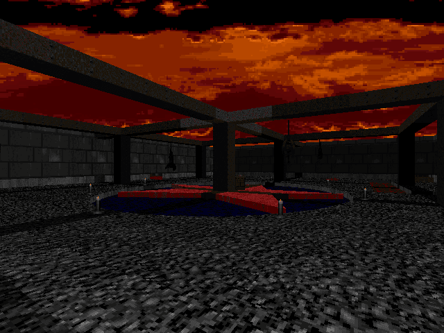
MAP15 - From Death
[Hunsager]
This is the final map of the first episode. It is an ok arena, but it's only in one texture color. The last two waves of monsters feels like overkill, and the Cyberdemons, arch-viles and pain elementals make for terrible gameplay.
Aesthetics: 3/6 - Layout: 3/6 - Gameplay: 1/6 - Score: 7/18
[Johnsen]
With approximately 300 monsters divided over several instant spawn waves, this sand colored brick fortress is quite the boiling pot. We got overwhelmed and died a few times here during the coop play-through, but I survived the map from scratch when having a bit more knowledge of its workings. Visually there is something slightly interesting about the height differences and the way the fortress is constructed with an inner and outer wall. With the detail level limit removing ports allow for though, something as simplistic and bland as this does not quite cut it. The gameplay suffers from too many hitscanners, as well as the fact that one cannot access many of the upper walls during the first and second wave, forcing you to gun down leftover monsters from below in a boring manner. I did not care much for the simple design solution of adding an impassible line around the outer edge of the map either. The fights go on for too long, and it's simply not a fun arena map, when it's over you're happy to leave it.
Aesthetics: 3/6 - Layout: 2/6 - Gameplay: 2/6 - Score: 7/18

MAP31 - Tribute
[Hunsager]
A map with cramped corridors and winding hallways and a confusing layout. There is of course a Cyberdemon residing in a small room deep inside the base. It's an optional room, so unless you want to challenge the cybie, it's a pointless visit.
Aesthetics: 2/6 - Layout: 2/6 - Gameplay: 4/6 - Score: 8/18
[Johnsen]
This is a fairly bland secret map. It showcases a simplistic design textured with grey stone and some grassy outdoor areas, with a bit of an abstract tech-base thing going on interior wise. The garden fights are alright, but you get far too much ammo here, so you basically run around with 50 shells all the time. It's still mildly fun though because of the easy fights and the fast pace. There's a Cyberdemon inside, but you'll quickly dispose of him with the BFG if you're not too drunk to dodge a few rockets within the limited square meters of his abode. I don't mind the day setting with the blue sky and the cranked up light level, it's sort of a throwback to the early maps in "Hell Revealed", or perhaps even the lesser parts of "Memento Mori". Besides some retro nostalgia though, you won't be the slightest immersed by the architecture. The route system is quite confusing too, since you have to backtrack to find the exit door, and it's easy to wander in circles despite the small size. For some reason there's a slight fog effect applied to the entire map, but it only adds an odd grey hue to everything.
Aesthetics: 3/6 - Layout: 3/6 - Gameplay: 4/6 - Score: 10/18

MAP16 - Sanctum of Life
[Hunsager]
As the second episode starts we have lost all our weapons and have to use a berserk and the chainsaw to fight off several spectres. The first map is very short, but there is at least a coherency in the texture theme as it's mostly green and tropical.
Aesthetics: 3/6 - Layout: 2/6 - Gameplay: 3/6 - Score: 8/18
[Johnsen]
I guess this map must be seen somewhat in context with the one that follows it, since this location seems supposed to be the cave-like entrance to Map17 - "Aquarius". It's not much of a cave though, more like a mix between a wine overgrown grotto and a brick temple, with a green fog illuminating parts of it. As incredibly simplistic as this map is, somehow it manages to create decent atmosphere because of the texture use and the ZDoom effects. There's a tranquil feel to it even as you engage the monsters, as if you are indeed roaming some isolated, abstract cavern. You'll have to run to the right after leaving the spawn location, in order to get a shotgun. Later on, the map supplies a berserk and a chainsaw, and since it goes light on the ammo it becomes somewhat of a Tyson styled gameplay, which I do not mind as long as the monster combos are fair. Some really annoying submerged imps and lost souls have been put to guard the exit lake though, and they will get the jump on you every time and claw you from below in annoying manner. I quite enjoyed ducking into the brown water to exit the map.
Aesthetics: 3/6 - Layout: 2/6 - Gameplay: 3/6 - Score: 8/18

MAP17 - Aquarius
[Hunsager]
This is something completely different as it's mostly an underwater adventure map with a submerged giant structure and several water-filled caves and tunnels. There's a slight issue with the gameplay since monsters that are situated almost vertically below you become hard to deal with. The map is perhaps a little too large for its own good, but it really does leave something to remember.
Aesthetics: 4/6 - Layout: 3/6 - Gameplay: 4/6 - Score: 11/18
"Aquarius" is probably the most creative map in the entire set, and the most memorable one. Yet, it's not a very well executed concept. For most of the maps duration you'll be swimming around in brown, murky water-filled catacombs, caves and tunnels. The highlight of the map is undoubtedly the moment when you first drop into the huge center cave, with a submerged and really cool looking building at the bottom of it. This scene granted one of the rare "wow" outbursts on TeamSpeak, and certainly will be remembered for a while. Underwater maps and swimming physics in Doom works surprisingly well, and we'll forgive the fact that the Doom marine is threading water, when you view the sprites in cooperative mode. It looks hilarious and induced several laughs throughout, there's nothing quite like seeing your partners head bob out of the water like a seal, only to submerge again and disappear. There's a really annoying Cyberdemon on guard in front of the yellow door, where he is notoriously overlooking the great water-filled cave. It's somewhat hard to get up and onto his ledge anyway, because of the bobbing dynamics when you are jerking around in the water. The gameplay is pretty challenging all through, but never downright unfair. You better locate all the ammo and weapons that are scattered in not so noticeable spots though, typically in tiny crannies and nooks and dark spots. I did not care much for the maze like layout of the map overall, but it has some really cool moments, with hidden shafts suddenly leading you onto dry land again after swimming the depths. The yellow key is placed at the end of some streaming aqueducts. Fighting the forces of nature (or the forces of the almighty ZDoom specials, pick you choice) was highly annoying. Overall the map is quite the memorable experience, if you can get past the sluggish movements you have to endure when submerged for the majority of the time. I salute the idea here, but it's not a map I'll want to complete again. Once is enough.
Aesthetics: 4/6 - Layout: 3/6 - Gameplay: 4/6 - Score: 11/18

MAP18 - City of Beholder
[Hunsager]
This could almost pass for a tiny "Plutonia" inspired city. It starts out with a hard red key ambush and it follows with a chessboard looking room with an army of monsters and two arch-viles. There is also a crypt with a dangerous revenant ambush. A hard but nice looking level.
Aesthetics: 4/6 - Layout: 4/6 - Gameplay: 4/6 - Score: 12/18
[Johnsen]
As little originality as this one offers, its still one of the best maps of the episode, and perhaps one of the handful of maps in the entire megawad that hold some replay value. It's basically a brown brick map, with a little flare of Dario and Milo Casali design-wise. You have a few slightly curved walls giving the map a smoother and different feel than the other maps. It's fairly open and grant good space for some high end monster fights. The chess-board like hall with the two arch-viles and their army of peasants, becomes almost a freebee kill scenario since you're loaded with rockets and there's a somewhat silly monster block line keeping them in place. The most difficult part of the map would be the sudden revenant spawn trap in the small graveyard basement. This trap instantly killed both of us on multiplayer, but I sufficiently fled it and survived easy enough on singleplayer when I was aware of it. This is a fun map, with better architecture, a better layout and a better gameplay than most of the megawad, but you'll hardly be impressed by it still.
Aesthetics: 4/6 - Layout: 4/6 - Gameplay: 4/6 - Score: 12/18

MAP19 - Doomed again
[Hunsager]
So we are back in the midst of the green poison fog, fortunately to a lesser overdone extent than Map08. The tech-sections are good, but I didn't like the part when you're teleported across the map and land on top of a pillar, simultaneously triggering some over-scaled ambushes. If you survive, you have to run across some grey pillars in order to teleport into a final Cyberdemon arena.
Aesthetics: 4/6 - Layout: 3/6 - Gameplay: 3/6 - Score: 10/18
[Johnsen]
In terms of size, this would be the little brother of Map08, but size is deceiving as this is clearly a harder map to stay alive in. It's a fairly small and violent green fog map with acid floors, tight ammo and lots of high end monsters. This tech-base is a nice enough creation, and the fog do create mood here as it's less abused than in Map08 and more suitable because of the confined space. If you can survive for as long, you'll eventually have to kill a Cyberdemon in a large hall divided by an annoying acid moat. The reward is instant though, since ending him will also end the map. It's one of the nicer looking maps of the episode, but not much fun to play.
Aesthetics: 4/6 - Layout: 3/6 - Gameplay: 3/6 - Score: 10/18

MAP20 - Desolate Fringes
[Hunsager]
This is a nice base in a icy countryside. The crates and the conveyor belt helps with creating a sens of location. There is a vast exit area with a cyber and several Spider Master-minds, and this is a spot where we would not have minded another invisibility sphere on multiplayer.
Aesthetics: 4/6 - Layout: 4/6 - Gameplay: 4/6 - Score: 12/18
[Johnsen]
This is another one of my favored maps in the megawad. You spawn inside this nice looking storage tech-base, and you have to pass through air-ducts, cross conveyor belts and jump crates to get around. Outside there's an icy, moody setting with some sweet, new textures. I really like the frozen cave look here - and the fog effect is used with excellent results for a change. This map seems to utilize the ZDoom effects well in general, and I much enjoyed sliding around on the ice covered pool in the yard, while trying to dodge incoming cyber rockets. The 3D-bridge didn't work for us during the multiplayer session, probably because of the oldschool settings we applied to the server config, but luckily it was possible to shoot my partner across a gap and collect the yellow key that way (entirely skipping the red). I'm not sure how I feel about the grand showdown this map turns into after the first fake exit. It's this huge outdoor area, covered in fog and ice, with multiple Spider Master-minds and a nasty Cyberdemon roaming around, among hordes of cacos and spectres. Of course it's an intended infight scenario, and we effectively utilized this to take out most of them. There's only one megasphere available, and we couldn't help but feel there should have been at least two of them on multiplayer, or an extra invisibility at the very least. The exit building in the horizon is a cool looking, spiky metal construction. Perhaps it would look even better if this one was constructed out of ice, since it already seemed like something sliced out of Supermans' Fortress of Solitude. The grey, somber, scrolling skyline fits the mood perfectly.
Aesthetics: 4/6 - Layout: 4/6 - Gameplay: 4/6 - Score: 12/18

MAP21 - Exosphere
[Hunsager]
This star-base is an acceptable creation which looks like it's actually floating in space. Perhaps it goes a little to heavy with the harder monsters, and the last cyber-arena with the chaingunners certainly wasn't easy.
Aesthetics: 4/6 - Layout: 3/6 - Gameplay: 4/6 - Score: 11/18
[Johnsen]
For a map with only slightly above 100 monsters, this is a tricky one. The theme is centered around a small tech-base set in space, with a few silvery walkways connecting the two parts across the dark void. Annoyingly enough the walkways are limited by impassible lines, making the gameplay a cramped affair since you keep getting stuck in invisible walls. It seems the author found no other good solution for this, and opted for an easy way out. The visuals are alright here and you sufficiently feel like you're walking around in a small space station. The most pesky parts of it would be the accumulation of mancubi, barons and revenants on the walkway, as well as a real nasty Cyberdemon showdown later on, past the blue door. He is not too bad on his own, but there's a completely dark ledge high above on each side of the room, and it's covered in shadow cloaked imps and chaingunners. An invisibility is supplied, so with a bit of luck, most of those guys will self destruct - but it's a risky scenario. I'm gonna be nice on the gameplay rating since it had a few viable traps, despite generating some frustration at times.
Aesthetics: 4/6 - Layout: 3/6 - Gameplay: 4/6 - Score: 11/18

MAP22 - The Virtual World
[Hunsager]
I hoped all the surreal maps belonged to the first episode, but nope, here comes another one. The entire map is textured in black with some horizontal stripes in blue and red. It gives me the same psychedelic vibes as the first level in the monochrome mapping project. How can you possibly spot specters against an almost completely black background? The room with the flashing lights and the hell knights is the kind of stuff which effectively manages to give me a psychotic breakdown. The final room is a giant open hall with Lost souls and an seemingly endless amount of blue squares and lines. It isn't obvious which direction you must take but the invisible exit line goes all around the edge of this giant hall. I thought Doom was all about killing the monsters, but in this case it looks like the author has intended that the player should panic and flee from the map as fast as possible. I wonder if he's actually aware of how frustrating it is to play this map? This is a premiere example of how to not make a Doom level.
Aesthetics: 1/6 - Layout: 2/6 - Gameplay: 2/6 - Score: 5/18
[Johnsen]
Unfortunately another bloody oldschool unfriendly 3D-bridge stopped us from playing much of this map in multiplayer mode, so I had to do a playthrough on singleplayer here. This is a highly original map, one that you'll certainly remember for quite a while, even if you hate it. Similar crazy stuff have been made many times through the years, but this one adds a few quirks to the mold. The entire map is made up of dark shapes that are outlined by either blue, red, purple or yellow lines. One look at the automap should tell you we're not talking about some grand design affair here, but the effects work. This feels like something out of Tron and it effectively immerse you and make you feel like you're stuck inside some nutty virtual reality world. The gameplay is fairly easy and forgiving, and thankfully becomes less of a challenge than the previous maps of the episode. Having this one too stacked with monsters would ruin some of the immersion. I didn't care much for the sequenced light section with all the hell knights, or the blue key pickup after a series of instant teleporters. The incredibly mind twisting scrolling star sky before the exit is something to behold though, if you can spec it without getting instantly motion sick and vomit all over your keyboard; its one of the weirdest and most convincing sensations of a sector moving sideways I've seen in any Doom map. I'll award this level for its originality, and its decent gameplay. The layout could have been much slicker and it suffers from a few annoying sections.
Aesthetics: 4/6 - Layout: 3/6 - Gameplay: 4/6 - Score: 11/18

MAP23 - Into the Sun
[Hunsager]
The concept for this level is to have you swimming around in lava. Several megaspheres and invulnerablities as well as a number of bio-suits are at your disposal, but this just gets too difficult as there are barons and revenants situated in the lava below steep drops. The exit is the worst, though. It is a lava cave filled with mancubi and a Cyberdemon. Luckily the Cyberdemon shot me straight into the exit. It was just a relief to escape this level without having to clear the last room for monsters. This map is simply too heavy on the lava and the hurt floors, and there's not much playability left, especially when you stack up the last hall with that many monsters.
Aesthetics: 3/6 - Layout: 2/6 - Gameplay: 1/6 - Score: 6/18
[Johnsen]
Wow, this is probably where Doom monsters go when they are too shitty to reside in Hell. What a sulfurus nightmarish pit. The entire map is covered in an orange fog hue, and almost everything hurts as you descend down several cliffs and shafts, constantly dropping you deeper and deeper into the fry. The gameplay is hard and unfair from the get go, as you're teleported into a close encounter cave filled with high end monsters, a moment requiring sufficient infights for you to survive. If you have the classic settings applied to your server here, like we did, you'll have serious issues with monsters clawing you from below, screwing you over as you attempt to drop further into the depths. To make matters worse, you're fully dependent on the bio-suits as you get to the lower levels, since the heat of the place will rip your health away. The layout is quite the mess, and you'll pretty much chaotically plasma spray your way through one claustrophobic enclosure to the next, leaving almost no time to recuperate or establish a sense of direction. It's a short affair though, so if you just push forward you'll get to the final descent which lands you in a large hall with a Cyberdemon and an army of mancubus. Of course the sector also deals out damage by itself, so you better act quick before the bio-suit and health runs out. Somehow my partner managed to mount a rocket and ride it into the exit, much like that dude at the end of True Lies. On singleplayer I did a playthrough from scractch here, and just managed to kill all the monsters in the final room before exiting as my health ran out, thus I consider myself redeemed. There are a few cool aspects to this map, undeniably it manages to create a place so unwelcoming you'll feel some despair just running around in it. Is it fun though? Nope. Not the least.
Aesthetics: 3/6 - Layout: 2/6 - Gameplay: 2/6 - Score: 7/18
 |
| Where are my sunglasses? I need some UV-protection in this Hell hole. |
MAP24 - ?A??=? ?# ? ?E??
[Hunsager]
This is a horror map, and it works, I have never played a scarier Doom map than this one. It uses sound effects like hysterical screams and creepy music, giant crushers with dead faces, disturbing textures, and a lot of hard ambushes. I can't say I like being traumatized, and I will probably never play this map again, not even for cash. This experience was just too unpleasant.
Aesthetics: 5/6 - Layout: 2/6 - Gameplay: 3/6 - Score: 10/18
[Johnsen]
There are very few Doom Maps in existence which sufficiently manage to create good old fashioned horror in the classical sense. Most of the Hell maps or "dark maze maps" that attempt to creep you out just come off as too dark, dull, stupid or bland. Somehow it's pulled off here. This map is creepy on a Michael Myers creepiness level, and for a Doom map that is quite extraordinary. This is a small hellhole that will leave an uneasy feeling if you bring your laptop to a cabin in the woods, and fire it up around midnight. I'd claim you can even play it mid day and get that icky feeling of being stuck in a nightmarish dream. The atmosphere is achieved through some very effective texturing, and a few perfectly timed gimmicky jump scares. But lets rewind a bit; you start in a rather annoying, darkly lit garden area that should have been cut from the map completely, since it adds nothing but a bit of time waste before you get to the actual haunted house. I suppose it was added in order to create some location feel and a buildup. But the first part basically consist of a dark garden with two large pits you can't enter because of some cheap and highly intrusive impassible lines, and from there you enter a tiny, annoyingly dark passageway in order to get to the next part. The author created some blocky trees here, but clever texture use actually make them appear sufficiently abstract and creepy, and it's some of the better sector created Doom trees I've seen. The haunted house itself is textured with a highly creepy grey and black wood texture, instantly setting the icky mood. The sky randomly flash between a regular night sky and a fleshy hell sky. Inside the wooden construct, you'll have to endure a looping cuckoo-clock sound effect. It's creepy alright but it becomes downright annoying after a while, and should have been randomized or just muted quick. The house is a mess as far as layout goes, and I really didn't care much for the fights it orchestrated. The pitch black red key section with the downstairs and upstairs simultaneous arch-vile release is probably the worst fight, as its unforgiving and cramped. The horror faced crushers added to the creepiness big time. There are some instant jump-scream effects that will make you jolt in your chair, I certainly had a few close encounters with my ceiling, but I'll avoid spoiling them in detail for anyone who want to test the map. There's a fairly neat looking sloped attic as well, but I'm not a big fan of slopes being applied inconsistently like this. The map goes on for too long, and its quite the mess and not much fun to play. One cannot deny having been wigged out, though.
Aesthetics: 4/6 - Layout: 3/6 - Gameplay: 3/6 - Score: 10/18

MAP25 - Heaven and Earth
[Hunsager]
This map has a giant slope leading towards a spaceship at the end, creating for an epic view, especially since there is a Cyberdemon guarding it by firing rockets up along the slope towards you. Unfortunately, this map gets ruined in the later parts as it seemingly try to create some sort of a surreal ending. You are supposed to take off with a space ship, but instead you are teleported into a dark hallway with a revenant, followed by some pointless pillar jumping. It's difficult to see the pillars and the monsters below you because of their height differences, and if you fall off you get teleported back to scratch. Maybe the author intended people to use mouselook here?
Aesthetics: 4/6 - Layout: 2/6 - Gameplay: 2/6 - Score: 8/18
[Johnsen]
The most epic scene in the entire megwad comes after you work your way past the start and onto the huge slope with the silvery ship construct at the bottom, all highlighted by the striking moonlit sky above. This scene is completely epic, and will certainly linger on the mind for a while. As for the rest of the map, it's pretty much a complete failure. The gameplay sucks, on singleplayer you get pretty much a shotgun monotonous journey with some rockets in the mix, and a BFG for dealing with the cyberdemons. There's a sucky fight early on with a baron in a completely dark sector - a big sin in such a confined space. The interior of the ship is rather cramped too. I completed the map from scratch in singleplayer mode too, but perhaps I shouldn't have since the later part is the worst one of the map. After getting the yellow key, there is a count down message appearing, and then you oddly teleport into a gibberish section with some arrows on the floor, eventually leading to a screwed up pillar jump section. The pillars are placed so low you can't see them proper, and each time you fall off you have to repeat everything. This falls under the category "highly frustrating crap" which only serves to kill the gameplay. The last part is a grey temple section with a few monsters and two Cyberdemons, and although nice looking it seems completely out of place.
Aesthetics: 4/6 - Layout: 2/6 - Gameplay: 2/6 - Score: 8/18

MAP26 - Foreign Capital
[Hunsager]
This is a star-base with quite the giant magnitude and scale. Again, some of the rooms here look like something from the monochrome mapping project as they are in black, grey or white. There is a cool spaceship, but the last invading army of monsters is unfortunately too overwhelming.
Aesthetics: 4/6 - Layout: 3/6 - Gameplay: 3/6 - Score: 10/18
[Johnsen]
The earlier mentioned 3D-bridge incompatibility struck again here, so this review is based off a playthrough done from scratch in singleplayer mode. This is a highly surreal grand scaled space-base slaughter map, with lots of beautiful black and grey honeycomb shaped textures in the mix. It proper utilize these wonderful textures to good effect, and the ship construct floating in space in the midst of the blue key garden, is rather neat. I didn't care too much for the over-scaled hallway with the pathway leading to the laser locked doors, nor the fact that you just teleport back up after falling for half an eternity should you fall of a ledge. The drop to the section with the pink generator that you need to shoot in order to turn off the lasers, is not easy to spot unless you check the automap. I did not care much for the placement of a Cyberdemon down there, he added little to the gameplay and was merely a drawn out distraction, as well as somewhat unfair. The section beyond the yellow door did little for me as well, I'm not too keen on all dark rooms with a few illuminated areas when you have monsters to fight. There are some serious waves of monsters flooding into the blue key garden, including two Cyberdemons and a bunch of mancubi, hell knights and cacos. You get a healthy supply of rockets to deal with what's left after the infights, and since there's a BFG behind the blue door, I assume one could leave a lot of monsters behind, and go back to clean them up later. I did not care too much for the layout, nor all the intrusive teleport lines if you drop into space. The gameplay didn't really do it for me either, but there are some cool visuals here, much thanks to the neatness of the new textures.
Aesthetics: 4/6 - Layout: 3/6 - Gameplay: 3/6 - Score: 10/18

MAP27 - The Crazy Factory
[Hunsager]
This factory is an amazing environment. The textures are great, and there is a good use of heights. The crushers, conveyor belts, pillars and the side-sliding, cool sounding moving sectors, manage to create an industrial looking, yet crazy factory. It's a shame that this is too intricate, and it really suffers from all the frustrating jumps onto crushers and pillars. If most of these crushers had been made as scenery and not part of the obligatory path, the gameplay would have been so much better. Then the author could still have been satisfied with his accomplishment of making a crazy factory but he wouldn't have driven the player into a frenzy. There is an exemplary use of heights inside the factory which makes it look cool. But instead of teleporting the player up every time he falls down, these heights could have been better utilized with various plateaus. That is actually done in the first open plateau where you can drop down over the edge to the right to come to a secret supercharge. More of that would have been superb. Beware that it's possible to get stuck in a little gap to the left just before the bridge to the blue key.
Aesthetics: 5/6 - Layout: 2/6 - Gameplay: 1/6 - Score: 8/18
[Johnsen]
No, you will not successfully frustrate us and then snicker at the result and get away with it mr. author, I refuse to be trolled. This is actually a great example if you want to show someone how much Doom can suck if a mapper lose sight of the entertainment aspect, and instead try to frustrate the player constantly. There's a wonderful texture theme here, and the map is quite nicely put together, so much so that it seems the author decided he needed to sadistically turn the gameplay into a complete disaster, as a cruel joke. You're forced to jump pillars, dodge crusher or suffer the combination of the two, while attempting to dodge incoming fireballs simultaneously. If you drop down from one of the pillars, god forbid (oh and you will, yes you will!), you'll have to endure a lengthy fall into oblivion before a teleporter see fit to bring you back to ground zero. Excuse me, but was I supposed to enjoy this bullshit? Another 3D-bridge made sure I had to suffer through this one in solitude, in singleplayer. Not touching this again, even if you throw in some perky tits.
Aesthetics: 4/6 - Layout: 1/6 - Gameplay: 2/6 - Score: 7/18

MAP28 - Core Overdrive
[Hunsager]
A nice base, but overpopulated with enemies. Good use of ZDoom effects, such as bridges, fancy lights and translucent windows.
Aesthetics: 4/6 - Layout: 4/6 - Gameplay: 4/6 - Score: 12/18
[Johnsen]
This is one of the best tech-bases in the set I'd say. I would assume it's one of the authors more recent creations as it's architecturally a step above most of the offerings in the megawad. Again we get some cheesy, easy solutions with impassible lines blocking different edges, preventing you from dropping into space - a side effect of the chosen design, and not one I'm very fond of. There are some cool ZDoom effects at work here, like proper lifts, a basement section with red lights and translucent honeycomb textured windows. The texturing is solid all through, and the new patches are put to good use here. I'm not sure what I think of the slight overload of pitching three Spider Master-minds at us, but at least the first one grant some strategic options with a nearby invisibility. You better grab the BFG secret before triggering the yellow key trap, as it spawns two hell knights and an arch-vile right in your face. The BFG also becomes vital for cleaning out the last two arch-viles inside the exit core. I really miss the super shotgun in this map, and it would have elevated the already decent gameplay another notch. Now it becomes more of a plasma and rocket spam party, with some sluggish single shotgun action in between.
Aesthetics: 4/6 - Layout: 4/6 - Gameplay: 4/6 - Score: 12/18

MAP29 - World of Chaos
[Hunsager]
This is a very interesting base with a lot of sand, mud and caves, and the author has succeeded in creating a realistic looking desert environment. There is even sand in the hallways of the basement, and the movement is slowed down when you walk it, as a result. The classic grey marble faces have been altered into a sand colored scheme, a genius little move which helps with creating a desert feeling. There is a beautiful, yet ominously grey sky, which together with sounds of thunder creates anticipation that something sinister awaits in this map. The mud bath to get to the yellow key and the caves create exciting variation, although we never leave the desert location. There is a last arena which turns into an inferno as soon as you grab the blue key.
Aesthetics: 5/6 - Layout: 4/6 - Gameplay: 4/6 - Score: 13/18
[Johnsen]
Map29 does not disappoint. What we get here is a large canyon map with neat cave formations and a sand-filled base, all set to one extremely cool storm sky. The sky is probably the best thing about the map for me, and the slow scrolling ZDoom effect accompanies it perfectly. I would not have minded some more lightning effects and thundering sounds on top of this, but one can't have it all. Gameplay wise the map is rather straight forward, it supplies you with vast amounts of ammo, and the hardest part is probably up until you get hold of the super shotgun. I'd recommend doing so before running into the cyber garden past the tiny 3D-bridge. That spot is excellent for infights anyway. In the same garden, there is a mud filled cave you'll want to check out, as it allows you to swim through a rusty tech corridor and emerge inside a sealed part of the base to grab some stash - super cool! I don't care too much for the large cave part with the bottomless drop, since it limits your movements, and looks cheap on top, as does the square stalagmite. Be sure to clear out the BFG cave with the cyber, and snack on the secret supercharge down there, before you proceed through the keyed doors, because the blue key is heavily protected. We managed to lock one player out of the arena during the coop here, and I'm not sure one can get back in if a death occurs beyond this point. Luckily I survived. The BFG and a megasphere helps greatly with the survival rate, but one better utilize the inifghts well. This is a really nice Map29 entry, with some creative ideas - thumbs up for the stream of sand poring into the caverns. Nice little scenery like that is always welcome. Not sure what I think of the sluggish movement you get when running on the sandy flats, but I suppose it's tolerable over limited areas, and furthers the realism somewhat.
Aesthetics: 4/6 - Layout: 4/6 - Gameplay: 4/6 - Score: 12/18

MAP30 - The Destiny
[Hunsager]
I don't have too much to say about the last map. Thankfully, there are no spawn crates or a Romero head, but this is an arena with waves of monsters spawning in, done in a similar way as Map15. There is a tall, dark obelisk in the center, and together with the stormy grey sky it serves as an alert to the coming turmoil.
Aesthetics: 4/6 - Layout: 4/6 - Gameplay: 4/6 - Score: 12/18
[Johnsen]
For a Map30 this is not bad at all. You really do feel like you entered a place where final battles are fought, as the stormy sky maintains the same awesome atmosphere as the previous map, while casting shadows on the ominous obelisk at the center. We also get some epic rays of light shooting from the ground upon defeating the second wave, and it's a great effect. The gameplay centers around spawning waves of monsters instead of the tiresome Icon of Sin, a choice we certainly appreciated. Each player succumbed to a death here, but it's perfectly doable to survive this thing, we just had some bad luck with the arch-vile and the cyber in the final wave. This is a pretty memorable and epic Map30, and marks one of the better aspects of the megawad in my opinion - it sends you off in style.
Aesthetics: 4/6 - Layout: 4/6 - Gameplay: 4/6 - Score: 12/18

Hunsagers' Summary and total score:
Restoring Deimos is not a very memorable megawad. I suspect that the maps in the first episode are the authors earlier creations as they are the most forgettable ones. The average map here seems like it's designed without any underlying idea at all, with just some amateurishly connected rooms with randomly chosen textures. The second episode is a step up in quality, especially aesthetically. Many of the maps there have some sense of place and a coherent theme, most of them being space-bases. However, in several cases the author has lost himself in the ZDoom features, and they cause the gameplay to suffer somewhat.
The second act is where he shows the most of his creativity. Yet, the ideas become either a bit too whimsical, like the horror map (24) or too annoying, like when you swim around in hurting lava caves in "Into the sun" (23) or when you leap between pillars and crushers in "The crazy factory" (26). Some of these just load up too much with crazy stuff and the gameplay suffers heavily as a result. It would have been for the better if something was done to tone down these concepts, if not to avoid them completely. Even though these maps stick to mind, something less overdone and less try hard with an average gameplay would have been a relief.
The difficulty in the last part often becomes too overwhelming. There are no typical slaughter-maps except for Map30, but instead a disproportionate amount of high end monsters. The author knows how to set up ambushes, but unfortunately he often makes them unfair. Many of these maps will probably be very difficult to finish with a pistol start. I don't know if the author has accomplished this or if he let the task to his beta-testers, but I will not try to do it as I haven't seen many maps that I would enjoy playing again. If I have to mention some, I will chose maps 13, 18, 20, 28 and 29 as the ones that had some appeal to me.
Luckily, there wasn't many large maps in here so we haven't been too frustrated about keyed doors that are not stay open. Apart from the surrealistic maps and the authors deliberate aim to cause traumatic brain-injury or some such, it seems that this guy is especially fond of the invisibility as there are several levels with as much as two bulbs. He might also have a slight fetish for the computer area map, as it's tossed around even in extremely tiny maps. Those two items stand out as his signature, and I have seldom seen such an overzealous joy with constantly supplying them. Last but not least, there was no super-secret map, instead Map32 - "Finale" is a conveyor belt credit screen, a self-centered, slow journey displaying one screenshot from every map in the megawad.
My score: 3.00
Aesthetics: 3.22 - Layout: 2.70 - Gameplay: 3.06
(Awarded points: 100 / 84 / 95 = 279)
Johnsens' Summary and total score:
Some megawads are of the kind you want to come back to again and again, just like a good movie, or TV-show or some other experience that you cherish and want to revisit once in a while. This one does not qualify for that basket. It's very much a one time experience, even though it sort of turned into a two-timer for me since I completed 90% of it from scratch as well, just to get a better idea before scoring some maps (I blame excess liquor and annoying 3D-bridges for that). There won't be a third, though.
The first part of this map-set is obviously very basic and the layouts more or less infantile. It gradually pick up however, and I would assume these were made almost chronologically, so the more experienced the author became, the more his output improved.
There are not many maps here that I would recommend, I would be hard pressed to find anything that I'd consider great. At times it overkills and infiltrate its maps with ZDoom specific effects, and this is obviously one of its visual downfalls. It's hard to justify using slopes the way they are applied here; either one have to consistently use them, or leave them out entirely, in my opinion. The fog effects are used with mixed results as well, we see them completely overused in Map08, arguably also in Map19, but then quite tastily implemented along the icy surface of Map20.
Despite its flaws, there are a few things worth noting about this megawad. It has a very unique feel to it, and will possibly appeal to some people on that account alone. I suppose this is a given side-effect when one author create all 32 maps, and there is something to be said about such a narrative. I'm sure some people will greatly enjoy a few of the conceptual maps as well, but if you're going to skip everything else, I'd recommend playing Map17, 18, 20, 22, 24, 28, 29 and 30. Some of the entries are downright unplayable, and I'd give a special nod to the "Crazy Factory" - Map27 as the primary example of such.
There are almost no coop stopping bugs present here which is highly refreshing, and the ordeal with the 3D-bridges hampering us falls solely on our own backs for not taking proper care to configure the server.
Restoring Deimos is not a masterpiece, it's not a classic and you will feel somewhat depleted after playing it, so I'd recommend you get relatively drunk like I did, and make the best out of it. And in any case, check out the maps listed above, they do be worthy of a look, even when you're sober.
My score: 3.15
Aesthetics: 3.32 - Layout: 2.77 - Gameplay: 3.35
(Awarded points: 103 / 86 / 104 = 293)
COMBINED SCORE: 3.07
Aesthetics: 3.27 - Layout: 2.74 - Gameplay: 3.20
I had good time playing it. Especially spider VS spider level was really challenging, now I feel that this game should be in new version.
ReplyDeletei loved this wad, specially the into the sun, and the horror house levels...the music was actually pretty good, even the funnier joyful tracks from the first levels. Also between worlds was really pleasant to play
ReplyDelete